


In today’s digital world, it’s easy to drift afloat in the never-ending sea of information. Data is literally everywhere, and that’s what makes it difficult to absorb all of them at once.
That’s where infographics come to play.
According to a recent survey by Hubspot, it’s found out that the number of infographic searches in Google has increased by more than 800%. That’s around a 1% increase in infographic creation every day.
The reason behind its exponential popularity increase is due to the ever-growing need for a better way to market content across the web. Infographics have proven to be more appealing and engaging to consumers. Its vibrant colors, simple visual presentations, and straight-to-the-point content are what makes them more sought-after compared to articles which only have written content.
Take note that 65% of people prefer looking at visual presentations over reading texts. This leads us to one fact – and that infographics are the way-to-go if you’re looking to improve your digital marketing efforts and online presence.
Here are ten examples of what a great infographic should be like:
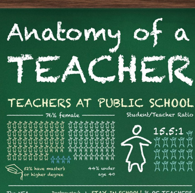
1. Anatomy of a Teacher


This is a good example of what a perfectly targeted infographic should look. The font and the background resemble a school chalkboard. This shows that it is specifically made for teachers and no one else, thereby catching their attention.
Pro tip: When you’re planning to make one, it’s important that you know who your target audience is. Remember that it would be better if you create an infographic that’s relevant to a specific audience instead of a generic one that appeals to everyone.
2. The Current State of Backup


The thing with infographics is that they should be made with putting focus in mind. The viewer should have an easy time understanding the infographic’s content.
Pro tip: This example shows how Mac users deal with their backups. It presents it in a very organized and detailed way. By putting figures, few icons, graphs, and well-thought-of words, you come up with a streamlined and easily understandable infographic. This way, you’re able to let the information drive the viewer to be focused on a single issue. In this case, it’s the backup practices of Mac users.
3. Geek vs. Nerd


In the example above, you can see how the headline’s words imply direct meaning. By using as few words as possible, you’re helping the viewer easily understand your infographic. Take note that the ideal headline length is 70 characters.
But what makes this example even more attractive is that it differentiates two very similar types of people. Most people don’t even know that geeks and nerds are different! That’s what sparks the viewers’ interest into reading the whole infographic.
Pro tip: Infographics might be more inclined to visual style. But don’t get us wrong, as its headlines still play a vital role in its ability to attract viewers. The principle here is simple: the better your headline is, the higher the chances of it gaining attention.
4. 7 Superpowers of a Knockout Infographic


You’ll notice how each section differs from one another in terms of color. Each section also has its own number and headline. Aside from that, its comic book style makes it easier for viewers to go through each section. It’s with this that you make sure that the viewer would finish reading the entire infographic from top to bottom.
Pro tip: An important trait an infographic should have is its ability to bring the viewer from one phase to another in a seamless and sequential manner. The infographic above is a perfect example of how you can assure that every phase will be interconnected with each other.
5. Companies that Acquired Customers from Facebook


Infographics aren’t exempted from the need of citing sources. Sources are important especially if you’re presenting statistical figures. It’s in citing the sources that prove your content is factual and legitimate. Just be sure they’re up-to-date and doesn’t distract the viewers from going through the infographic’s visual flow.
6. The Growth of Artificial Intelligence in eCommerce


The infographic talks about AI growth in e-commerce, which is reflected by its theme that features shopping robots. Apart from its simple yet relevant theme, it also made efficient use of the spaces in between points. This helps the viewers to easily read and understand the content of the infographic.
Pro tip: Having a single-color theme is another good idea if you’re looking to create an infographic that’s built to go viral. This example shows how it effectively utilizes different shades of blue into its font and background.
7. The 2016 Classy #GivingTuesday


The above example also lets the viewer feel a nostalgic feeling due to its “Home Alone” theme. The tarry staircase and the VHS tape are Easter eggs to the classic thriller movie. Psychology Today reports that nostalgic memories influence social behavior, thereby making the infographic more shareable.
Pro tip: Color scheme and nostalgia have powerful effects on the attractiveness of an infographic. Having fewer colors is better as it makes the content easier to understand. A recent analysis of more than 200 Pinterest infographics shows that those that have a maximum of two colors are the ones that have the most Likes and Pins.
8. Is Life Good?


Infographics should not only be a means to present something, but they should also be capable of evoking viewers’ emotions. This infographic is pretty good in doing that as everyone can relate to it.
Pro tip: The simplicity of the question and flowchart is what captures viewers’ attention. Add into the equation the surprising, yet very obvious reality of simply changing something to live the good life.
9. Cheetah: Nature’s Speed Machine


Here is another good example of an infographic that has a minimal yet meaningful content. It presents how a cheetah’s speed stacks up against other animals, vehicles, and even with Usain Bolt, the former world’s fastest man.
Pro tip: The way it presented the comparison is so simple, yet highly effective. The illustrator portrayed the icons in a silhouette shade to make it look clean. The headline is also placed inside a border frame. This highlights the infographic’s headline and makes it more organized.
10. How Steve Jobs Started


A good example of this is by showing a brief timeline of the life of Apple founder and former CEO, Steve Jobs. Talking about Jobs’ life is a great way to attract viewers because he has influenced the modern world in a lot of ways. You can also see how the elements of headline, simplicity, and visual cues come to play here.
Pro tip: Discussing the life story of an influential person is a great idea when creating an infographic. Infographics are not only meant to inform and educate people, but these are also made to quench the viewers’ curiosity.
Final Thoughts
Creating an interesting infographic boils down to these four things: simplicity, readability, target audience, and visual style. When you incorporate these four areas into your infographic, there’s no doubt that it’s going to go viral. Remember that it’s easier and more interesting to deal with visual graphics than reading an entire article. Thus, now is the perfect time to start making infographics – lots of them!