The saying “lead by example” is important in politics and leadership roles — and it’s also critical in marketing.
Sure, you can tell potential customers your marketing team is the best at running YouTube campaigns or effectively increasing a website’s cost-per-acquisition (CPA), but until you offer examples, they’re going to have a hard time believing you.
What is a case study?
A case study is a detailed story of something your company did. It includes a beginning — often discussing a conflict, an explanation of what happened next, and a resolution that explains how the company solved or improved on something. A great case study is also often filled with research and stats to back up points made about a project’s results.
Putting together a compelling case study is one of the most powerful strategies for showcasing your marketing skills and attracting future customers. But it’s easier said than done — you’ve executed the campaign, you’ve collected the results, now what?
To help you create an attractive and high-converting case study, we’ve put together a list of some of our favorites. Take a look, and let these examples inspire your next brilliant case study design.
Case Study Examples
1. “Shopify Uses HubSpot CRM to Transform High Volume Sales Organization,” by HubSpot
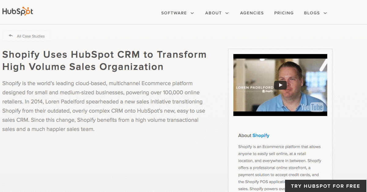
What’s interesting about this case study is the way it leads with the customer. That reflects a major HubSpot credo, which is to always solve for the customer first. The copy leads with a brief description of why Shopify uses HubSpot, and is accompanied by a short video and some basic statistics on the company.
Notice that this case study uses mixed-media. Yes, there is a short video, but it’s elaborated upon in the additional text on the page. So while your case studies can use one or the other, don’t be afraid to combine written copy with visuals to emphasize the project’s success.
2. “Designing the Future of Urban Farming,” by IDEO
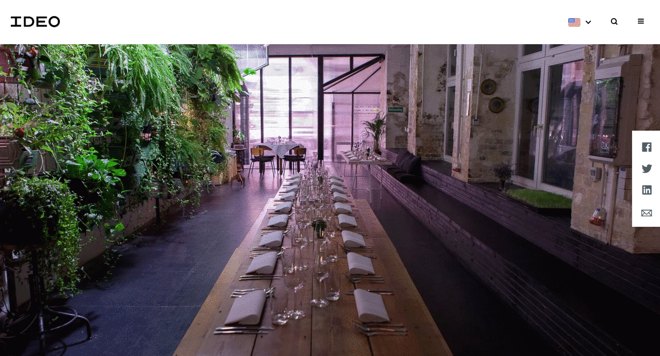
Here’s a design company that knows how to lead with simplicity in its case studies. As soon as the visitor arrives at the page, he or she is greeted with a big, bold photo, and two very simple columns of text — “The Challenge” and “The Outcome.”
Immediately, IDEO has communicated two of the case study’s major pillars. And while that’s great — the company created a solution for vertical farming startup INFARM’s challenge — it doesn’t stop there. As the user scrolls down, those pillars are elaborated upon with comprehensive (but not overwhelming) copy that outlines what that process looked like, replete with quotes and additional visuals.
3. “Secure Wi-Fi Wins Big for Tournament,” by WatchGuard
Then, there are the cases when visuals can tell almost the entire story — when executed correctly. Network security provider WatchGuard is able to do that through this video, which tells the story of how its services enhanced the attendee and vendor experience at the Windmill Ultimate Frisbee tournament.
4. “Customer Case Study: ElliotLee Estate Agents” by Pioneer Business Systems
In 2018, 45% of people watch more than an hour of Facebook or YouTube videos a week. A video case study could be a compelling way to attract potential customers who prefer watching a video over reading text. Additionally, a video allows you to convey customer emotion. This case study by Pioneer Business Systems, for instance, allows viewers to see firsthand the effects Pioneer’s telephone system had on their clients, ElliotLee Estate Agents. It includes text, as well, to thoughtfully organize and break-up the video into sections.
5. “Sapio User Acquisition Case Study” by Fractl
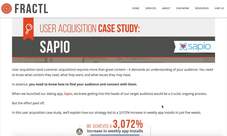
Fractl uses both text and graphic design on their Sapio case study web page to immerse the viewer in a more interesting user experience. For instance, as you scroll, you’ll see the results are illustrated in an infographic-design form as well as the text itself. Further down the page, they use icons like a heart and a circle to illustrate their pitch angles, and graphs to showcase their results. Rather than writing which publications covered their news story, they incorporated the media outlet’s icons for further visual diversity.
6. “USA Today” by Fantasy
What’s the best way to showcase the responsiveness and user interface of a website? Probably by diving right into it, via video — which is exactly what Fantasy does on their case study page for USA Today. They keep the page simple and clean, with a large red play button embedded at the top, inviting you to review their redesign of USA Today’s website via video. The video itself is simple, showing the website’s interface and clicking on various links with simple instrumental music in the background.
If you’re more interested in text, you can scroll to find their goal, “make USA Today’s website responsive”, in one short paragraph, followed by a simple “1” icon, with the text “Became the most visited US News site.” Fantasy understands that, as a potential customer, this is all you need to know. Scrolling further, you’re greeted with a simple “Contact Us” CTA.
7. “Coca-Cola Uses App Annie to Amaze & Delight Customers” by App Annie.
(embed link: https://www.youtube.com/watch?v=sHo0SnZFTMw)
A video is a phenomenal way to grab a viewer’s attention, but in our video-heavy world today, it can be hard to keep potential customers’ eyes on the screen. To combat this, App Annie’s case study of Coca-Cola includes drawings and text to highlight what Greg Chambers, Coca-Cola’s Director of Innovation, is talking about on-screen. They also occasionally cut away from his face to include full-screen text. By incorporating graphic designs and text in their video, App Annie encourages viewers to stay engaged.
8. “How One Ecommerce Business Solved the Omnichannel Challenge with Bitly Campaigns” by Bitly
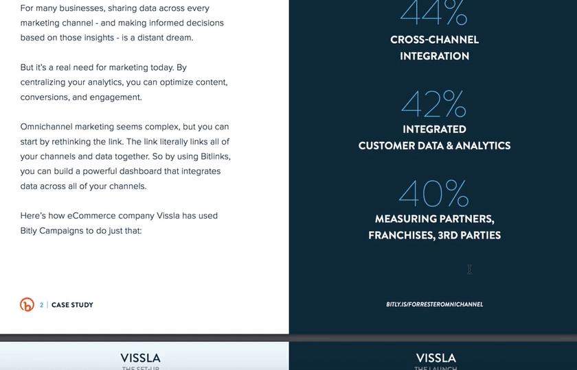
Bitly takes a different approach to text-heavy case studies, by providing their case study of ecommerce company Vissla in PDF form. The case study is clean and easily scannable, with sections divided into “The Goal”, “Top Omnichannel Obstacles”, and images of “The Set-Up” and “The Launch.” The downloadable PDF format makes the case study feel like an exclusive behind-the-scenes look, and uses colors and text that align with Bitly’s brand. Since the PDF opens in a separate browser, it’s easier for the viewer to avoid distractions as they scroll the pages.
9. “How Social Media Insights Turned Around Lexus’ Holiday Campaigns” by Infegy
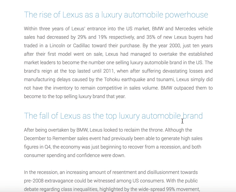
It can be risky to include hurdles to your case studies, but with great risk comes great reward, right? In Infegy’s case, their gated content is worth the fill-out form information, particularly since their client is such a big name in the automobile industry: Lexus. The PDF case study reads like a compelling news article, including titles like “The Rise of Lexus” and “The Fall of Lexus”, colorful pie charts, and real online comments from customers who were unhappy with Lexus’ old holiday ads. The PDF is six pages but features big font and plenty of white space, so viewers can easily skim it in only a few minutes.
10. “Fiesta Bowl” by OH Partners
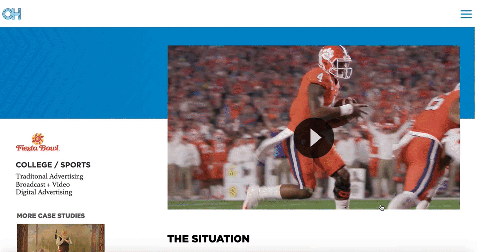
OH Partners doesn’t let superfluous details distract from the most important themes of their case study — “The Situation”, “The Solution”, and “The Success”. Each one of their case studies, including this Fiesta Bowl one, is organized into those three categories, with a video at the beginning followed by a few large font, easily skimmable paragraphs.
Best of all, OH Partners puts other case studies on the left side of the page, with highly enticing visuals to ensure a potential consumer can continue perusing the case studies until they’re confident in OH Partner’s track record.
11. “The Gifted Day” by Digitas
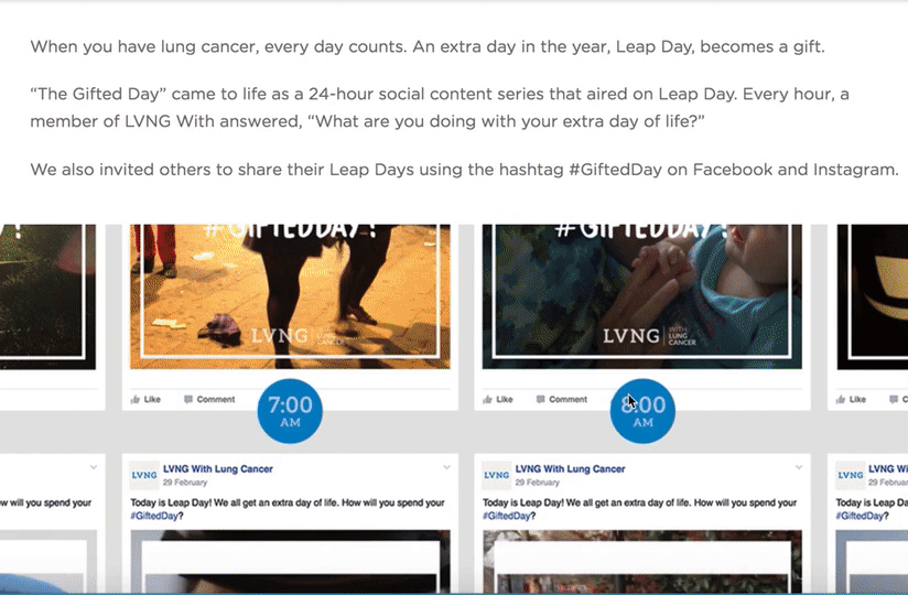
Digitas’ case study page for LVNG With, a cancer support community created by AstraZeneca, is one of the more emotionally moving campaigns in our list and might even evoke a few tears. The page begins with a heart-wrenching video of all the moments — a grandmother holding her grandchild, someone riding a roller coaster — that “weren’t supposed to happen”, exemplifying the enormous gift a single day could be to a terminal patient. Scrolling down, it’s obvious that Digitas kept AstraZeneca at the forefront of their strategy, but more than that, they used real people as their focal point.
12. “Wine.com” by RichRelevance
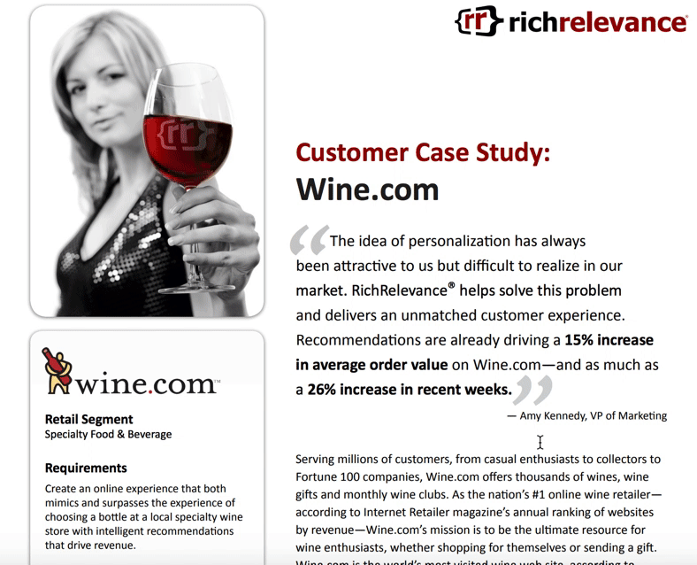
What first attracted me to RichRelevance’s Wine.com case study was the box on the left-side that quickly summed up the case study, including requirements, solution, and results. Adding an abridged version to a case study enables you to attract a larger audience, by offering a quick-read for those short on time, and a longer version for those interested in the details. RichRelevance’s case study also offers an impressive amount of information for those wanting to understand the nuances of their strategy, including a section titled “Fine-tuning Recommendations by Geography”.
13. “Synapse Innovation” by Uniface
SlideShare is a platform that allows you to encourage engagement from your viewers — which is likely why Netherlands-headquartered Uniface chose to use a SlideShare for their customer case study. As you click to the right you’re able to easily read their process from challenge to solution, and they provide a link to the full case study, and their social media accounts, on the last slide. Since each slide only needs a few lines of text, the SlideShare feels especially digestible.
14. “StyleHaul” by Asana
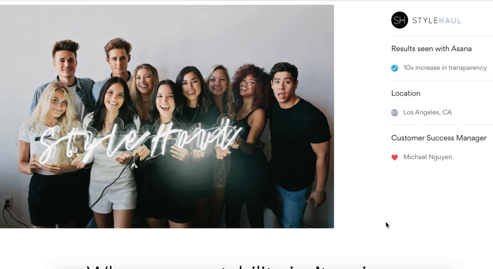
While Asana’s case study design looks initially text-heavy, there’s good reason — it reads like a creative story, and is told entirely from the customer’s perspective. For instance, Asana knows you won’t trust their word alone on their impressive customer service, so they let StyleHaul’s SVP of Business & Network Operations, Drew, tell you instead: “Our Customer Success Manager, Michael, was amazing. If I had a question, I wasn’t put into a queue—I could get it answered right away.” The entire case study reads like an in-depth interview, and captivates the reader through creative storytelling.
15. “Patagonia” by Amp Agency
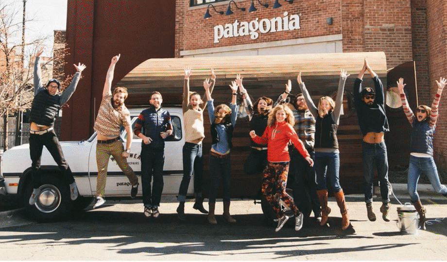
Amp Agency’s Patagonia marketing strategy aimed to appeal to a new audience through guerilla marketing efforts and a coast-to-coast roadtrip. Their case study page effectively conveys a voyager theme, complete with real photos of Patagonia customers from across the U.S., and a map of the expedition. Personally, I liked Amp Agency’s storytelling approach best, which captures viewers’ attention start-to-finish simply because it’s an intriguing and unique approach to marketing.
16. “Budweiser Influencer Marketing Case Study” by Anomaly
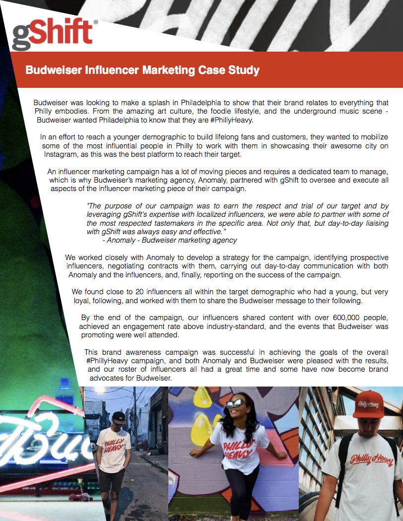
Budweiser’s one page, poster-esque case study is a good reflection of a brand knowing its audience. Anomaly’s case study for Budweiser appears edgy and modern, with a design that playfully pushes the text to the right as it showcases pictures of social media influencers wearing a campaign-related t-shirt. Both the top and the bottom of the page are eye-catching, and the text itself is simple and straightforward.
17. “Clinique” by AdRoll
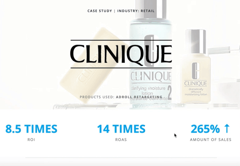
Sometimes, starting with the results is the best way to capture your readers’ attention. In Clinique’s case study, AdRoll does just that, beginning with some impressive numbers: “8.5 Times ROI, 14 Times ROAS, 265% Amount of Sales”. Once it has boldly outlined their results, AdRoll smartly pulls back to discuss the “Benefits of Personalized Ads”, letting the viewer consider how these same benefits might help their own company.
The page is short and sweet and ends with a compelling call-to-action — “AdRoll has generated revenues in excess of seven billion for its customers. Try it now.” The clean, whitespace-heavy page is an effective example of using a case study to capture future leads.
18. “TEXTCARE” by The George Institute
The George Institute chose to display the case study for their program, TEXTCARE, in a documentary-style video with real people discussing how TEXTCARE helped them become healthier and more active. If your case study results benefited people, there’s likely no better way to showcase that than through on-screen interviews.
19. “Reclaiming The Identity of a Brand: A Levi’s Case Study” by Levi
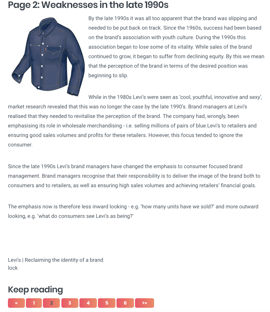
If you’ve got a case study with dense text, one of the more creative solutions to breaking it up could be to organize it by pages. Levi’s case study uses this method — their page one, for instance, is labeled “Introduction”, while page two is labeled “Weaknesses in the late 1990s”. Each page tackles a different topic, and the design makes it feel more like reading a book than a business article.
20. “Red Sox Season Campaign” by CTP
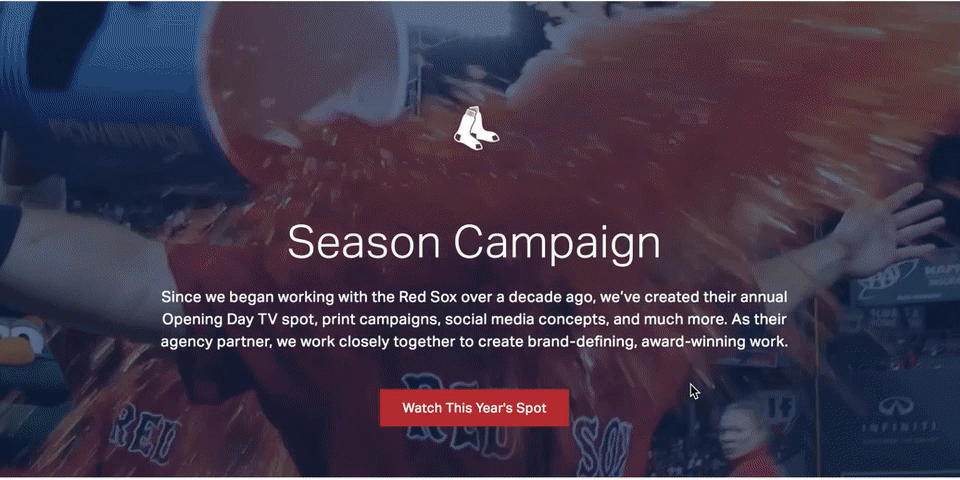
What’s great about CTP’s case study page for their Red Sox Season Campaign is their combination of video, images, and text — a video automatically begins playing when you visit the page, and as you scroll, you’ll see additional embedded videos of Red Sox players, a compilation of print ads, and social media images you can click to enlarge. At the bottom, it says “Find out how we can do something similar for your brand.” The page is clean, cohesive, and aesthetically-pleasing, inviting viewers to appreciate the well-roundedness of CTP’s campaign for Boston’s beloved baseball team.
21. “BIC: Bringing One Stop Shopping to BIC Razors” by Genuine
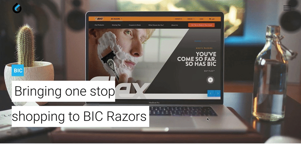
Sometimes, simple is key. Genuine’s case study for BIC razor’s is straightforward and minimal, with only two short paragraphs, “The Insight” and “The Solution”, accompanied by two images. The simplicity of the page allows the reader to focus on the sense of humor in the text, like “Helping a consumer find their perfect match and making them smile along the way means gaining a brand loyalist for life. Or until they grow a beard.” The page displays Genuine’s brand personality well, while offering the viewer all the necessary information they’d need.
22. “Cisco Systems: Velocity to Value” by Apptio
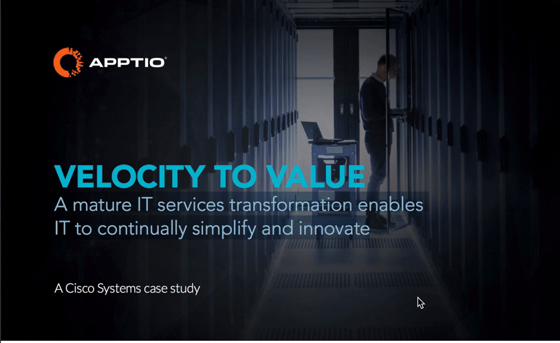
An attention-grabbing title is one of the easiest, yet most effective, ways to help your case study stand out — like Apptio’s Cisco Systems case study, titled “Velocity to Value: A Mature IT Services Transformation Enables IT to Continually Simplify and Innovate.” The piece is well-organized and uses compelling headers to keep the reader engaged, and offers a side panel for viewers who just need the bullet points. Despite its length, Apptio’s case study is appealing enough to keep viewer’s attention.
23. “Airbnb’s Custom 360-view of the Customer” by Zendesk
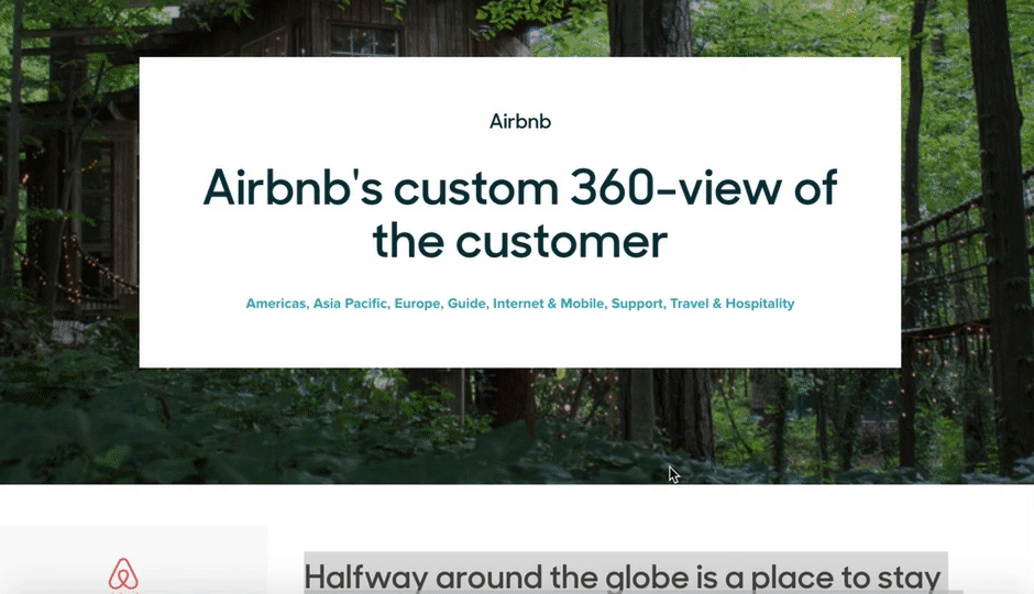
Zendesk’s Airbnb case study reads like a blog, and focuses equally on Zendesk and Airbnb, highlighting a true partnership between the companies. To captivate readers, it begins like this: “Halfway around the globe is a place to stay with your name on it. At least for a weekend.” The piece focuses on telling a good story, and provides photographs of beautiful Airbnb locations. In a case study meant to highlight Zendesk’s helpfulness, nothing could be more authentic than their decision to focus on Airbnb’s service in such great detail.
24. “Herschel Delights with Hootsuite” by Hootsuite
If you didn’t know this video was a case study for Hootsuite, you’d assume it was simply an artsy video capturing Herschel’s startup success. The Herschel marketing team mentions Hootsuite, but they do it authentically and remain primarily focused on the appreciation they have for their social media community. This video doesn’t have the feel of a traditional advertisement — instead, it feels unique and true to Herschel, highlighting Hootsuite as both a helpful and unobtrusive partner.
25. “4 Content Marketing Success Stories [Infographic]” by Kapost
You don’t always need a ton of text or a video to convey your message — sometimes, you just need images. Kapost’s infographic does a fantastic job of quickly providing the fundamental statistics a potential customer would need to know, without boggling down their readers with dense paragraphs. The infographic includes percentages, customer quotes, and colorful charts to provide the viewer with both numerical and emotional reasons they might choose Kapost.
Start creating your case study.
Now that you’ve got a great list of examples of killer case studies, think about a topic you’d like to write about that highlights your company or work you did with a customer. For more examples, check out these social media case studies.