Is your site mobile friendly? Find out how you can prepare for Google’s mobile-first indexing
It should come as no surprise Google is working toward indexing web pages primarily based on the mobile output of web pages versus desktop versions in what the search engine giant has called the ‘mobile-first’ index. This is where search engine users are predominantly headed, after all.
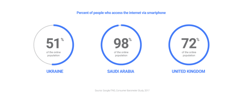
2017 marked the year, when, according to Google’s Consumer Barometer Study, mobile internet usage crossed 50% in all 63 countries covered by the report for the first time, albeit the range of usage country to country differed dramatically.

Download FREE Resource – 10 business-limiting SEO mistakes
The search engine optimization (SEO) mistakes to avoid and what to do instead. Google’s engineers have said there are at least 200 ‘ranking signals’ which affect whether you can rank above your competitors or not for searches which will bring you new business. To make SEO even more challenging, many of them change frequently in Google’s algorithm updates. So, it can be really tough knowing what matters in SEO and what doesn’t.
Access the 10 business-limiting SEO mistakes
Furthermore, from a search engine user perspective, Google have shared there are now more searches on mobile devices than desktop in several countries.
What is the mobile-first index and how is it different?
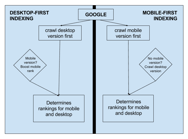
Historically, Google’s index has been based on primarily crawling both desktop and separate mobile site web pages with a desktop user-agent.
Google’s John Mueller mentioned the split traditionally has been 80% Googlebot (desktop) and 20% Smartphone crawler. The index has been built based on the desktop versions of canonical desktop content and the ranking of webpages for separate mobile website pages was based on their desktop equivalents.
Why is the Google switching to mobile-first indexing?
There are now more mobile searchers than desktop searchers but because the index has been built based on desktop web pages, mobile specific sites can differ from their desktop counterparts. They may even have substantively less content or content in different places in a webpage dependent upon the device accessing a URL. Search engine users on mobile, therefore, might not reach the most relevant result for their query. There could even be mobile sites ranking (based on their desktop content) in Google’s search engine results pages for terms they do not meet the search engine user’s informational needs at all. The user has potential to feel results were unsatisfactory.
Ranking tool differences of desktop versus mobile merely show algorithmic suppression introduced by ‘the mobile-friendly update’ in April 2015. Here, pages not passing Google’s mobile-friendly test are weighted (ranked lower) when crawled and served in response to search queries when compared with web pages checked as mobile-friendly.
With the introduction of the mobile-first index, everything is going to switch around. Google’s index will be built from the crawl of web pages from a mobile user perspective via the smartphone user-agent, instead of a desktop crawler. The smartphone crawler is now expected to crawl 80 percent of the time with the desktop bot visiting 20 percent of the time. All web pages will be judged independently (whether desktop or mobile site), indexed and ranked based on crawling by a smartphone crawler.
Should you be worried by this change?
Both Google’s Paul Haahr and Gary Illyes have said they don’t anticipate the introduction of mobile-first indexing will have much impact on search engine rankings overall and we know some sites are even now already included in mobile first indexing. The mobile-first index appears to have already begun to be quietly introduced over time as sites are deemed by Google to be fit for mobile-first indexing overall.
That’s not to say Google won’t be keen to downplay any potential impact from mobile-first indexing since its initial announcement in October 2016. Cast your mind back to ‘Mobilegeddon’, when dramatic negative consequences were expected from the pre-announced April 2015 mobile-friendly update and the SEO world was whipped up into a furore of panic due to an impending set deadline. Whilst impact was far less overall than forecast, the negative chatter caused by the pre-announced update (and subsequent anticlimax as the date rolled by and non-mobile-friendly sites did not fall off the edge of a cliff as anticipated) didn’t leave Google in a particularly positive place for its communications with webmasters and SEOs. Another side-effect of ‘mobilegeddon’ was unscrupulous SEOs spinning the change out of proportion to panic-sell prospective customers via fear, uncertainty, and doubt (FUD). When you add these together it makes sense for mobile-first indexing to be handled differently from a Google public relations perspective.
Google has already told us for those web pages delivered as part of a responsive web design or dynamic serving content, there shouldn’t really be a problem with mobile-first indexing. However, for those organisations with entirely separate desktop and mobile sites, where the content on mobile pages is not substantively equivalent to their desktop counterparts there is likely some work to do for mobile-first indexing.
To clarify, responsive web design sites return the same content for both mobile and desktop users from single URLs, albeit they adapt output to fit appropriately to the device of the user. Dynamic serving sends different content dependent upon the device user-agent the visitor is using with some content hidden for smaller screens, using a Vary HTTP header signalling any change. Google have recommended responsive web design as the preferred option.
Google’s main advice re mobile-first index
Apart from the obvious advice to ensure content on mobile sites is substantively equivalent to their desktop counterparts, Google have provided the following advice around the mobile-first index, which is as follows:
- Ensure both the mobile and desktop sites serve structured data
- Ensure Google’s crawlers can access the mobile version of the site (and desktop too of course)
- No change is needed for canonical links on mobile sites at this point.
- Ensure the mobile site is verified as a separate property in Google Search Console.
Mobile-first isn’t mobile-only
Whilst it is highly likely mobile-compatible pages will take preference in rankings in the index over desktop-focused pages it’s important to note the new mobile-first index isn’t a mobile-only index. Pages primarily desktop-oriented will still be crawled and indexed (as long as they are not duplicative (they will likely be filtered pre-indexing anyway), and pass Google’s index inclusion quality thresholds of course).
How will mobile-first crawling versus desktop-first crawling look?
Bridget Randolph gave a good illustration of how desktop versus mobile-first crawling and indexing will look in a recent blog post on Moz.
However, I would go a step further to say prioritization on mobile might go something like this:
- 1st priority – AMP Pages (but only if it is your canonical)
- 2nd priority – App URLs
- 3rd priority – Mobile subdomain URLs (m.(yourdomain).com)
- 4th priority – Desktop URLs
Mobile-friendly isn’t automatically ‘mobile user delight’
Sites are already likely being judged on their mobile user experience (and desktop too for that matter), regardless of whether they are responsive web design, dynamic serving or mobile only.
Whilst Google tells us not to worry too much if we have a response or dynamic content serving site, just because our web page has the same amount of content on mobile devices as it does on desktop it doesn’t necessarily follow the experience for users from either offering is a positive one.
The mobile-friendly test, however, does not tell us how users view our mobile-first offering, nor what they’re looking to achieve when visiting your site on either mobile or desktop devices.
What can you do about it?
First things first.
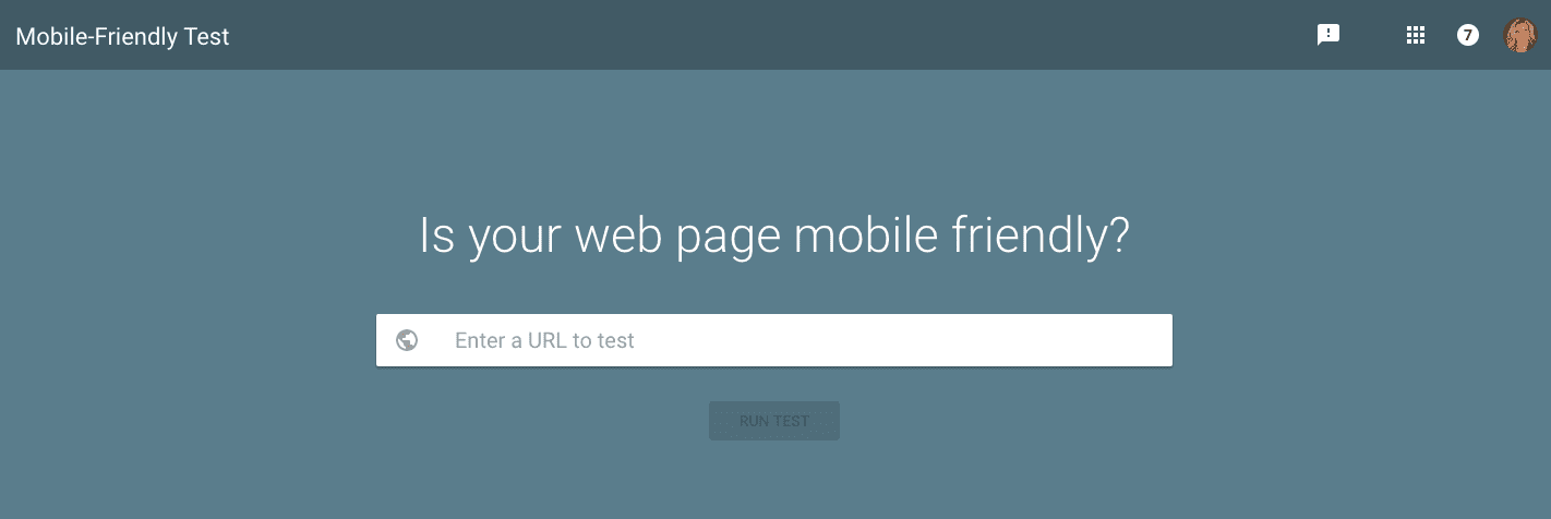
Undertake the mobile-friendly test
The natural starting point is to test whether your site is mobile friendly of course, with the mobile-friendly testing tool:
Google mobile-friendly testing tool.
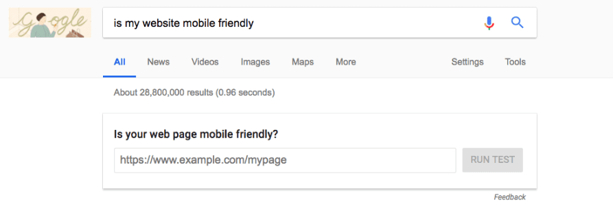
Alternatively, Google have made testing your site’s mobile-friendliness even easier by adding the testing tool directly to Google’s search engine results pages when users type “Is my website mobile friendly?”:
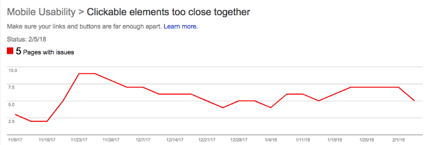
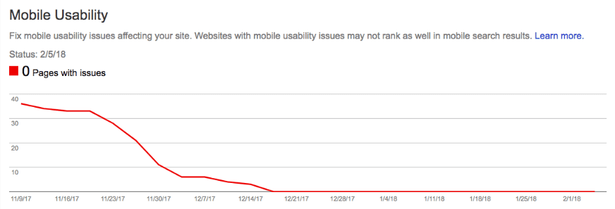
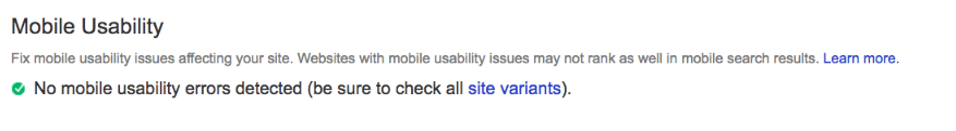
Once you’ve verified both your mobile and desktop sites (if they are separate and not a single responsive site), you can now also check the mobile usability report in the old version of Google Search Console). Go to ‘Search Traffic’ -> ‘Mobile Usability’. Here you will see if there are any issues with pages which do not pass Google’s mobile-friendly test. You’ll also be able to see clearly the issues which are preventing the pages from being considered mobile-friendly as well.
Mobile usability report in Google Search Console
You don’t want to see this:
This is better:
Ultimately you want to ensure there are no errors on web pages from a mobile-usability perspective, so this is best:
Tip 1. Switch to a responsive web design site as soon as possible
Prioritising and Inefficiencies in managing multiple websites
It goes without saying time is in short supply when it comes to developing websites and even more so in managing two websites (a desktop and separate mobile site).
There is often far more attention focused on the desktop site and the mobile site tends to become somewhat neglected over time. Some m.dot sites may even be a one-time scraped version of a desktop site. The desktop site goes on to be further developed and the mobile site remains as was in its original scraped form.
I’ve seen sites with different logos and designs on desktop to mobile, because it becomes increasingly problematic to continually synchronize everything. We know that a cross-device consistent message provides for a positive experience and helps with overall brand-recognition over time, and even perhaps the ‘halo effect’ which comes about as a result of ongoing recognition of a common branded experience. Having a single responsive site can help with this.
Switching to a single responsive site means consolidation of effort and therefore a more efficient use of resource and consistency of offering.
As with anything, where change is somewhere down the line, it’s easy to procrastinate until we end up with a very near website crisis, or you’ve missed the boat.
We know in larger organizations change can some time to plan and implement in development sprints.
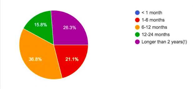
A study by Distilled found almost 40% of SEOs were waiting between 6 to 12 months to get their most critical SEO changes implemented by developers.
Getting a responsive site onto the planning and discussion agenda as soon as possible should take priority.
Tip 2. Don’t jump the gun
Ticking the Mobile-Friendly Test Checkbox Doesn’t Make Your Site Automatically Mobile Friendly For Users
Ticking the mobile-friendly test passed box does not a mobile-ready site make. I’d hazard a guess many sites rolled out sub-standard changes simply to avoid a ranking-drop when the April 2015 mobile-friendly update rolled out, negatively impact the UX of sites for visitors. Google have told us specifically it is better to not sacrifice a fully functional desktop-focused site and wait to roll out URLs which provide a positive user experience for mobile visitors rather than rushing and producing something substandard just for the purpose of mobile-first indexing.
Tip 3. Everything points to putting UX front and centre of priorities
Content hidden behind tabs, concertinas, and carousels.
Google has told us that on desktop content hidden in tabs, accordions and concertinas holds less weight than content not behind these UX features. Content behind concertinas, tabs and accordions are treated differently in the mobile-first index as long as they are used for user experience. This emphasizes Google’s appreciation of functionality and UX over the traditional ‘wall of text’ some sites have offered on desktop (particularly in an era of ‘Content is King’).
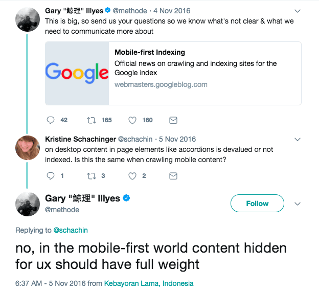
Remember though, if content is hidden behind an ‘on click’ action, crawlers do not carry out javascript actions (onclick), so would be unable to access this content.
The code example below from W3Schools ‘tabs’ content creation tutorial, for example, would not allow content to be accessible to search engine crawlers, and therefore, regardless of whether the device is mobile, desktop, or tablet, this would not be included in content consideration.
<div class=”tab”>
<button class=”tablinks” onclick=”openCity(event, ‘London’)”>London</button>
<button class=”tablinks” onclick=”openCity(event, ‘Paris’)”>Paris</button>
<button class=”tablinks” onclick=”openCity(event, ‘Tokyo’)”>Tokyo</button>
</div>
It’s also very important to remember that where content is placed on a mobile (or even desktop) device is crucial to SEO. Google’s Gary Illyes has confirmed recently at a conference in Amsterdam that the placement or position of content on a web page impacts how important that content is seen by the search engine and will affect rankings. Because of this it’s important to ensure focus on key messaging and the meeting of informational needs mapped to queries is in ‘main content’ areas (highly visible and above the traditional fold).
Broader implications for the future of search from the mobile-first index
Users behave very differently on mobile devices when compared with desktop:
- Far less attentive
- More easily distracted
- Often on the go with shifting context (albeit a large % of queries on mobile are also made from home)
- Information overload (not just on mobile, but desktop potentially too (how many of us have far too many tabs on desktop open all of the time))
- Slower connections on wifi
- Much smaller screens than desktop (of course)
Understandably Google have undertaken research into the types of tasks users undertake on various devices, and this is published already.
Think about what mobile users want to achieve in ‘task driven’ mobile-first search
It’s not just how often people are using mobile devices over desktop but the many tasks they are undertaking with those mobile devices, which naturally reach far further than that which can be achieved on desktops.
Ensure users identified top tasks are high in the navigational systems on the site.
Tip 4. Think about ‘information overload’ in an over-connected mobile-first world
Concise brevity and information overload avoidance
Can you say the same things or meet the same informational need (ie. provide ‘substantively’ the same) in a shorter, more concise way?
Here, the use of executive summaries, TDLR, table of contents, named anchors which jump quickly to the important sections of the page or back up to the top quickly will all add to user delight. They may even help you to be the ‘chosen one’ (answer) in voice search queries over time.
Page length appropriate to query intent & informational need
Ensure content meets informational need (and that may be a task-driven need rather than a wall of text) from search engine results.
Google advises human raters in their voice search quality rating guidelines that short sentences provide the best answers. The answer needs to be early in the page. The other quality guidelines also tell us to meet the need early in the page (in main content). The mobile user wants to achieve their tasks and meet their informational needs very quickly. Look at ways in which you can provide substantively the same content (i.e. it amounts to the same thing) in either fewer words or by replacing with some functionality, or marking up its equal relevance to the topic with structured data.
Tip 5. Flash is a total no-no
Completely avoid presenting content to users on mobile-devices (Googlebot smartphone is crawling as a mobile visitors so will interpret any issues with flash installation requests as a human visitor would and will realize Flash cannot be installed), which requires flash to be installed as mobile devices do not support this. Talk to your developer with a view to exploring alternatives to flash by combining HTML5 and javascript, or CSS3. Many of the features Flash have provided can be at least in part emulated or entirely replaced by these newer markup and coding technologies.
Conclusion
There are several other ways in which you can prepare for mobile-first indexing as we move toward this next phase of search. Hopefully, the items listed above will be enough to get you started as you plan to transition your assets to be highly visible in search for mobile users and desktop alike.