
Yours truly was thinking aloud about CTA’s recently:
“As in, do CTAs really have the power to make or break website sales, as some inbound experts confidently claim, as they keep A/B testing their CTAs, over and over again?”
Trust me, I didn’t have to look far and wide for an answer. Right around the corner, I found some incredible stats and facts that support what the inbound marketers and conversion analysts have always believed, since time immemorial: CTAs Are Turnaround Tools. The moment you include them on your website and apps, clicks and conversions go up.
Before we dive deep into the power of CTA buttons and it’s incredible role in drawing traction and traffic, let’s begin with the basics first.
First off: What Are CTAs Precisely?
CTAs or call-to-action buttons are specifically designed for websites and landing pages with the basic intention of capturing user attention and, at the same time, tempting them to click on what you want them to click on. They are the laser of a website that concentrates user focus and inspires them to click instantly.
Commonly used call-to-action buttons:
- Add to cart buttons
- Free trial sign-up buttons
- Download buttons
Online businesses commonly use CTAs to prompt visitors to buy products, download PDFs, forms, and sometimes to reach just another page.
The button consists of two elements in all: design and copy. Though they play diametrically different roles in the conversion realm, both need to go hand-in-hand for accelerating clicks and conversions.
How?
The button design is a visual sign that tells users “where to click,” while the button copy helps decide, “To click or not.”
Needless to say, crafting buttons is part science and part art. The magic lies in the right mix of both that gets clicks and conversions.
Here’s a complete run-down on 5 top CTA design tips that drive user conversions:
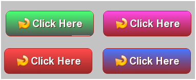
#1. Choose Highly Contrasting Colors
To talk about an ideal CTA button color is to talk about flying pigs. Why? It’s because there isn’t such a thing in the CTA realm.
Okay! Let me put things in perspective for you.
Turns out businesses often experiment with a variety of colors before nailing down the perfect CTA color for their website. Sometimes it’s red CTA. Sometimes it’s blue CTA. Sometimes it’s green CTA and so on.
Now, how do you decide which CTA button color is right for your site? Simple. Choose contrasting colors. Or choose highly contrasting colors, if need be. This makes sure that your CTA stands out on your website page.
But then again, make sure it goes with the flow of the website and doesn’t jar the user’s eye. For this, you need to conduct a series of A/B tests on different buttons to see which color is best for your website page.
Let’s check out this example from Unbounce for a better understanding.
Unbounce ran a test with blue and green CTA buttons to scope out which color converts better for a client’s website. Keeping the text color as it is, they simply changed the color of the CTA buttons, while conducting a couple of A/B tests.
The result? The green button outperformed blue by 35.81%.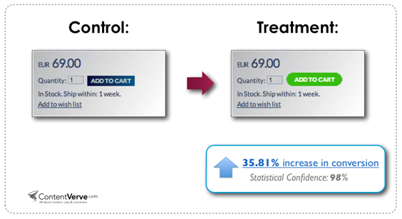
What do you think? What made users click on the green button more than the blue button?
Here’s the thing. Green button got more hits because it stood out from the rest of the page. And, in case, if you think symbolisms associated with color green such as *freshness* and *go* may have nudged the users to click on the green button more, think again.
Sure enough, green evokes positive emotions. Sure, it stands for environment, freshness, nurture and everything in between. Not to mention the significant role it plays in traffic signals. But then again, you also go green with envy. Uh! Didn’t that ring a bell?
The bottom line? No particular color can be related to CTA conversions. Just use highly contrasting colors. That’s about it.
Let’s check out another example here:
Try painting the entire web page in blue, and then top it up with a differently-shaded blue-colored CTA button. Think about it. Is it going to help? Maybe a little.
On the contrary, if you whitewash the CTA in orange, be assured, the conversions will be better.
If you found orange to be too jarring, give http://buttonoptimizer.com/ a shot. The site facilitates the creation of different CTA buttons, which helps you to pick and choose the best ones for your webpage. One thing that you can do is: Spread all the buttons on a blank page and see how they look. Then nail down the contrasting ones first. Thereafter choose the one that goes well with your website background.
According to Michael Aagaard, Unbounce’s Senior Conversion Optimizer, you could even try the squint test formula to see if the CTA sits perfectly with your site. For this, complete the page design first, and then take a few steps back and then squint your eyes and see if the button stands out.
Takeaways
- There is no ideal button color
- Choose a contrasting button color that perfectly bodes with the background color
- Make sure it grabs user attention immediately
#2. Sizing Shouldn’t Go Over The Top
Sizing is important. In fact, trust me when I say, it’s more important than color.
As per Fitt’s Law, the bigger the design buttons the better. It’s because they are easier to click on. But then, it also states that when you make a smaller button 10% larger it would increase the clickability of that particular CTA button, but ironically the same logic doesn’t apply when you make an already large button 10% larger.
The target size and usability plotted on an XY axis and this is how it looks: 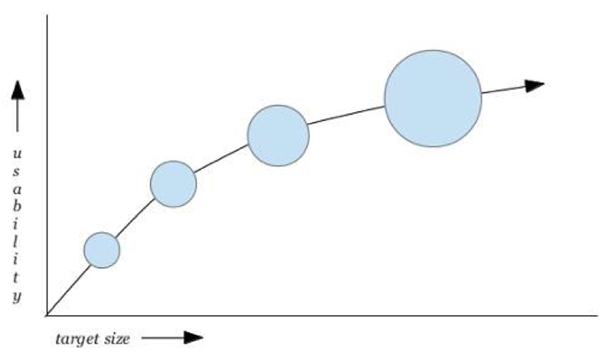
The possibility of a CTA button being clicked is nonlinearly related to the size of the button.
The bottom line: The size of the CTA button should be large enough for the text to be read easily. But then, it shouldn’t be so large that it makes the rest of the page look unwanted and orphaned.
The best way out is to make your CTA button 20% larger than the logo. Sure, the logo will be much more noticeable given that it’s placed on the top of the page. But then again, be assured, it doesn’t take away anything from your CTA button, given that it’s already larger in size than the logo I mean, and on top of it, it should be contrastingly colored as well.
Takeaways
- Button size shouldn’t be too big or too small
- It should big enough to click comfortably
- The content should be legible
- If possible, make it 20% larger than the logo design
#3. Make Them Curvy
Square-shaped buttons or square buttons with rounded corners typically dominate the website and the app world.
If you try and crystallize the reasons behind these round corners, you’ll find the visual psychology behind it. As per Neuro-aesthetics researchers, rounded corners draw people’s attention to the center of the button; whereas square edges draw attention away from the center.
Sure, you can be creative and try different shapes such as circles, triangles, and even custom shapes. But then, don’t forget, that latter might be very risky.
Whatever button type you choose, make sure you maintain consistency all through the site, so that users could easily identify the interface elements as buttons.
Takeaways:
- Keep round borders
- Maintain consistency throughout the website/app.
- Limit your Choice to Just Two
As it turns out, a web page may have more than one to call to actions. But then I’d suggest you keep just two. More than 2 CTA’s could simply clutter the page and could create confusion in the user’s mind as well.
So, just have two buttons and then design them in such a way that a user could easily figure out the important one of the two.
As a rule of thumb: the primary CTA button should be sized bigger and should be made noticeable too, while the secondary CTA could be made subtler and smaller in size.
Takeaways:
- Stay away from too many CTA buttons. It creates confusion
- Stick to 2 CTA buttons per page
- Having 2 CTAs make sure that user clicks at least on one
#5. Leave Enough White Space
White space or dead space around the call-to-action button helps your CTA buttons to stand out from the rest of the page.
Check out how Paypal leverages dead space around CTA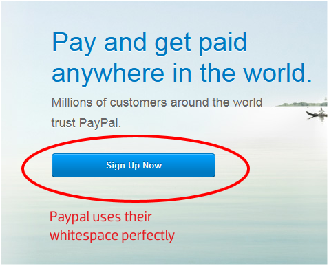
You can try having curved arrows (in the white space) pointing to the CTA like this:
Takeaways:
- Keep enough white space around the CTA
- If need be, use curved arrows pointing toward CTA
Additional Designing Tip
Leverage Personalized Vocabulary
Even text plays a crucial role in the design of the button. Remember to keep the text short. No one has the time to read your long text these days. This will help you to get your message across in the least time possible.
Delete old-fashioned words like “ Buy,” “Submit” and “Download.” Rather use words like visitor sign-ups. And also focus on using more personalized copies and, if possible, add something unique to your service.
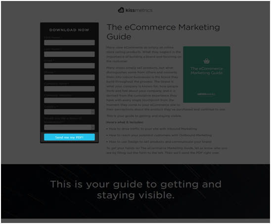
Kissmetrics leverages the first-person vocabulary to attract user clicks.
Try using the first-person vocabulary more and more like: “I,” “me,” and “my” and similar words to address your users.
Check out this instapage CTA to get a better idea.

You can even take the help of top web design companies to make sure you’ve got clickable CTAs on your website.
Takeaways:
- Avoid big words
- Use the first-person language
- Message should point-blank
- Use “free” prominently
Your Turn Now
Do you have any more CTA design ideas running in your mind? Go ahead and give us a shout-out in the comment section.
Or, if you implemented any of the above-mentioned tips, do share with us your experiences.