Marketers can use qualitative app analytics to investigate the real reasons for falling conversion rates
Are your mobile app’s conversion rates breaking your heart? Let’s turn that frown upside down. If you are marketing a mobile app, you’ve probably had long days or even nights of staring at less-than-stellar conversion rates, trying to understand why they are low. We’ve all been there. One of the problems in the analytics methods we use today is that they show you WHAT is happening in your app, but not WHY it’s happening. That’s where qualitative analytics comes in. In addition to data that show trends in user acquisition and retention, qualitative allows you to delve deeper into the “why” of your conversion rates, giving you a front-row seat to see how your users behave by showing you video recordings of real user sessions.
Why more marketers are turning to qualitative analytics
Qualitative analytics is an analytics method that records users’ actions on the app, providing a deeper look on user experiences and behaviours. This means that in addition to graphs and numerical data such as MAU/DAU, new sessions, and in-app purchases, you’ll be able to look at the various screens of your app and see how users interact with them. The two key features of qualitative analytics are user session recordings and touch heatmaps.
Qualitative also gives you the ability to look at individual users and watch their behaviour, instead of guessing what actions they take by consulting quantitative conversion funnels. This doesn’t mean that you have to choose between quantitative and qualitative – it means that you benefit from both worlds, and you are able to first look at aggregate data and then zoom in onto the single-user level. A good qualitative analytics tool will also point you to the specific user and session recording that is relevant for the issue you’re tackling.
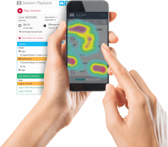
User session recordings
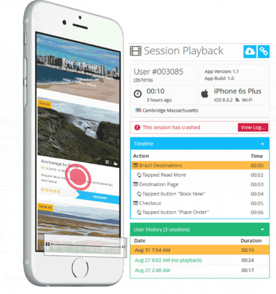
Session recordings are the cornerstone of qualitative analytics. What they show is a video recording of each session a user had in your app, as well as a breakdown of each action the user took. By looking at session recordings and seeing why users quit the app or dropped out of a funnel, marketers can discover the exact causes of conversion and retention drops.
Let’s take a look at some real world examples of how you can use session recordings to bring those conversion rates back up again.
In-app pop-up messages
If you’re using pop-up messages to try and get your users to complete an action, such as rate the app, invite friends to join, or finish placing an order, you’re probably tracking their success in numbers. With qualitative analytics, you can watch users interact with your pop-ups in real-time. For example, quantitative data will tell you if a lot of users simply quit the app immediately following a pop-up message. Why did they do that? That’s where you would use qualitative’s user session recordings to watch what happened when your users quit. Maybe a user agreed to a popup and then demonstrated confused navigation – meaning that the message conveyed in the popup was likely unclear, or that the popup is not working when it is supposed to take users to a specific destination.
In-app purchases
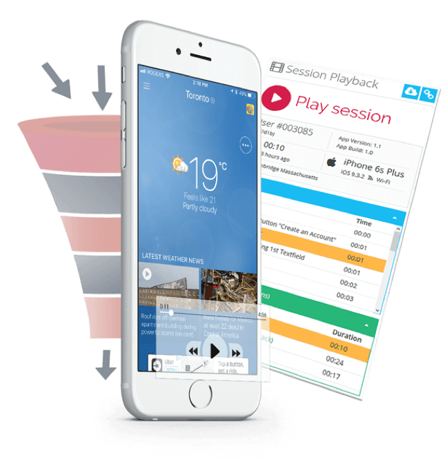
- Qualitative analytics utilizes two functions to help you find the recordings you need and then use them to better understand your conversion rates:
Conversion funnels – these show you every facet of the journey to an in-app purchase and how users are moving toward it step by step. When you combine conversion funnel analysis with user session recordings, you can really walk alongside your users as they move down the funnel, and see what made them drop out. This conversion funnel cheat sheet will train you to become a conversion ninja. - Action cohorts – these enable looking at in-app purchases from a higher level of perspective. With the right filters set in place, you can see how soon after the launch users complete a purchase, or how often they come back to fill their shopping cart. Combined with session recordings, action cohorts will show you what caused some users to complete only the first action. Learn more about action cohorts with this cheat sheet.
Ad quality assurance
The ads that show up in your app can have an extremely detrimental effect on your retention rates if they are in any way problematic. Unfortunately programmatic ads can sometimes have inappropriate content, technical or design-related issues, or abusive practices. You won’t know that your app’s ads are ruining your users’ experience until you see it with your own eyes by watching session recordings. With qualitative analytics, you’ll be able to see how the ads appear and identify which ads send your users running. Get a list of the most common in-app ad pitfalls and how to solve them in this in-app ad quality cheat sheet.
Touch heatmaps
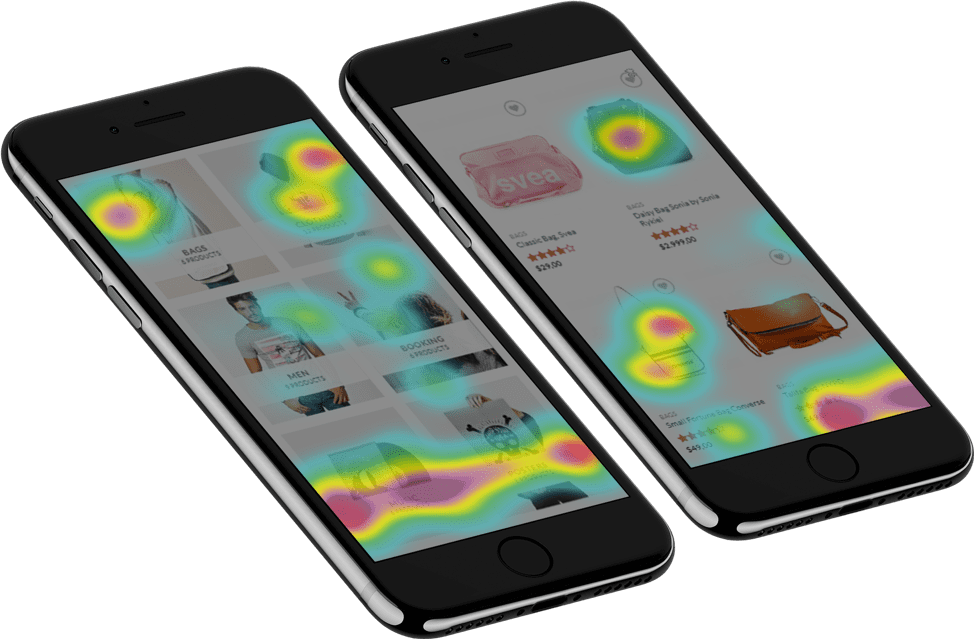
Simply put, touch heatmaps show an aggregate view of where your users’ fingers spent the most time on each screen, using a color-coded map. This is the zoomed-out version of qualitative analytics, in which you can get a feel for how users interact with your app and which elements of each screen are pulling their attention or confusing them. Touch heatmaps can point to problematic ad displays, layout and wording of CTAs, and even show where engagement can be improved.
Here are three use cases that show how marketers can use touch heatmaps:
Interstitial ads
If you have fullscreen in-app ads, you’ll want to know not just whether or not they’re bringing in leads, but also why they aren’t. The best way to research this is to see how users interact with them, and this can be done quickly and effectively by looking at touch heatmaps. Touch heatmaps will show you the overall interactions on a single ad. You’ll see where users tap the most, where they “were not supposed to tap”, and whether not the ad had a negative effect on their conversion journey. This will give you crucial insights on your ad’s design, wording, and placement within the app.
CTAs
Wherever you gave your users a call to action, some will tap as you intended them to tap, and some inevitably won’t. The latter probably interests you more than the former, and the way to understand both is to look at a map of the screen with the CTA and see what users made of it. Touch heatmaps can reveal the CTAs with which users successfully interact, versus the ones and what ends up as an unresponsive gesture (a UX issue in which a user taps or swipes the screen but the app fails to respond in any way).
Engagement
Every gesture made in your app says a lot about the user’s intent and what they want to achieve from the app. Touch heatmaps can help make this clearer. When you see screens with a high level of engagement (in heatmaps this means spots coloured red), you know what your target audience is there to do: the features they’re looking for, the choices they make, and the filters or options they prefer. You can then learn to establish clear user journeys, making users’ progress through the funnel as smooth as possible. In addition, this intimate look at your target audience helps you understand how to better market your app.
A few key takeaways…
You may have heard of qualitative analytics as a tool for UX designers alone, but qualitative has a lot to offer marketers. From finding the reasons behind reduced in-app purchases to quality assurance for in-app ads, qualitative analytics provides a chance to watch your users’ journey through each conversion funnel. This deeper, more intimate look at users and leads helps give marketers not just data, but genuine knowledge of their target audience.