
Why You Should Care About Accessibility

An accessible website means it is properly designed and coded in such a way that all users can access the same resources regardless of abilities. Simply put, an accessible website means that all users regardless of background have equal and fair access to all your site’s content and resources. Sadly, even in our new decade, a majority of the internet remains inaccessible to millions of people. If you operate any online resource blog, eCommerce shop, web application, etc., ignoring this portion of the population not only reduces the number of customers you can serve but also presents legal risks, as well. It is my intentions to serve as a starting point in your journey to making your online services more accessible to others, although I make no illusions to this being a comprehensive list. However, by putting into practice these steps you will be well on your way to making your WordPress a more fair and accessible place.
Monetary Benefits
It’s estimated 19.4 % of all United States residents have some form of disability. This represents over 48.9 million people just in the U.S. alone. The total after-tax disposable discretionary income for working-age people with disabilities is $21 billion! From a conversion perspective, why would you not want to serve value customers? In a survey by Click-Away in 2016 71% of disabled customers will abandon a site that isn’t accessible and will never return.
Legal Reasons
In 1998, the US Congress amended the Rehabilitation Act to require Federal agencies to make their electronic and information technology accessible to people with disabilities[1] . The reason behind this decision was to provide equal access to all information technology for people with disabilities.
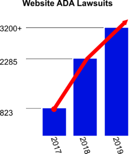
Fast forward to today, and still, a large part of the public web remains inaccessible to those with some form of disability. This inaction of the collective web has resulted in the need for legal action to force website owners to bring their sites into compliance with local state and federal laws. Since 2017, there has been significant growth in the number of federally-filled website accessibility cases nearly doubling every year.
Recent examples include the Supreme Court ruling that the Domino’s website and mobile-app must be screen-reading capable, which supported a lower court ruling in the case known as Domino’s Pizza v. Guillermo Robles, No. 18-1539. Further examples include federal district court cases in Florida and New York which ruled that websites failing to meet Web Content Accessibility Guidelines (WCAG) guidelines are violating Title III of the ADA code.
It’s unfortunate that it takes legal action to encourage website owners to be more accessible, but I felt it best to include this section to drive home the significance of applying good accessibility practices. I’m not a lawyer and make no attempts to say that by applying the following steps in this article you will have done enough to avoid legal action. It is simply my hope this will better prepare you to take your first steps to make the your WordPress site and the web more accessible to others. For more information, I would highly recommend looking up additional details about section 508 and Title III of ADA guidelines and how they apply to private organizations.
Use Accessibility Tools to Make Your WordPress Site More Accessible?
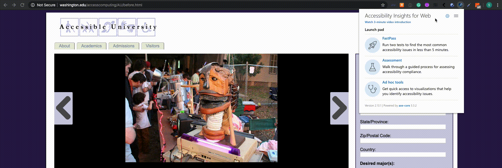
Before we begin making any changes to our website, it helps to get an understanding of how it currently stands in regards to accessibility. A great first place to start is using the free Accessibility Insights tool developed Microsoft. Using Accessibility Insights tool in our case the chrome extension we can run their FastPass test to see quick things we can fix in our site.
Note: The Accessibility Insights tool will identify a lot of elements that can be potentially wrong with your site from color contrast, images missing alternative text, forms missing labels, and so much more. With all the issues it might identify for your domain, it can be easy to become overwhelmed by the results. It’s always best to make changes to your website in phases. There is nothing wrong with taking it slow. Now that we are aware of some issues with our website, we can begin applying our first steps to making our WordPress site more accessible.
Alternative Accessibility UI Tool: Wave Accessibility Tool
First Steps to an Accessible Website

1. High Contrast Colors
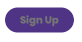
When designing elements for your website, such as graphics, menu links, and buttons, ensure that the colors combined in your design have high enough contrast in order to be visible. In order to be WCAG 2 AA compliant, there must be at least a contrast of 4.5:1 between your color choices. It’s okay if you don’t know how to choose the proper contrast. There are great online tools such as Monsido Color Contrast Checker that allows you to combine color combinations online and see their calculated contrast differences.
The following are examples showing how by simply changing at least one color in a combination, we can enhance the visibility of our elements.
|
|
|
|

2. Use ALT Text
When using images anywhere in your blog, you should always ensure that there is alternative (ALT) text included with the image. ALT text refers to the invisible description of images that are read aloud to visually impaired users with the assistance of screen readers. Adding ALT text allows you to include images, while still providing the content of the image in an alternative text-based format.
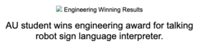
It’s not important to just provide ALT text; it must be useful within the context of the content. You do not have to describe every detail of the image, and you are able to skip over purely decorative images, but images containing crucial information need to have ALT text used. An easy way to come up with descriptions is to think about how you would relay the information over the phone.
For example consider a graphic at an online store that states which credit cards are accepted. What is the more appropriate ALT text?

1. ALT=”Credit Card Logos” (Which credit cards?)
2. ALT=”MasterCard, Visa, American Express, and Discover accepted.” (This specifies which credit cards.)
Get more information about ALT Text from Penn State.
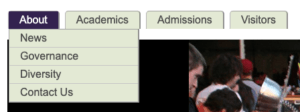
3. Use Headings Properly
H1, H2, H3, H4, H5, H6… oh, my.
Headings can be tricky when making your WordPress site more accessible. Naturally, if you’re like me, your default habit when publishing a blog post is to probably use headings to format your posts and documents to be easier to read.
The purpose of headings are really to serve as an outline or skeleton of the page’s content. Although sighted readers can easily identify headings by visually scanning pages for larger text, visually impaired readers rely on screen reading software and are unable to see these visual cues. So, increasing the font size won’t assist. It is important that you nest your heading elements properly in a semantic-based approach, not how they look visually.
Note: If the visual style of how headings look is preventing you from using them properly for the page’s content, you can always update them for sighted readers with simple modifications with CSS. Or, if you are using a page builder tools, often you can increase the size of text regardless of what header type was selected.
Video Resource: Why headings and landmarks are so important — A11ycasts #18
4. Using Proper Links

When you are including text within an article, it’s important to help users understand the destination of where the link is taking them. A good rule of thumb is to write links that still make sense out of context using descriptive title text about what the content is, not “click here” or “read more.”
The following are bad examples of links in the text:
- Click here to see examples of our previous work.
- For a full list of our services, or to see a list of all our published books, click here or here.
The following shows the same links in a more usable form:
- Examples of our work are available on our website.
- Learn more about our services or check out all our published books.
Additional Tips for Good Links
- Make sure that text links are (not a link) underlined and in a different color than the rest of the page’s content to help colorblind users find links easier.
- Avoid links opening up a new window or tab if you are able to. New windows have a different window history disabling the Back button for users and the new windows are harder for those with screen readers to navigate to.
- When using an image to serve as a link make sure to include the link in the ALT tag.
5. Use Plugins to Enhance Accessibility
Finally, once you have fixed all your images, headings, and links you might consider checking out adding One Click Accessibility Plugin to your WordPress site. While installing this plugin won’t replace good content writing habits, in just a few seconds you can provide your readers with an easy-to-use tool to self-service your site’s content in a way that is best for them.
Features Included
- Resize font (increase/decrease)
- Grayscale
- Negative Contrast
- High Contrast
- Light Background
- Links Underline
- Readable Font
- Link to Sitemap / Feedback / Help pages
- Enable skip to content
- Add outline focus for focusable elements
- Remove the target attribute from links
- Add landmark roles to all links
- Customizer for style adjustment
Not the End
That’s it. That’s all I got!
I hope you found this post informative and hopefully you learned a thing or two on how to make your WordPress site more accessible for others. This post was never intended to be comprehensive instead focusing on simple features that you can apply immediately to your posts and pages. Don’t stop here and remember to continue your learning. An accessible website is not a race; it’s a marathon. Start slowly and improve as you go. If you have any questions, feel free to ask below and I’ll try to do my best to respond.

Additional Resources and References
- Accessibility.io
- WordPress Accessibility Guidelines
- How Thinking About Accessibility Can Lead to Success
- 4 Ways to Make Your WordPress Site More Accessible
- When Good Sites Go Bad: The Growing Risk of Website Accessibility Litigation
- Video: Accessibility Tools & Resources for WordPress
- Accessibility Department of Penn State <— This was one of my personal favorites.
The post 5 Ways to Make Your WordPress Site More Accessible appeared first on WebDevStudios.