
How well does your ecommerce website convert?
On average, ecommerce sites in the United States convert at about a 3% rate.
If you’re hovering somewhere around that number, you might think your website is already optimized for high conversions.
Even if you think you’re doing well, there’s always room for improvement.
In fact, some of the top performing websites, such as the Google Play Store, have a conversion rate close to 30%.
Companies such as the Dollar Shave Club have roughly a 20% conversion rate.
Do you still think 3% is sufficient?
I don’t.
If you have an ecommerce website, you need to constantly make improvements that add credibility to your website. This will help you get more conversions.
For the most part, these changes won’t cost you much money but will bring a massive return.
You could double or even triple your conversion rates in just a few months by implementing some of these conversion rate optimization (CRO) strategies.
Those of you who don’t know how to optimize your ecommerce site for conversions are in luck.
I’m an expert in this space and have plenty of experience consulting businesses about their CRO.
I’ve come up with a list of the top eight ways for ecommerce sites to increase their conversions.
Here’s how you can get started right away.
1. Simplify the checkout process
How long does it take for someone to complete a purchase once they’re done browsing on your website?
Studies show 27% of shoppers abandon their carts on an ecommerce website because the checkout process is too long and complicated:
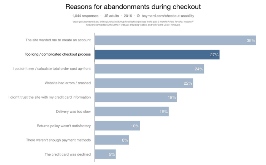
On average, the number of steps to check out on an ecommerce website is 5.42.
If you’re somewhere in that average range, nearly 30% of your prospective customers think your checkout process is too long.
Think about how much money you’re leaving on the table.
The more steps a customer has to take to complete the checkout, the more likely they’ll abandon the cart.
It gives them too many reasons to back out.
Don’t give them an excuse. Finalize your sale.
Get back to the basics, and narrow down the information you actually need from the customer:
- shipping information
- payment information
- email address to send a receipt.
That’s really it.
You don’t need to know their favorite color or who referred them to your website.
While additional insight may be beneficial to your marketing department, you still have plenty to work with from just those few pieces of information.
Based on the shipping location, you know where the customer lives. You have their name from their payment information. And you have a way to contact them via email.
Now you can send them a confirmation email as part of an actionable drip campaign to try to cross-sell and upsell products based on the customer’s current order or location.
You can even personalize that message since you know the customer’s name.
Don’t force your customers to fill out a form that’s longer than paperwork at the doctor’s office.
Simplify your checkout process and only ask for essential information needed to complete the sale.
2. Highlight items that are on sale
Most online shoppers—86% of them— say it’s important for them to compare prices from different sellers before making a purchase.
It’s no secret price is an important factor when it comes to a purchase decision.
That’s why you shouldn’t hide your discounted items.
Take a look at how Macy’s highlights markdowns on their homepage:
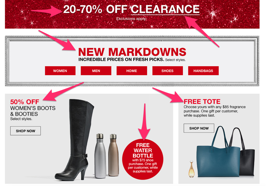
The website is absolutely plastered with buzz words like:
- free
- X% off
- markdowns
- sale
That’s why they are able to get higher conversions than their competitors.
Customers love to get a deal.
Buying something that’s on sale makes your customers feel better about spending money.
All too often I see companies try to hide their sale items.
They would rather sell items listed at a full price.
That’s a big mistake.
Instead, highlight discounted products and services.
You can always try to cross-sell or upsell to those customers later by enticing them to buy something else through other marketing efforts.
3. Display multiple pictures of the product for sale
You shouldn’t be selling anything based on just a description.
Your customers want to see exactly what they’re purchasing.
Make sure your images are high quality and portray the item in question accurately.
Here’s a great example from Lululemon to show you what I’m talking about:
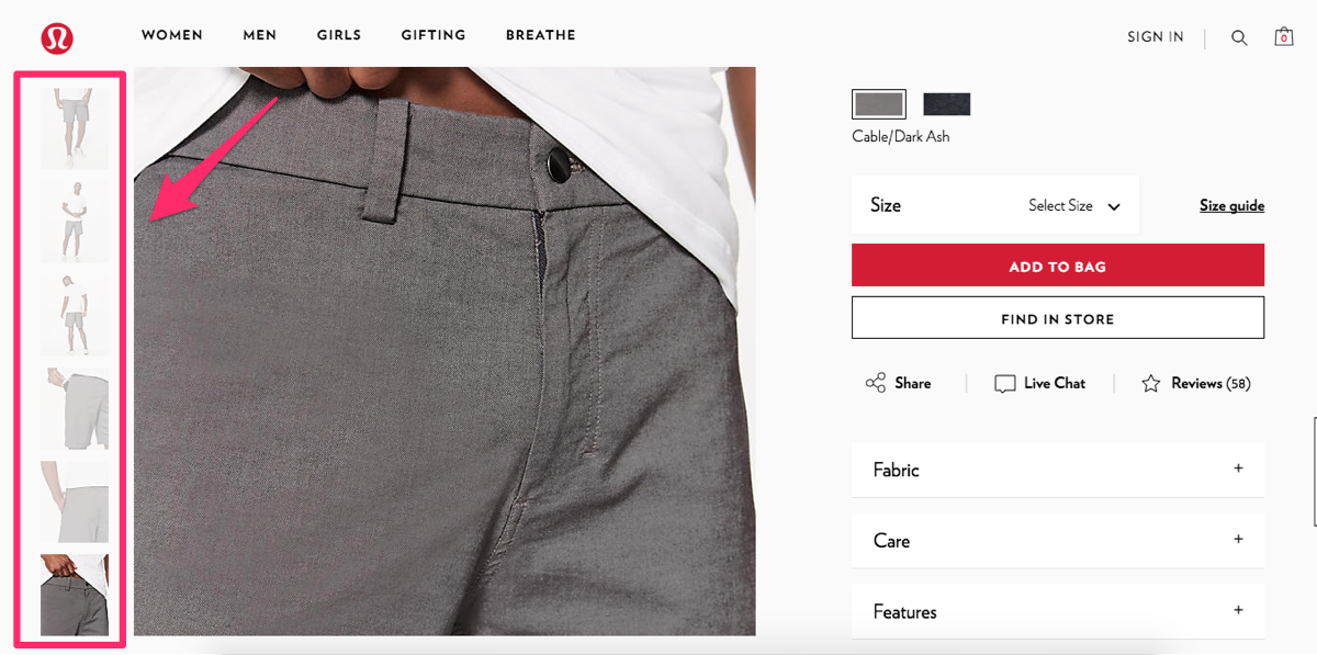
There are six different pictures of just one pair of shorts.
They show the product from different angles and even zoom in on some of the top features like a pocket that’s designed to keep a cell phone secure.
Pictures are much more reliable in relating information about a product than a written description of it.
You can apply the same concept to your ecommerce site.
Sure, it may take you a little bit more time to set up each product.
You’ll have to take more pictures and include additional images on your website.
But I’m sure you’ll notice a positive impact in terms of your conversions after you implement this strategy.
4. Provide live chat support for customers who are shopping
Even if your website is very informative, some customers may still have questions while they’re shopping.
You should set up a live chat option for your site visitors to communicate with a customer service representative.
Imagine someone wants to buy something, but they don’t—simply because they have a question and don’t have a way to get an answer.
Try to offer an online shopping experience they would get inside a physical store, with a sales associate available to assist them.
Look at how Apple does it. They offer a live chat for shoppers on their website, and it looks like this:
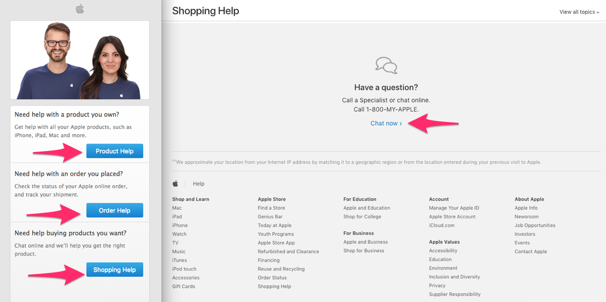
They make it super easy for customers to get all their questions answered online.
This is especially important if your company sells products that may need some extra explanation.
Realize not all of your prospective and current customers may be experts in your industry.
Although your product descriptions may be accurate, it’s possible there’s some terminology the customer doesn’t understand.
Rather than forcing them to pick up the phone or do outside research, offer them a live chat. Receiving this type of help can be the deciding factor that leads to a conversion for this customer.
5. Offer multiple payment options
Imagine this.
Someone wants to buy something on your website, but they can’t because you don’t accept their preferred payment method.
This should never be the reason for you to miss out on conversions.
While I realize some credit card companies may charge you higher rates than others, it doesn’t mean you should restrict payment options for your customers.
Try to accommodate as many people as possible.
While I’m not suggesting you need to accept cryptocurrency like Bitcoin, you should be accepting every major credit card, e.g.:
- Visa
- MasterCard
- American Express
- Discover
You should even offer alternative payment options such as:
Here’s an example from American Eagle:
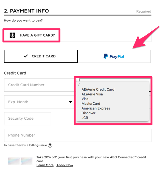
They accept nine different payment methods on their ecommerce site.
You need to offer as many options as possible for your customers.
It all comes down to convenience.
Some companies may just accept MasterCard and Visa.
They figure those are popular options, so everyone must have one, right?
But here’s the thing: you don’t know everyone’s financial situation.
While someone may have a Visa, it could already have a high balance on it, forcing them to use a different payment method.
Others may want to use their American Express card or Discover card because they get better rewards there.
And some people may not want to use a credit card at all if they have a sufficient PayPal balance.
The more options you offer, the greater the chance you’ll appeal to a wider audience.
Don’t assume everyone wants to pay with the cards you accept if that selection is limited.
Assume people will find a similar product elsewhere, where their preferred payment option is accepted, which will crush your conversion rates.
6. Have clear CTA buttons
Make sure your call-to-action buttons are clear.
They should be bold, standing out from other content on your website.
You can even put a box around the CTAs, clearly separating them from other text on each page.
Take a look at how The North Face does this on their website:
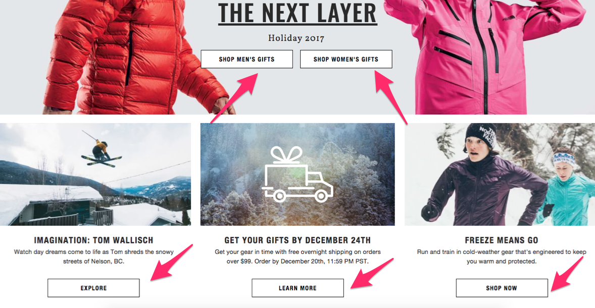
It’s clear which buttons on their homepage will direct customers to the right page.
Even though they have lots of different options, their website isn’t cluttered, and it’s organized in a professional way.
This makes navigation easy.
Now their customers can find what they’re looking for faster and start adding items to their carts.
Look at how the CTA button changes when a customer views an item:
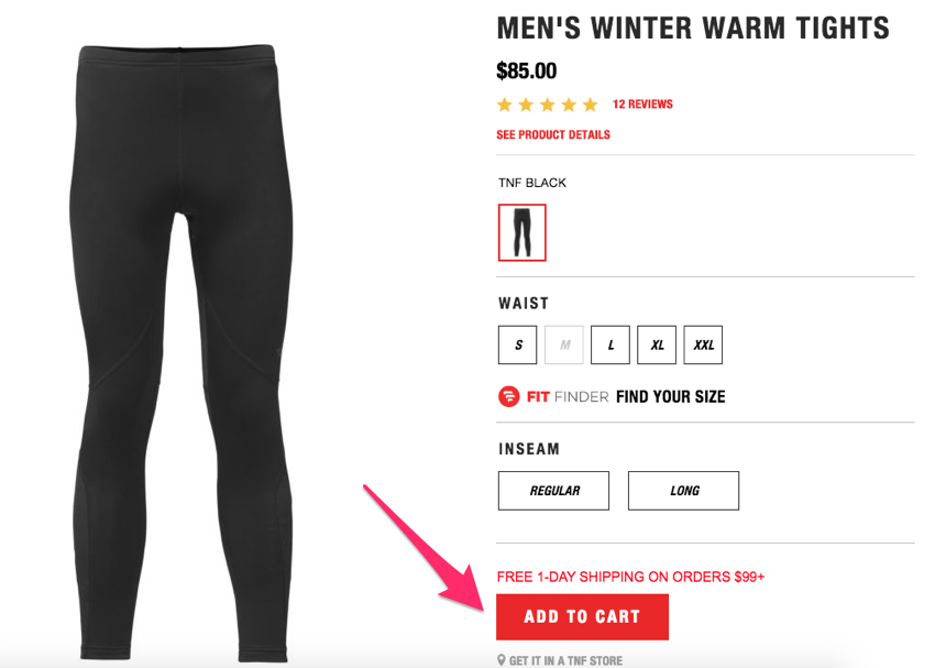
Now the button is even more apparent because it’s red.
It stands out, so it’s clear what the customer should do.
Don’t hide your CTA buttons.
It should be easy for customers to navigate and add items to their carts.
Big, bold, clear, and colorful call-to-action buttons can help improve your conversion rates.
7. Include user reviews
Consider this: 88% of shoppers say they trust online reviews as much as they trust personal recommendations.
That means nearly 90% of people trust a stranger’s opinion online as if it were coming from their spouses, best friends, or family members.
Furthermore, 39% of people say they read product reviews on a regular basis, and only 12% of customers say they don’t check online reviews.
Basically, this means customers want to see what their peers have to say.
Encourage customers to review products they’ve purchased, and display those reviews on your website.
Take a look at how Johnston & Murphy does this on their ecommerce site:
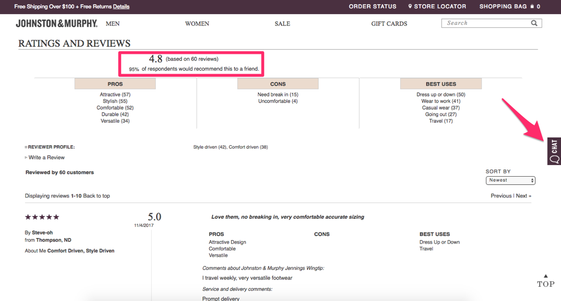
More reviews means more credibility.
Obviously, you’re going to say only great things about the products you’re selling.
But other customers will be truthful about their experiences.
That’s why consumers trust these ratings and reviews.
Customers share personal stories about the uses of the products they purchased and the reasons for recommending them (or not).
Notice I also highlighted the chat option on the Johnston & Murphy website—a topic I covered earlier.
Don’t be upset if not all your reviews are absolutely perfect.
You’ll get some negative comments.
It happens.
Those negative remarks can actually help you. It shows shoppers your reviews are legitimate.
Hopefully, the positive ratings will largely outweigh the negative ones.
This will help you get more shoppers to convert and complete the purchase process.
8. Add a video demonstration
If your products are unique, include video demonstrations showing how to use them.
Here’s an example from the Training Masks website:
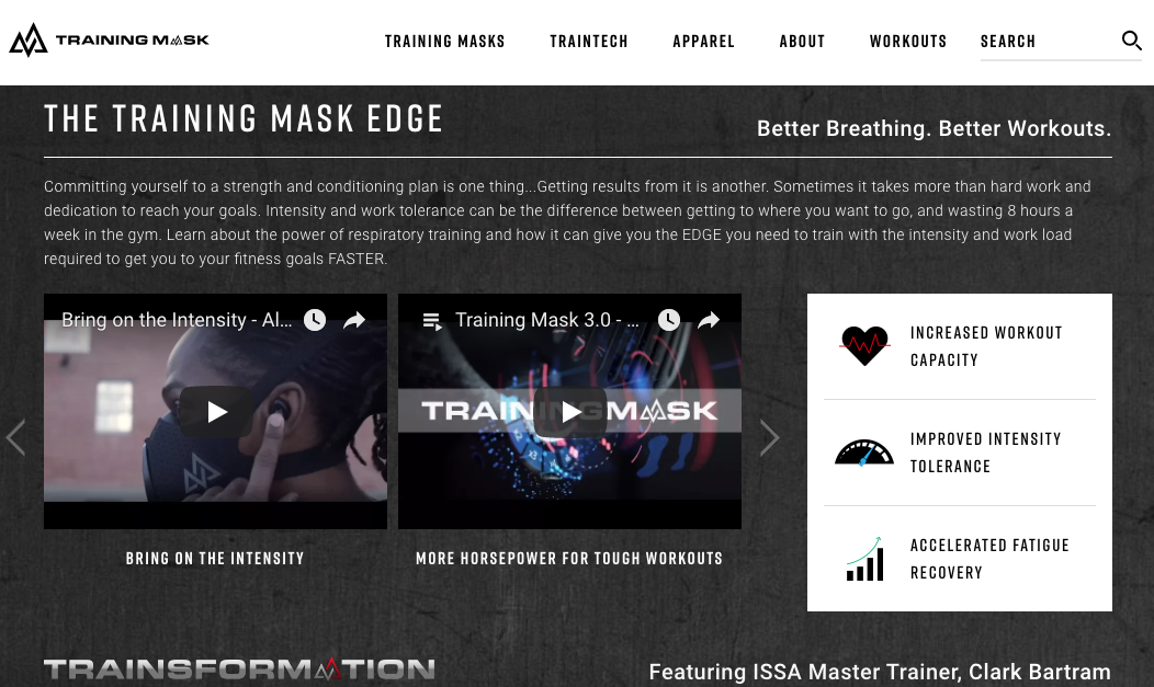
They have workout videos to show people how to use their product to train harder and smarter.
Since this product isn’t something you see every day, the majority of the population may not know how it works.
But don’t think you can’t use videos even if you’re selling something simple.
For example, everyone knows how to use a piece of luggage, right?
Well, that doesn’t stop Thule from including a video demonstration on their website:
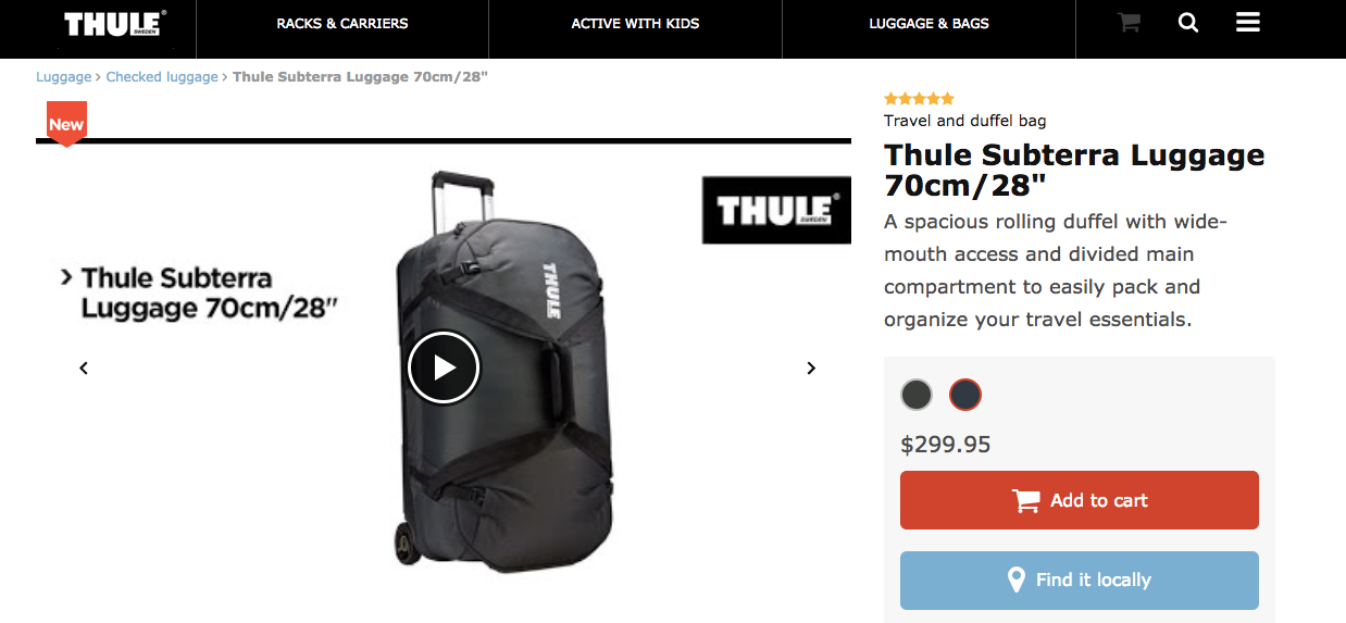
The video shows all the hidden compartments of the bag.
It also shows customers how they can adjust the handles and straps and utilize other features.
In addition, you can include a video demonstration highlighting the features that set your product apart from similar products.
Even if you’re selling something simple, like a shirt, a video can show customers the item’s versatility for different occasions, scenarios, or weather conditions.
You just have to get creative.
Conclusion
Your ecommerce site should be making more money.
Don’t settle for average.
Take steps to improve your conversion rates.
You can make subtle changes or additions to your site that will get more people to make purchases.
Start by simplifying the checkout process. You’ll get higher conversions with fewer steps.
Emphasize items that are on sale or discounted.
Include multiple photos of each product from different angles.
Allow your customers to chat online with customer service representatives to answer any questions they might have while shopping.
This will give your customers the same feeling they get whenever they are shopping inside a brick-and-mortar store.
Don’t restrict payment options. Offer as many payment methods as possible to appeal to a wider audience of prospective shoppers.
Your CTA buttons need to be big, bold, and clear.
When placed in proper locations, these buttons can help you get more conversions.
Make sure you include customer reviews for all your products.
These recommendations can encourage others to make a purchase.
Create videos showing detailed explanations of how your products work.
This is the perfect chance for you to highlight the unique features of your product.
These tips are easy to implement, and they won’t cost you much money at all.
Trust me, they work.
You can start applying some of these elements to your website right away.
What have you done to increase conversion rates on your ecommerce site?