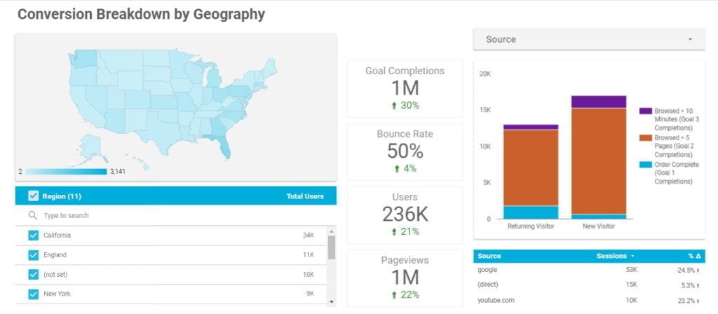
What is Hotjar Used For and How Does it Work?
Hotjar has incredible functionality, with tons of ways to get to know your users better. Hotjar allows you to visualize how users engage with your site. Hotjar uses interactive heatmaps of their clicks and actions, recordings of their sessions, and gathering of their words from survey and feedback polls to help you build a strong, […]