

Blog design sure has come a long way since I started doing them 6-7 years ago. Back then the designs were very … bloggy.
The most recently written post was given all the prime real estate on the home page, with the next most recent posts appearing beneath it. Sidebars were crammed full of stuff that would take you away from the site (blogrolls, sponsor ads, Google Ads) along with things that really didn’t need to be there (remember tag clouds?).
We then experienced the ‘magazine site’ evolution. Bloggers realised that serving up just one visible post on their home page was folly. What if a new reader wasn’t interested in that post? They’d be gone in an instant. Magazine style sites allowed a new reader to scan all the most recent posts, and/or the recent posts from major categories, decide where they wanted to start, and dive in there.
Today we’re in the midst of a new evolution for blog sites. Blogging has become a crowded and noisy space and to stand out from the crowd, bloggers now have to act and treat themselves like brands.
Which is why most of the world’s top blogging sites now look like brand websites where the blogger is the star of the show. This has helped give rise to the following trends.
1. It’s all branding above the fold
For years, big brands have been using the area above the fold on the home page to make it really clear what they stand for, who the website is for, and what the website is about. In the past few years, bloggers have used the same to differentiate themselves.
Gabby Bernstein’s design is a great example of this:
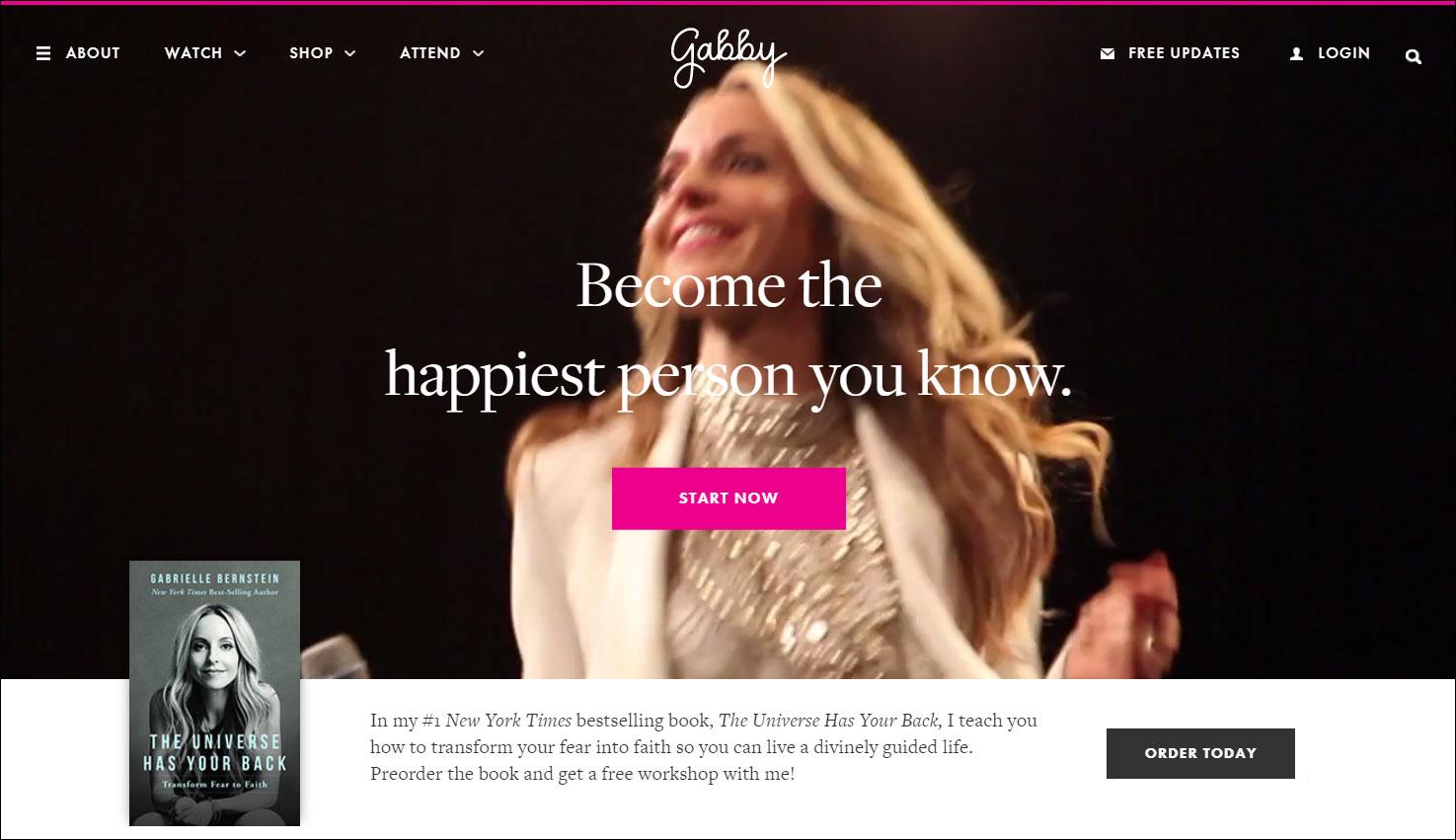
Video is used cleverly to both show the face of the site’s author while conveying her unique energy and vibe. The tagline overlaying the video dictates quite clearly who the site is aimed at.
Planning with Kids’ Nicole Avery takes a similar approach on her site.
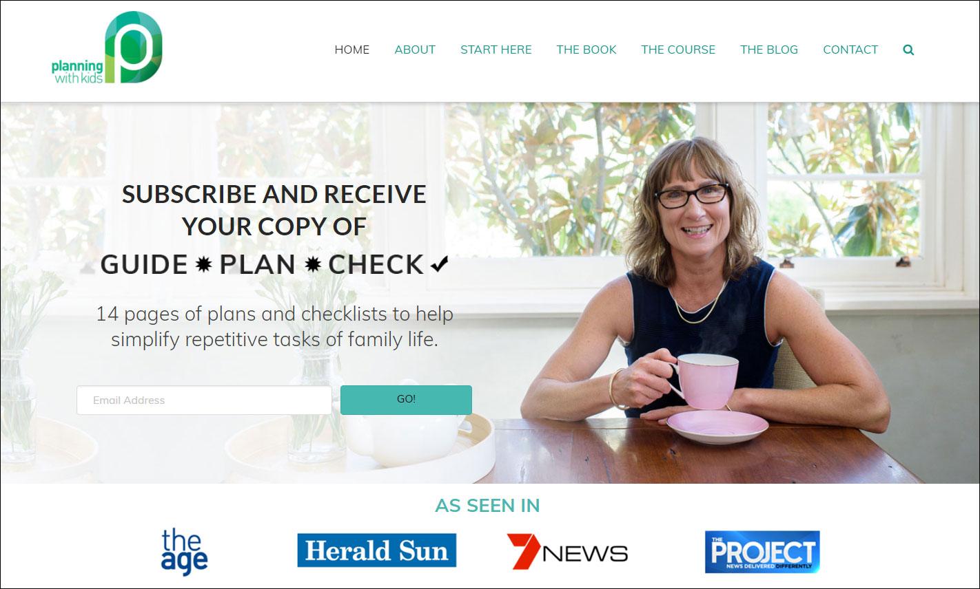
She’s seated at her kitchen table, has a lovely smile on her face, and is offering the reader checklists to simplify the repetitive tasks of family life. If you’re in Nicole’s target market (overwhelmed parents), you immediately feel at home.
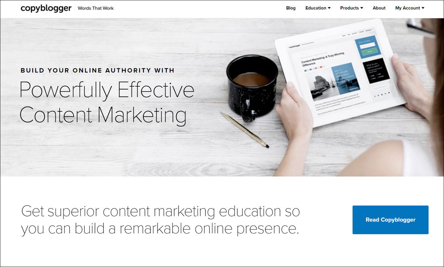
What if there’s no face to your blog’s brand? Then you’d do as Copyblogger has done and use a relevant image plus on point copy to ensure if someone in your target market lands on your site, they know this is the place for them:
2. Credibility counts
Another way to stand out from the crowd today is to display the logos of media outlets where your work has appeared or where you’ve been featured. These all fit neatly under the header of ‘As Seen In’, as Nicole has done on Planning with Kids:

Or ‘Featured in’ which is what Ramit Sethi uses on his site:
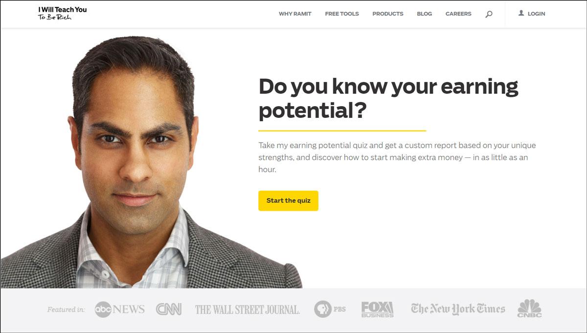
Displaying these logos gives you and your site instant credibility. It shows that well-respected media brands rate you highly.
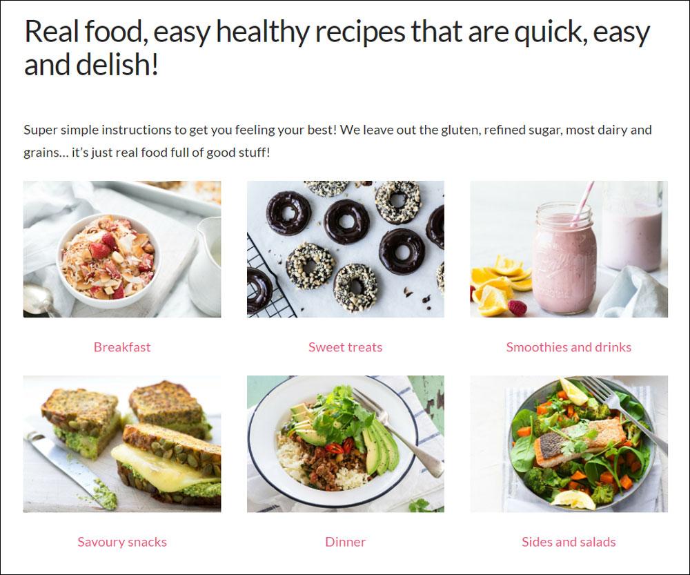
3. Professional imagery
I’ve been banging on about the importance of imagery for years. Today, more than ever, it’s crucial to the success of your site. You can see above that Gabby, Nicole and Ramit have all brought in professional photographers to capture them and their brands.
Nikki Parkinson is another who’s always prioritised high-quality imagery when it comes to her personal brand:

And the Merrymaker Sisters show how great images can have people salivating over your blog posts too:
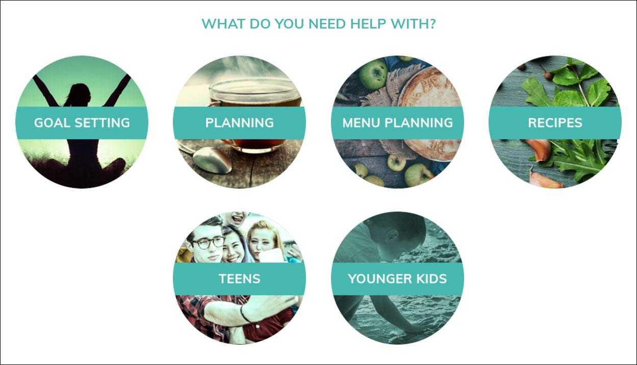
4. Wayfinding
If you’ve been blogging for five years or more, there’s a good chance you’ve created content that covers quite a wide range of categories. Using ‘wayfinding’ design elements to quickly and easily direct people to the right content for their needs is a smart way to help people find their way around your site.
On Michael Hyatt’s homepage he asks people, ‘What can I help you with?’:

Nicole Avery takes a similar approach:
5. Loads of whitespace
In design, whitespace isn’t just ‘any space that is white’. It refers to space in general.
When elements are crammed close together, there’s not much whitespace and this makes the reader subtly anxious because they don’t know where to look first.
When the elements on a page are given room to breathe, the eye is more easily directed to the things that are important, and the brain feels happier because it knows what to do.
Chris Ducker uses whitespace really well on his home page.
Here is an example where the background is a coloured image:

Having all the text justified left leads the eye naturally down the line of text … and then over to the right where the image is able to come through because there is not text there. The image, despite being subtle, neatly supports the word ‘community’ in the heading.
Notice also that the Youpreneur logo, heading and button are given fairly equal weighting as far as the eye is concerned, but the brain is able to easily process all three, in the right order, because of how nicely spaced they are.
Here’s another nice example of whitespace on Chris’ homepage:
Again, it’s clear to see how the spacing of all the elements allows the eye to track around easily, and for the brain to process which thing it wants to click without too much angst.
When it comes to implementing good whitespace on your own site you want to look at the space between everything; images, lines of text, headlines and the text below, your logo and the top of the screen. Ensure every element has an appropriate amount of room to ‘breathe’.
In summary
As mentioned at the top of this piece, the blogging world is a noisy and crowded space today. Great design allows you to differentiate yourself to readers and show them you take your work seriously. Cover off the five points above on your site and you’ll be well on your way to standing out from the crowd.
Are you using any of these design features on your blog?