
Google recently added highlights at the bottom of various sections of their mobile search results. The highlights appear on ads, organic results, and other various vertical search insertion types. The colors vary arbitrarily by section and are patterned off the colors in the Google logo. Historically such borders have conveyed a meaning, like separating advertisements from organic search results, but now the colors have no meaning other than acting as a visual separator.
We recently surveyed users to see if they understood what the borders represented & if they felt the borders had any meaning. We did 4 surveys total. The first 2 allows a user to select a choice from a drop down menu. The last two were open ended, where a user typed text into the box. For each of the 2 survey types, we did a survey of a SERP which had an ad in it & a survey of a SERP without an ad in it.
Below are the associated survey images & user results.
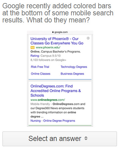
Google recently added colored bars at the bottom of some mobile search results. What do they mean?
| answer | no ads | with ad |
|---|---|---|
| none of the other options are correct | 27.7% (+2.7 / -2.5) | 29.9% (+2.8 / -2.7) |
| the listing is an advertisement | 25.8% (+2.8 / -2.6) | 30.1% (+2.8 / -2.7) |
| each color has a different meaning | 24% (+2.7 / -2.5) | 19.6% (+2.5 / -2.3) |
| colors separate sections but have no meaning | 15.5% (+2.4 / -2.1) | 12.5% (+2.1 / -1.9) |
| the listing is a free search result | 6.9% (+1.8 / -1.5) | 7.9% (+2.0 / -1.6) |
Given there are 5 answers, if the distributions were random there would have been a 20% distribution on each option. The only options which skewed well below that were the perceptions that the colored highlights either had no meaning or represented free/organic search results.
Link to survey results: without ads vs with ads.
And here are images of what users saw for the above surveys: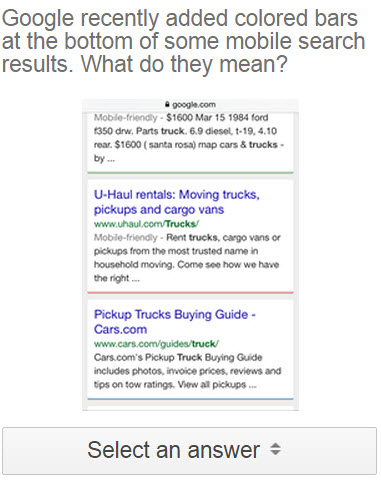
For the second set of surveys we used an open ended format
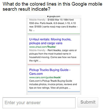
The open ended questions allow a user to type in whatever they want. This means the results do not end up biased by the predefined answer options in a quiz, but it also means the results will include plenty of noise like…
- people entering a, c, d, k, 1, 2, 3, ggg, hello, jj, blah, and who cares as answer choices
- some of the responses referencing the listing topics
- some of the responses referencing parts of a search result listing like the headlines or hyperlinks
- some of the responses highlighting the colors of the bars
- etc.
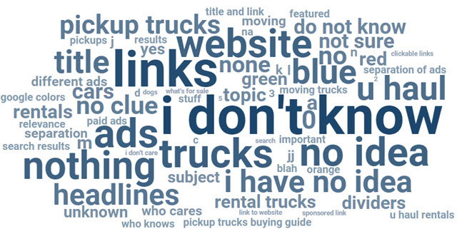
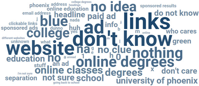
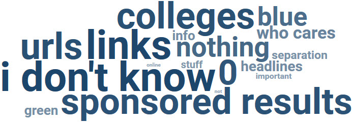
Like the above surveys, on each of these I ordered 1,500 responses. As of writing this, each had over 1,400 responses completed & here are the word clouds for the SERPs without an ad vs the SERPs with an ad.
SERP without an ad
SERP with an ad
On each of the above word clouds, we used the default automated grouping. Here is an example of what the word cloud would look like if the results were grouped manually.
Summary
For a couple years Google has removed various forms of eye candy from many organic results (cutting back on video snippets, limiting rich rating snipets, removing authorship, etc.). The justification for such removals was to make the results feel “less cluttered.” At the same time, Google has added a variety of the same types of “noisy” listing enhancements to their various ad programs.
What is the difference between reviews ad extensions, consumer ratings ad extensions, and seller ratings ad extensions? What is the difference between callout extensions and dynamic structured snippets?
Long ago AdWords advertisements had a border near them to separate them from the organic results. Those borders disappeared many years ago & only recently reappeared on mobile devices when they also appeared near organic listings. That in turn has left searchers confused as to what the border highlighting means.
According to the above Google survey results, the majority of users don’t know what the colors signify, don’t care what they signify, or think they indicate advertisements.