What types of email-signature banners draw the most interest? Does it help to include a call to action? Which are more effective: horizontally or vertically aligned units?
Sigstr examined the performance of 1,000 email-signature banner campaigns and conducted more than 50 eye-tracking tests.
Email signature banners are visual elements that are used by brands in a range of ways, including to promote products/services/deals to external audiences and to communicate information to internal staff.
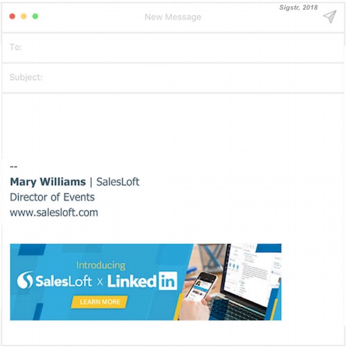
Signature banners typically appear at the bottom of messages, as in this example:
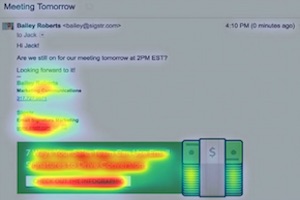
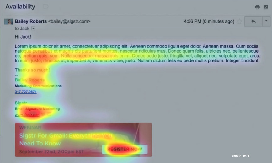
The researchers found that eye-tracking study participants tended to focus quite a bit of attention on call-to-action (CTA) buttons in email signature units.
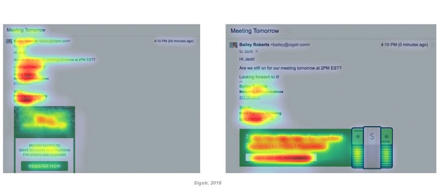
However, though well-defined CTA buttons drew attention, email signatures in which the entire unit was treated as a promotional opportunity (and no button was included) garnered equal or slightly higher engagement rates.
The eye-tracking study participants paid significantly more attention to horizontally aligned email signature units than to vertically aligned email signature units.
The researchers found a width range of 300 to 450 pixels and a height range of 60 to 120 pixels to be most engaging.
About the research: The report was based on data from 1,000 email-signature banner campaigns as well as data from 50+ eye-tracking tests.

Ayaz Nanji is an independent digital strategist and a co-founder of ICW Content, a marketing agency specializing in content creation for brands and businesses. He is also a research writer for MarketingProfs. He has worked for Google/YouTube, the Travel Channel, AOL, and the New York Times.
LinkedIn: Ayaz Nanji
Twitter: @ayaznanji