As website owners and creators, it’s our shared responsibility to make sure that our websites are accessible to all users including people with disabilities. A person with a disability should be able to understand and interact with most of the content on your website. Compared to physical content, the web has made it increasingly easy for creators to create accessible content. We have all the right tools available to be able to test and implement changes required to make the web accessible.
Accessibility not only helps people with disability but makes it even more usable for people without a disability. Tabbing through a natural keyboard tab order is an equally satisfying experience for people with or without any disability. Headings to explain each section will add structure to a page which would be equally helpful for screen reader users and people who can consume content visually. Accessibility is always a win-win situation.
At WebDevStudios, we take accessibility seriously and it is part of our code review process.
My goal for this article is to explain how you can take advantage of modern tools to test your website for accessibility issues.
Keyboard
Not everyone can use a mouse, click on small links, work with interactive elements or even track the location of an interactive element reliably. For this reason, a simple or specialized keyboard is one of the most effective operable tools that can be used by blind users and people with limited motor skills.
Being able to Tab through a website to navigate and interact with interactive elements is an important part of web accessibility. Unplug your trackpad or mouse and go through your website elements by using:
- Tab / Shift + Tab key to jump between interactive elements.
- Enter or Space key to interact with the selected element.
This should cover the minimum keyboard interactions required to make the interactive content on your website accessible.
While tabbing through your website, look for following key items:
Focus Indicator
A keyboard user can tab to an interactive element like a standard link, button and input fields. When actively “focused” on one of the interactive element, a visual user should be able to distinguish between it and rest of the content.
A basic focus style is provided automatically by the web browser and is typically shown as a blue border on most browsers.

You can customize the focus styles by targetting the :focus CSS pseudo selector in your stylesheet. As an example, a change in the background colour of a text link and input fields on hover & focus state is generally recommended to make them more visually-apparent. However, make sure that there is enough contrast between background colour and text colour otherwise it would be counter-productive. You can use Color Contrast Checker which is a nifty tool created by WebAim.
Tab through the example below which uses :focuspseudo selector to add a more visually-apparent focused state to a link and button:
Navigation Order
A keyboard user using Tab key to navigate between interactive elements excepts a natural flow of order, generally left to right, top to bottom. From header to page content to the footer. By default, the browser will follow this flow of page by following the HTML markup structure but you can manually control the visual order of the tab order using CSS or by defining tabindexattribute on HTML element. Defining a tabindex of > 0 manually is not recommended.
By default, the browser only allows navigating to links, buttons and input fields. To add an ability to tab to a custom element like an accordion title, you can add tabindex of 0 to it.
If your website uses elements like dialogs, you can add a tabindex of -1 which will not add that element to taborder but you can manually trigger focus on it by using JavaScript. For example, you can use JavaScript to focus on the dialog as soon as it opens. This will let the user tab through the contents inside that dialog.
Skip Links
Keyboard users rely on tabbing to navigate through page content. It can be a frustrating experience to not be able to skip repeated elements like header and jump straight to the main content area. Skip links are added to the top of the page and they’re initially hidden. They’re activated when a user starts navigating a page (first tab) to give them an option to skip directly to page content. There can be multiple skip links to point the user to the important parts of the page. It is recommended to use only one skip link to move focus to the main content area.

Visual Testing
Visual impairment is another common form of disability which can be low-vision, cloudy vision, and colour blindness (unable to see red or green colour). Visual impairment is extremely common among people of old age.
NoCoffee is a free extension for Chrome (download link), which can be helpful for simulating the problems faced by people with slight to extreme vision problems.
Low Contrast
Many designs have low contrast between the text colour and background colour which would make it difficult for someone with low vision to be able to read it.
Use the NoCoffee app and use the Contrast Loss slider to test for low contrast on your website.


Go through your website with NoCoffee chrome extension in low contrast mode and make sure that the visual elements can be seen and consumed easily.
Colour Blindness
Colour blind users cannot see reds or greens or blues or no colour at all. It is possible that a colour blind users are unable to consume feedback during interacting with elements on your website. An example would be success and error borders on forms.
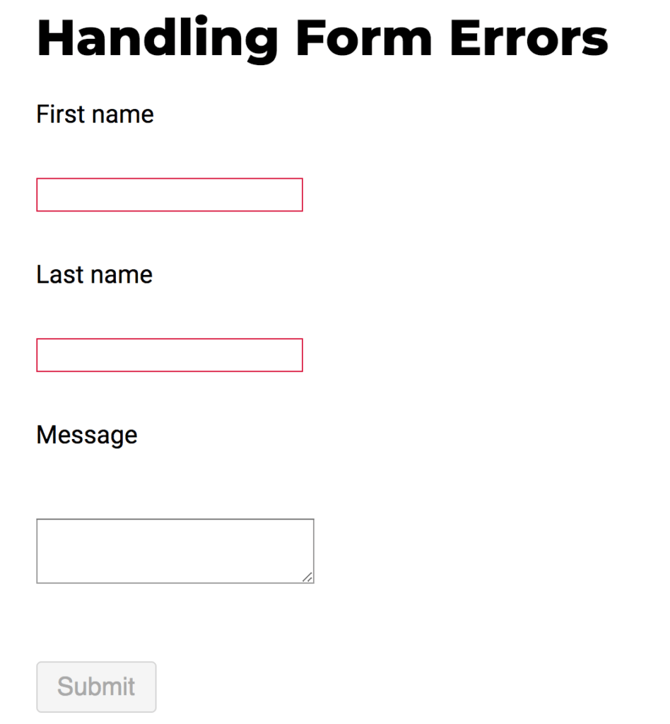
A user who is colour blind and cannot see any colour at all or a user who cannot see red will not be able to consume the feedback with just the border of the input field changed to red colour.
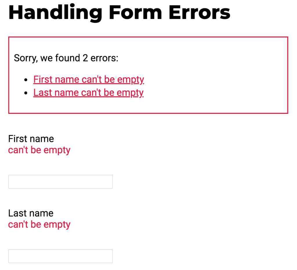
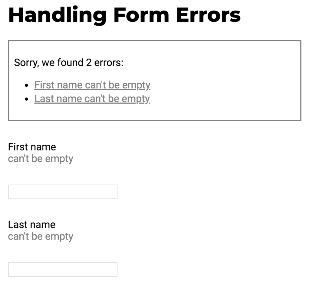
Labels are an important part of a design where user feedback is involved. This not only helps colour blind users but users without disability and users who are using screen readers by providing the exact error message.
Although labels are recommended in most cases to optimize search engine results such as clearly defined headings for each section, and to provide context to screen reader users, real-life photographs and art doesn’t necessarily need labels to communicate the message e.g the following image communicates the message behind the photograph in both colour and no-colour mode.

Go through your website running the NoCoffee chrome extension under various colour profile to simulate users with colour blindness.
Screen Readers
- keyboard navigation
- alt text for images
- skip links
- headings
The post Fixed: The Beginner’s Guide to Accessibility Testing appeared first on WebDevStudios.