Your comments and likes are up month over month, and your new campaign hashtag has been used over 1,000 times, but what do the numbers mean?
And, once you figure that out, how do you convey it to stakeholders?
If you’re asking these questions, you’re not alone. According to the Sprout Social Index: Empower and Elevate, 71% of social marketers agree they are able to provide helpful insights to other departments, yet only 12% of social teams say their primary function is to do so. Social and bottom-line business metrics continue to exist in a state of disconnect.
To bridge this gap, we need stories. We need to translate the raw data, which lacks context, to a holistic vision that helps everyone understand the impact social has on an organization. This is where storytelling with data comes in.
As the name implies, social media relies on human networks, open communication and connections. What better way to express its impact than with one of our most social practices? As a social expert, you already have storytelling skills. Let’s talk about how to incorporate them into your approach to reporting and analysis.
Start with the numbers: quantitative data
In social media, quantitative data refers to the numbers behind social media metrics such as engagement, awareness, share of voice, ROI, and customer care. These numbers focus on the “how many” of social media, as in how many:
- new likes, comments, or shares your content received this week
- impressions you’re achieving
- posts you’re mentioned or tagged in compared to the competition
- purchases driven by a social media referral
- comments and questions about your brand that your team responds to
And so many more. Executives and other stakeholders like this kind of data. They especially enjoy seeing a translation of social media numbers into revenue dollars, or at least growth in metrics that correlates with an increase in conversions.
Literally made it one of my performance goals to educate…used data, our own successes, fails, etc. more than anything being Real about KPIs and what really matters.
— Jen Hartmann (@jenalyson) January 11, 2020
However, numbers can be deceiving. One viral post or brand crisis can skyrocket your numbers for a month (for better or worse), which could set unrealistic expectations for KPIs like impressions or engagements if you don’t put the data in context.
Comparing data month-over-month or year-over-year is meaningless without the story behind the trends. There needs to be an explanation for changes over time. This is where qualitative data comes in.
Then give the numbers meaning: qualitative data
Commenting is way up this week—that’s awesome!
Or is it?
Qualitative data looks at what those comments actually say. If they’re all positive, that’s great. If they’re all negative, that’s a problem.
This kind of data gives numbers context. Your interpretation of what it all means gives both types of data a narrative. If influencers are posting about you, what are they saying? Are mentions raving about your products, or are they pointing out a serious customer service issue? If comment threads are accumulating, what’s driving the discussion, and what’s the overall sentiment?
You can use social listening tools to analyze trends in overall discussion about your brand, which can be particularly helpful if you’re seeing a major spike. This can show you what people are talking about, sentiment, keywords and trending topics.
But even without social listening tools, you can look at your results and start to dig into the “why.” Look at individual messages to identify what people mentioning you are talking about the most, what they’re saying, and so forth. Those specific examples will help you craft a report that puts your numbers in context, and allows you to identify future opportunities. This is where your story begins to develop.
Social & digital has made us impatient as marketers, but the foundational things matter more than ever. Values, vision, focus, storytelling & connection. A brand’s why. These things build & come to life over time.
— Jess Smith (@WarJessEagle) November 3, 2018
Bring data and analysis together: how to craft a story with data
Creative writing workshops abound, but few cover the artistry behind presenting numbers in an elegant, comprehensible way. If you’re not sure where to begin, here’s a step-by-step guide with a data storytelling example:
- Identify the most interesting points.
You should already have a main objective in mind, whether it’s relaying campaign status or justifying a bigger budget. What pieces of quantitative and qualitative data most support the main idea you want to convey? What data points directly contradict what you thought was going to happen? Perhaps the amount of website traffic driven by social has risen in conjunction with sales. Even if you aren’t tracking your social efforts all the way through to purchase (more on how to do that here), understanding which content drives traffic (and what kind doesn’t) will provide some insight into what’s fueling the fire. - Start with your second most interesting piece of data.
You don’t want to show your whole hand, but you do want to demand attention right at the beginning. “As you already know, sales are up this quarter. What you may not have seen until now is that this trend correlates with our increase in traffic from social.” Include any other interesting points after this, but don’t use your best one yet. - Leverage visual aids as you go.
“As you may already know, sales are up this quarter,” (graph of this quarter’s sales appears). “What you may not have seen until now is that this trend correlates with our increase in social media traffic,” (second graph of traffic by social platform appears as an overlay to first graph). Can you visualize the impact? - Predict questions or challenges.
Naturally, your audience will independently analyze what they are seeing. In the example we’ve used so far, they may ask themselves, or even you, something like, “How do we know sales are up because social traffic is up, and not the other way around?” Depending on whether you’re presenting data to a group live or emailing a written report, incorporate slides or bullet points that answer the exact questions you expect your audience to ask. These questions are good: they keep your audience engaged long enough to deliver your final blow. - Share the most interesting piece last.
“We considered that correlation might not indicate causation, so dug a little deeper and looked at the shares, social referrals, and conversions. We were able to trace 33% of our new customers this quarter to one particular influencer’s post,” (screenshot of post here) “in which she raved about how our product helped her. She has over 700,000 followers, many of whom also shared the post and clicked through to our site from it.” - Get to your next steps and the “so what.”
Just because you’ve shared the data doesn’t mean your analysis is over. Round out your presentation with why this matters to your overall social goals and business goals. Then share how you may be using this data to inform new ideas moving forward. For example, because this one influencer post did so well, we’re looking to partner with other influencers who have similar audiences.
Boom. Mic drop.
Is that example a dream situation we can all hope to live one day? Sure. But more importantly, the flexible format can be repeated as needed and applied to just about any medium from presentations to reports or emails. Even if you’re just sending a quick Slack message, a single sentence can cover it:
“Sales and social traffic are up this month, so we looked into it and learned that 33% of our new customers came from this post (link/image).”
It is important to note the common data point threaded throughout this story: social traffic. While additional data points might help if sandwiched in between, one of the most powerful ways to get your point across is to use related data as the slices of bread on the top and the bottom of the story.
You may have lots of data (hopefully!) to comb through to find the right points to cover. That’s why the first step is picking out the most interesting ones. It’s up to you to gather the data that best illustrates your main idea and use it to focus your audience on your key message. Here’s how Lindsay Bruce, Marketing Manager at Twitter Business, approaches using data to both understand her target audience and create more impactful reports (serious reporting pro tip at 1:13).
To tell a story with data, you need insights
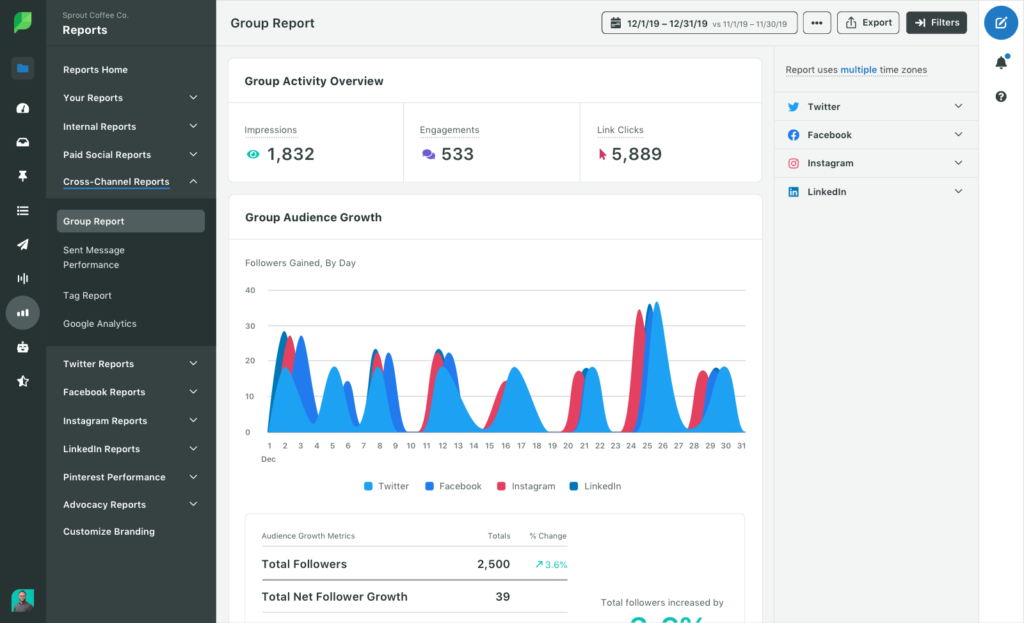
Social media platforms offer their own native analytics tools that provide plenty of data to work with. However, strong storytelling comes from a big-picture view that takes all of social media marketing into account at once. Compiling that information takes a lot of work!
Fortunately, software like Sprout can alleviate the workload. Sprout pulls all of your metrics from various social media platforms and puts them in one place. It even provides presentation-ready reports and analytics and allows you to compare your metrics to your competitors’ and benchmark your own metrics.
This bird’s-eye view displays what content is working, who is talking about you, and whether what they are saying is positive. It also uncovers audience demographics, the best times to post, and which platforms give the highest ROI.
When quantitative data is already pulled together into one place, it leaves you with more time for strategic storytelling.
Ready to get started? Check out our free social reporting and analytics toolkit, complete with templates and worksheets you can use for your best social performance analysis yet..