Anyone can create a landing page; it’s easy.
But if you’ve browsed the Internet for any amount of time, odds are you’ve come across numerous landing pages that barely hold your attention for 10 seconds.
Now, you sure don’t want your page to be like that — scaring people off once they land on it. You want to build a web page that holds your audience’s attention longer than their average attention span of 15 seconds.
(By the way, we know that by now, you’ve gone beyond asking questions like “What is a landing page?” So we’ll just use this guide to help you create one that converts.)
Here are seven steps to set up a landing page that holds visitors’ attention and converts them.
1. Choose your landing page builder carefully
Creating effective landing pages used to require companies to hire professional UX and graphic designers capable of creating custom designs from scratch.
Today, however, there are numerous, cost-effective solutions readily accessible. There’s no shortage of landing page builders on the web today. But this also creates a problem: choosing the right landing page creator may be a bottleneck for you – due to the plethora of brands competing for your attention.
Still, it’s not that difficult. If we’re being honest here, any landing page creator with the following core capabilities is good enough to create a well-designed landing page that converts:
Must-have functionalities:
- Drag-and-drop editor: Also referred to as “what you see is what you get” or WYSIWYG capabilities. This means you can design your landing pages without touching the code.
- A/B testing capabilities: This allows you to display different versions of your landing page to different visitors (or the same visitors) enabling you to evaluate the most effective copy/design.
- Analytics dashboards: A few of the metrics you’ll want to track include landing page views, sessions by source, average time on page, bounce rate, and conversions. You can also use Google Analytics to track these metrics — it works, too.
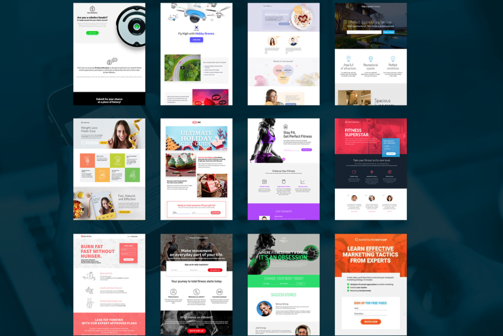
- An extensive collection of fully-customizable templates: This is helpful, because landing page templates enable you to hit the ground running with your creative processes — especially when they’re fully customizable.
For instance, here are some of the landing page templates in GetResponse:
- WordPress landing page: If you plan to set up your landing page on WordPress, you need a tool that lets you do this easily.
- Customizable domain integration: Your landing page creation should support custom domain names (e.g., YourWebsiteName.com rather than YourCompany.LandingPageTool.com) as visitors aren’t as likely to trust a page with a random URL. (Although, if you’re using a free landing page builder, you might have to settle with YourCompany.LandingPageTool.com)
- Integrations: You need a landing page builder that plays nice with other tools you’ll employ to streamline your conversion process.
- Responsive design: This ensures the landing page renders correctly regardless of screen size.
By the way, GetResponse’s landing software provides these functionalities. Get a free trial here.
2. Decide what user experience should look like
One of the biggest mistakes you can make when creating your landing page is ignoring user experience (UX) principles.
Aside from the fact that usability is a search engine ranking factor, a great UX will help you cement trust with visitors, which in turn will increase conversions.
We can’t address UX design in its entirety here as it’s a broad field, but these three tips below will help you design a page that’ll make visitors enjoy their time perusing the offer(s) – and more importantly, improve your conversion rates:
- Be concise. Make the main benefit of your offer (product/service/anything) clear in your headline. This is important, because you only have 15 seconds to pique the interest of your visitor and keep their attention long enough for them to sign up for your offer.
- Provide an inside look at what you are offering. If you’re selling a product, name its specific functionalities with screenshots or item photos.
- Use trust symbols. Displaying client logos, testimonials, and press mentions are all effective ways to boost credibility and stand out from the competition.
Brand consistency is a huge part of UX
When designing a new landing page, especially if you’re doing it for the first time, you may be tempted to get overly creative and design it using all the colors, widgets, and fonts.
Don’t do it. You’ll likely end up making a squeeze page with inconsistent branding.
For example, imagine this scenario: you click an ad on Facebook and land on a page with a light-blue background. It has a pretty interesting offer so you scroll about 60% down the page, reading every word and nodding in agreement with everything in it.
Eventually, you reach a call to action (CTA) button to sign up for the offer. Still excited, you click-through the button.
But all of a sudden, you’re now on another page with a yellow background.
Everything looks different, confusing — since the previous page had a light-blue background. You’re not sure which brand you’re dealing with anymore. Doubts, questions, and scepticism start racing through your mind.
This is what brand inconsistency does. So you don’t want a landing page like this. Businesses say the biggest negative effect of inconsistent branding (off-brand content) like this is that it leads to customer confusion – and rightly so.
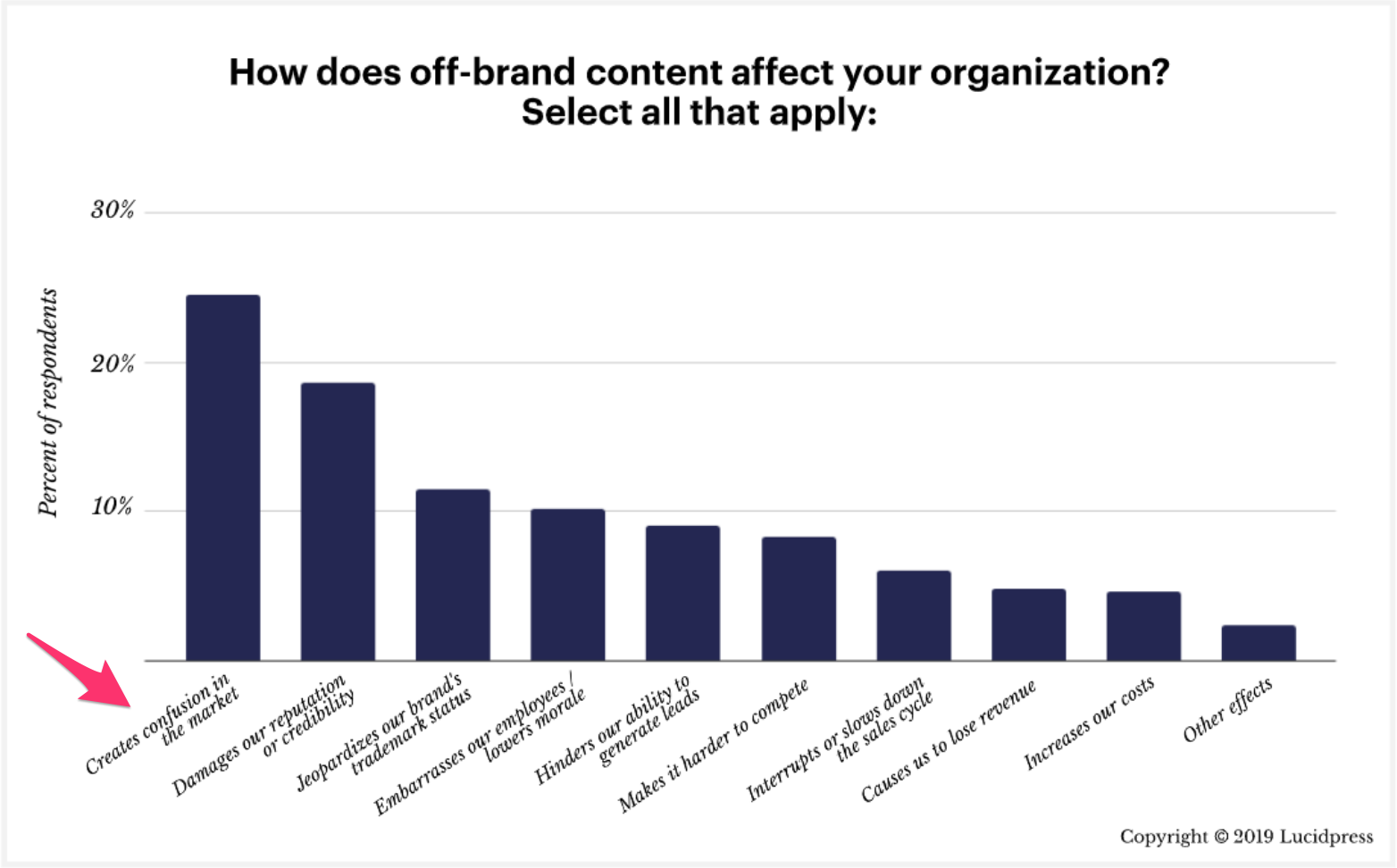
On top of that, they listed Damage in reputation or credibility as the second biggest negative effect of inconsistent branding.
It’s not wrong to use different colors (or fonts, etc) on a page, but you have to be consistent with them. That is, as visitors move from your landing page to another page/email/etc., your branding elements (colors, fonts, etc.) need to be consistently coordinated and recognizable as your brand.
For example, if your landing has a white background color and header font size of 35, these elements should remain as they are when visitors move from one page to the other. This will keep them from being confused about who you are – as a person or business.
3. Get your site speed right
Earlier in this article, we touched on how website visitors have short attention spans. Imagine what happens when your landing page loads too slowly.
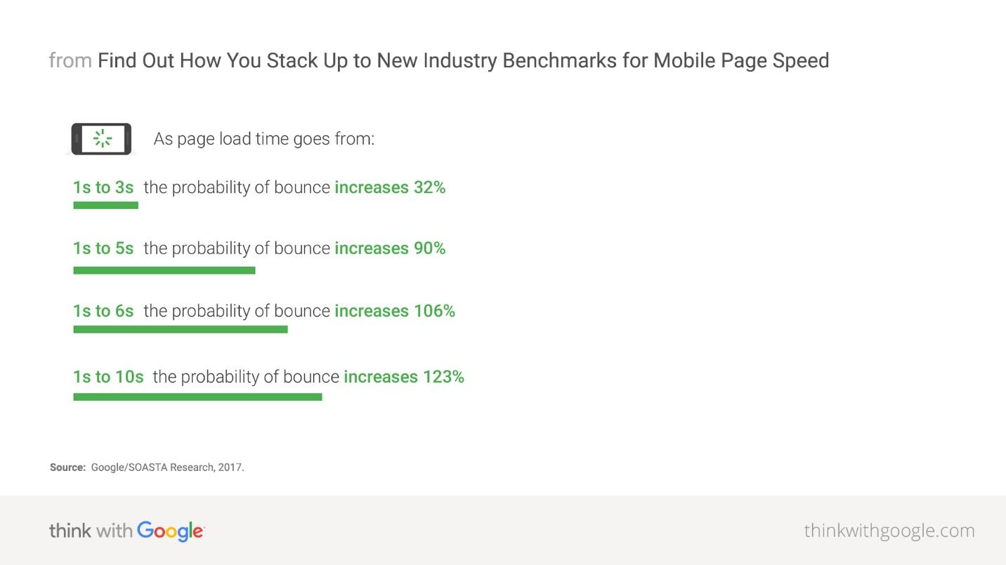
Folks browsing the Internet don’t have time for slow landing pages, so they won’t stick around. Google reports that a 9-second increase in load times increases the probability of a visitor bouncing by 123%.
Here are a few steps to improve your landing page load times:
- Use a content distribution network (CDN): This helps to reduce page load times by disseminating content from servers that are closest to visitors based on their geographic location.
- Optimize your images: Before uploading images to your website, resize them to the dimensions required, and if possible, compress them in PNG or JPEG format.
- Implement accelerated mobile pages (AMP): Developed by Google, AMP is a web framework that lays the foundation for faster load times.
Note: This is mostly important if you’re hoping to get high traffic from organic search. With landing pages, however, it’s rarely the case your pages will rank high in Google or Bing.
For more information, you can check out this extensive list of strategies from Moz on improving your landing page load times. For speed benchmarking, you can use Google’s PageSpeed Insights tool.
4. Use descriptive visuals
What are “descriptive visuals”?
They’re essentially images or videos that describe the benefits or problems you’re addressing on your page. Here are some examples from our free landing page templates:
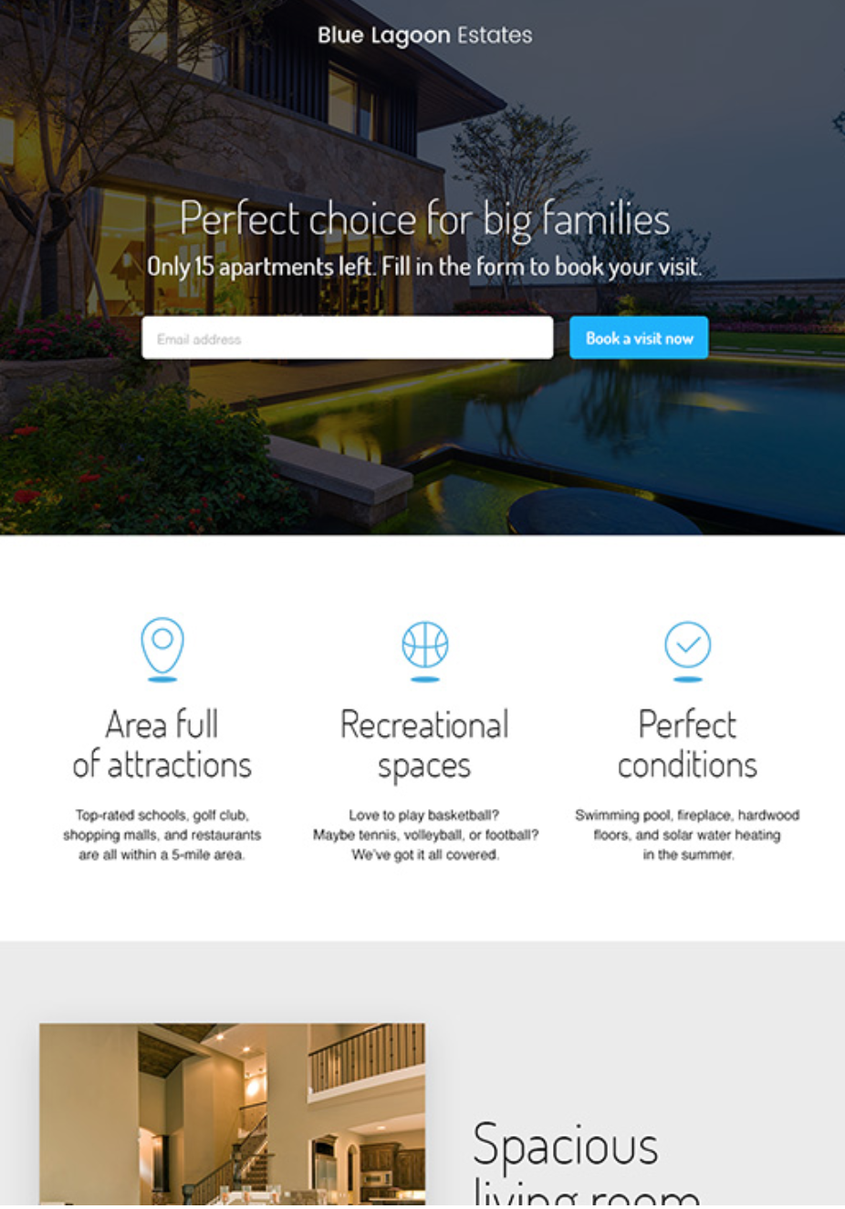
A landing page for families looking for an apartment:
If you were looking for a nice apartment for your family, the image on this page already gives you a feeling of what that looks like:
Use this landing page template
Or let’s say you’re a fitness trainer; you need images on your page that give visitors a vibe that they’ll get the body shape they want if they subscribe to your gym membership:
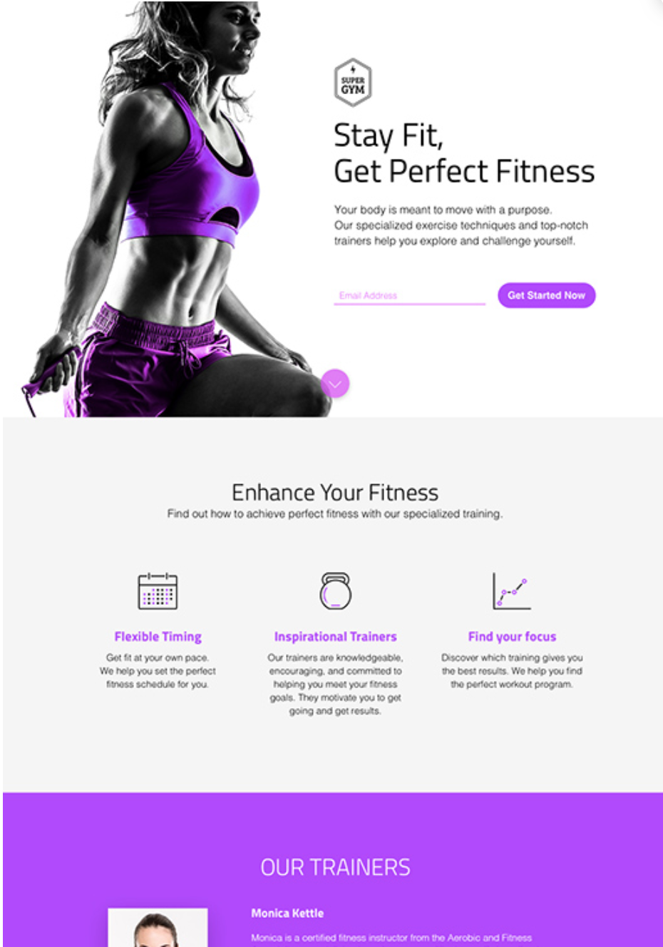
Use this fitness landing page template
You can use videos, too – especially now that consumers are 64-85% more likely to buy a product (or sign up for your offer) after viewing a product (or offer) video.
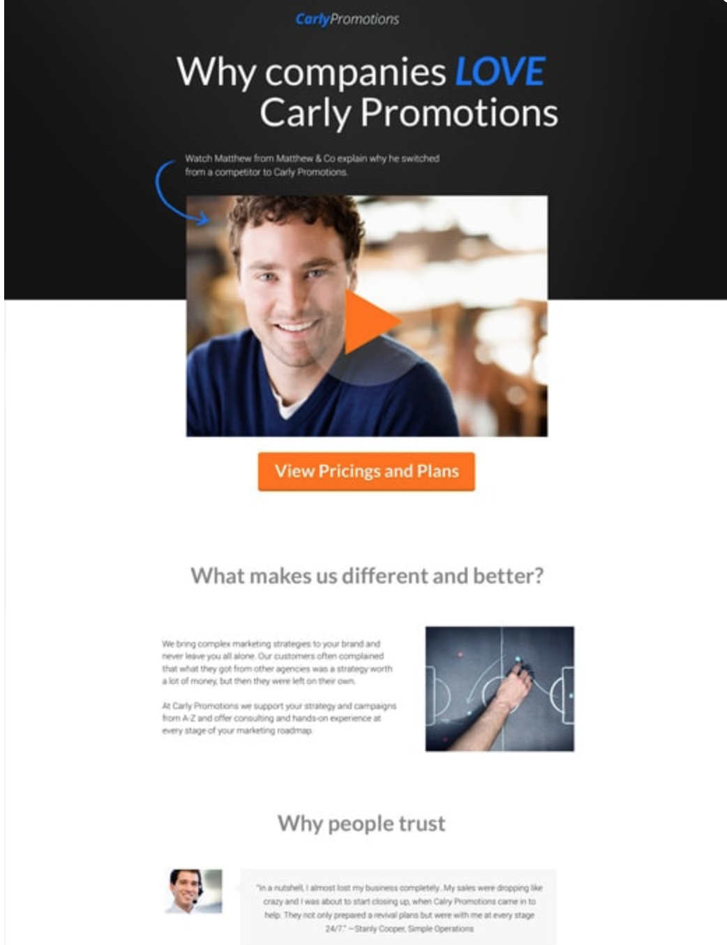
Use this video landing page template
As I’ve mentioned earlier, your conversions are closely tied to user experience (UX). So if images and videos on your page make visitors feel like you get them, they’ll sign up for your offer.
5. Make your page responsive
While building your landing page, make sure you’re optimizing the design for both desktop and mobile visitors – because mobile currently accounts for half of all global web pages served.
So how do you build a responsive page?
It all depends on the landing page builder you’re working with; you have to make sure to use one that lets you create a page that adjusts to fit the size of your user’s screen size.
A responsive page looks something like this for different screens:
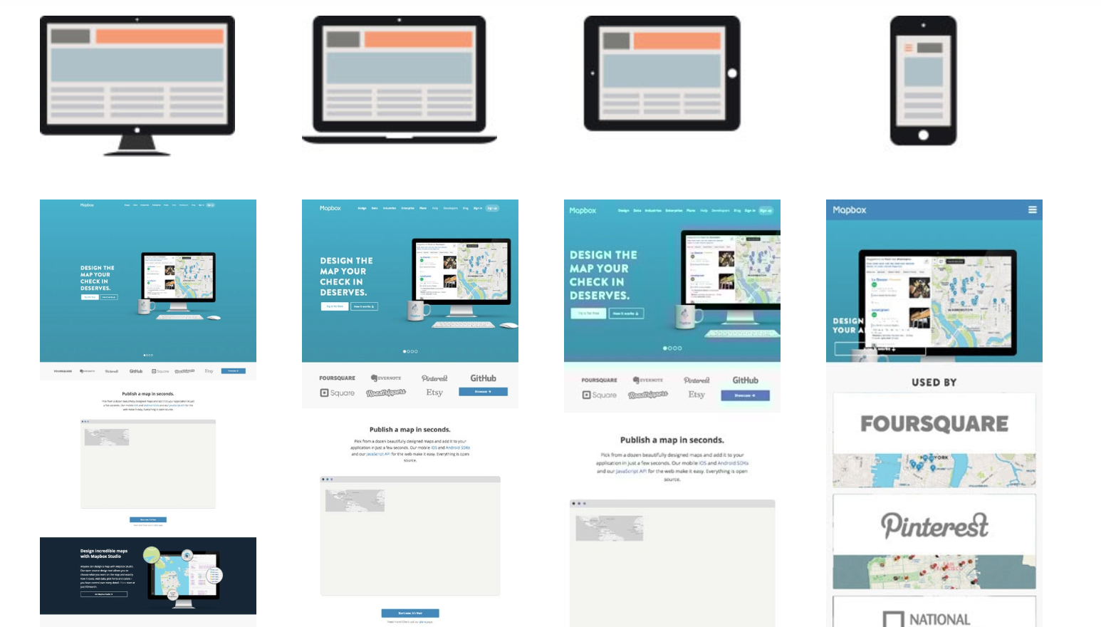
Source: GetResponse landing page design guide
Many (if not most) landing page builders have this functionality built-in, but you still need to check their features to be sure.
6. Research your market and audience before writing copy
So far, most of this article has focused on the aesthetics of landing pages — which, of course, is important.
But what’s even more important is your copy, the writing you have on your page. You need to make sure you research your audience well enough to be able to write copy that resonates with them.
And the best way to do audience research is to talk to them. Ask them questions. Find their pain-points. Essentially, do audience interviews or create a survey.
Here are a few tips you can follow to improve the effectiveness of your audience interviews:
- Limit the interview to 30 minutes: Setting a time limit helps to let interviewees know you won’t be taking too much of their time. It’ll also help you to focus on the insights that matter the most when talking to them.
- Use resources efficiently: Interview at least five audience members, but no more than 12. Why? It’s simple: because usually after five interviews, you’ll see trends and themes in your findings.
- Be conversational: Customer interviews shouldn’t be like an interrogation. At a high level, you want to let the customer tell their own story.
But if you’re not planning on doing audience interviews, below are some tips to improve survey completion rates:
- Focus on close-ended questions: Unlike open-ended questions, these are often in multiple-choice format, so the participant can easily select their answers.
- Use neutral language in questions: Avoid leading questions and language that can influence answers. For example, phrases such as “Many customers enjoy feature X of Y, do you agree?” often reduce the effectiveness of surveys.
- Only ask for one thing at a time: Limiting questions to one aspect or point reduces ambiguity and ensures that the insights you gather are actionable.
7. Use these two copywriting formulas to improve conversions
The final collection of strategies we’ll discuss here are copywriting formulas.
Although there’s an art to creating copy that drives conversions, you don’t need to become a wordsmith to write high-converting copy.
Below are a couple of handy formulas you can use to build out your copy:
Before – After – Bridge
This approach is like what you see in case studies. Describe the problem you’re addressing in your landing page and situation before the problem occurs. Then discuss what would happen after the problem is solved. Finally, introduce your offering and show how it will help get tangible results.
We won’t be showing examples of these formulas here because that’s not what this article is about. But you can read our post on copywriting.
Features – Advantages – Benefits
This formula is valuable because it goes beyond simply calling out the features or elements of your offering. Instead, you’re illustrating why each feature matters to visitors. In short, this formula goes something like: “You get this… and the product does this… so that you get this…”
Conclusion
Thanks to improvements in technology, it’s never been easier to create high-converting landing pages.
With the right tool, you can build a landing page that looks amazing and converts well enough to make your business, project, or campaign successful.
Even more, you don’t need to spend months to build a “perfect landing page” in the hopes that it would perform well. Instead, you can easily create multiple versions of it and A/B your way to find winners. Learn more about landing page A/B testing here.