
User experience can make or break your business.
The checkout process is the most crucial element to consider in that regard.
Even more important is the context of that experience.
What’s appropriate for the desktop will not be suitable for the mobile interface.
For the most part, businesses understand this. It’s why there has been a widespread preoccupation with mobile friendliness.
Here’s the thing though.
People often neglect the checkout process.
Your customers make their final purchasing decisions before they get to checkout.
So why bother, right?
That’s being incredibly short-sighted.
Shopping cart abandonment is a real problem for ecommerce stores.
Customers expect their mobile shopping experience to be seamless, easy, and without friction.
If your checkout process does not meet these expectations, your conversion rates will dive, and your revenue will head south.
Considering that more than 50% of ecommerce traffic is mobile, you shouldn’t take it lightly.
![]()
In this article, I’ll give you some tested strategies for making your mobile checkout experience as easy as possible.
This way, your customers won’t be impeded by any friction when reaching for their wallets.
Your conversion rates will be higher, and shopping cart abandonment won’t be a dire issue for you.
Let’s start.
1. Enable guest checkout
If I’m mandated to create a user account before I check out, it’s an immediate turn-off.
I don’t know about you, but that’s the consensus.
Sure, you may take the time to create an account when you’re on a desktop.
Otherwise, it’s a hassle, and customers hate it.
Need proof? This is the second most common reason for shopping cart abandonment:
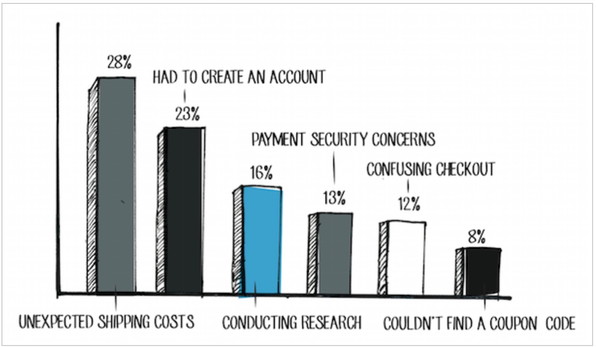
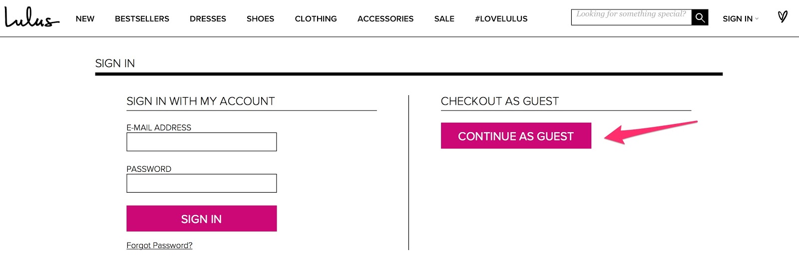
It’s likely that mobile shoppers are using this interface because they’re pressed for time. That’s why it’s important to have an option to check out as a guest.
Here’s an example:
I understand there are many benefits to increasing your user base.
You’ll have:
- more demographic data to tailor your marketing to your customers;
- a better chance of increasing your customer lifetime value because subsequent purchases will be easier;
- the means to cultivate a strong bond with your customers, leading to more customer advocates.
The advantages are undeniable.
And there is an easy solution.
Provide incentives for shoppers to create an account.
You can reward them with a coupon code or credit towards their next purchase:
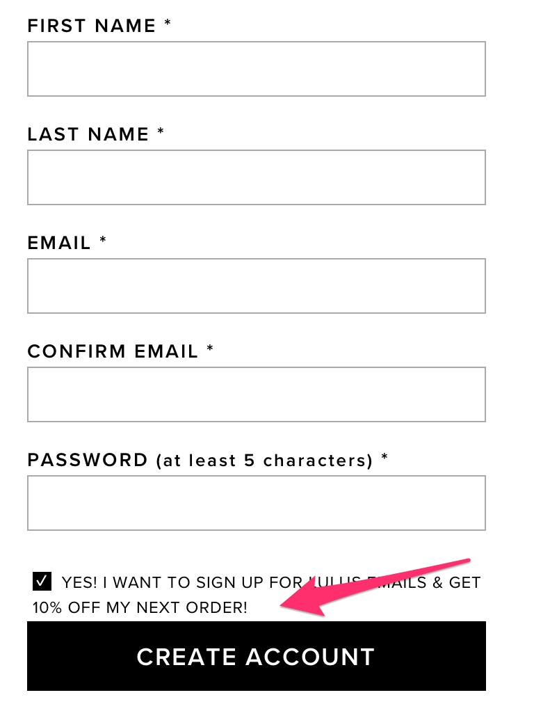
Guess what? Most people will jump on that offer.
That’s a much more effective approach than forcing them to create an account.
The encouraging news is, many businesses are catching up to this. Most offer both options.
2. Make it easy to add items to cart and check out
Here’s the deal.
Many people who shop on their mobiles have likely visited your desktop store.
They already know what they want to buy.
They know where on your website it’s located.
The easier it is to find this item, add it to the cart, and locate the checkout, the faster you make the sale.
It’s as simple as that.
Having a “quick view” option right within navigation is an excellent way to put this into practice.
Here’s an example from Lulus:
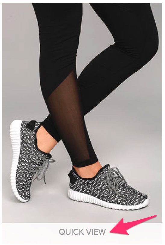
If I click on “quick view,” I will not be redirected to a separate page for that particular product.
Instead, a window pops up with an obvious the “add to bag” option.
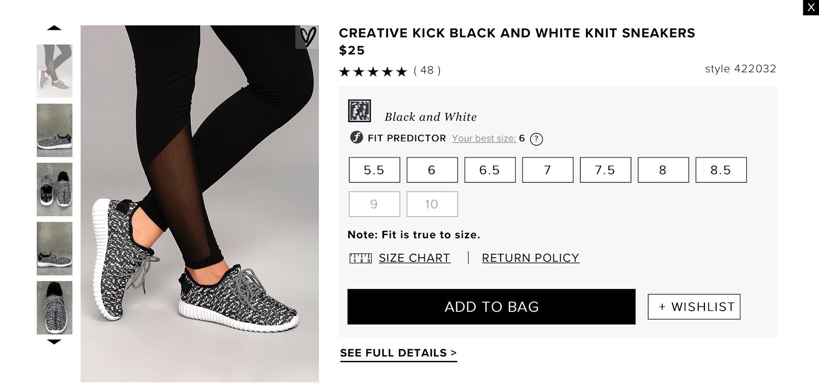
I’m met by another pop up that allows me to check out easily.
All this happens without me having to leave the page I was browsing.

Convenient, right?
3. Eliminate unnecessary form fields
The less information customers have to fill out during checkout, the faster they get through the process.
It also means they’ll have less resistance.
I highly recommend to include as few form fields as possible to complete the transaction—only the ones you actually need.
Checkout pages usually have both requied and optional fields:
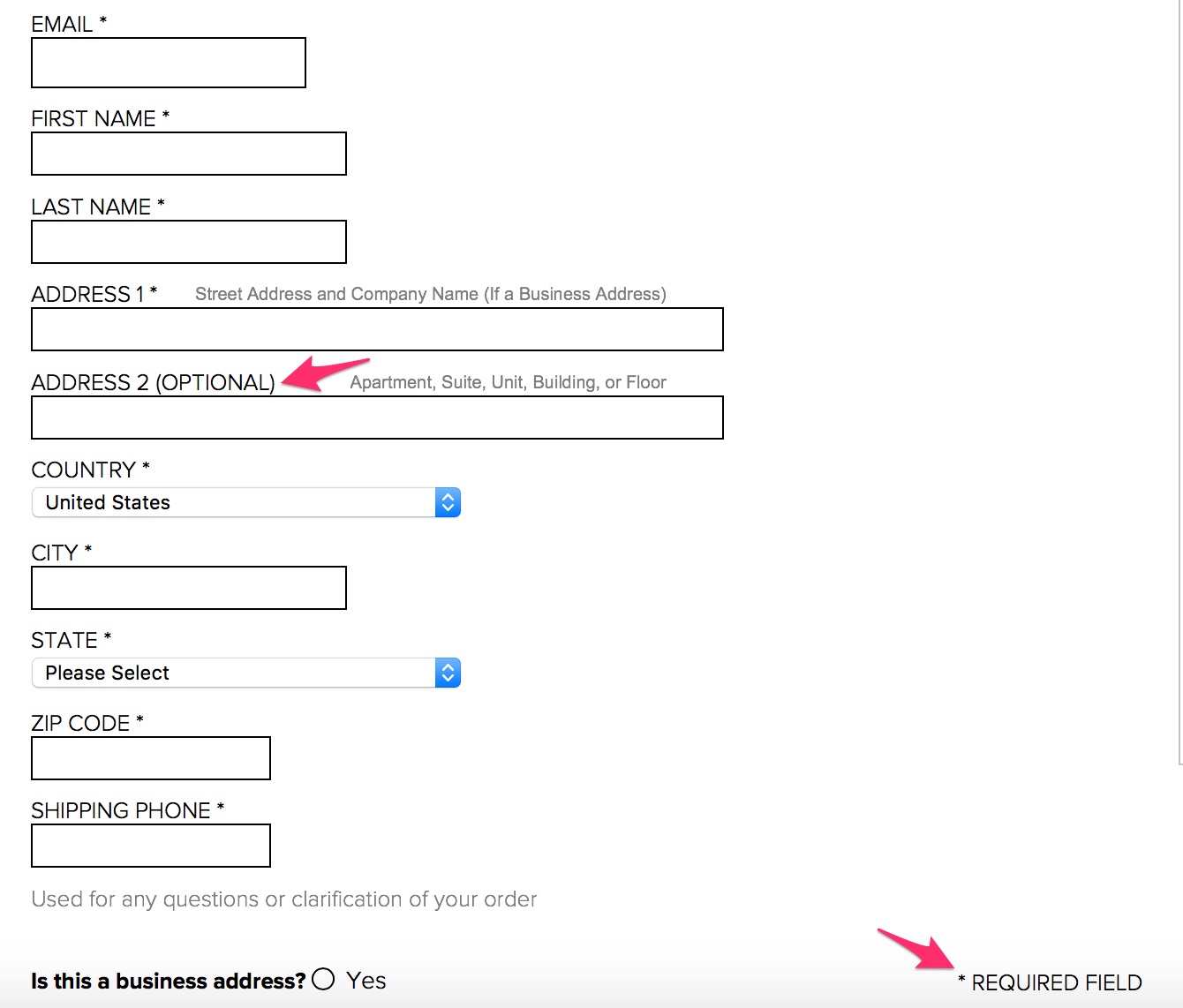
If your checkout process doesn’t suffer without the optional fields, get rid of them.
It’s why many businesses opt for a one-page checkout.
However, I don’t recommend just one page for mobile.
Why?
For one, you have little screen real estate.
It means shoppers have to scroll endlessly to fill out their information. They also have to move back and forth to verify they have no errors.
It’s not the most optimal experience.
A paginated checkout allows you to break the process into bite-sized steps.
This, combined with a progress bar, will make it easier for your customers to compelete the checkout.
Here’s what I mean:
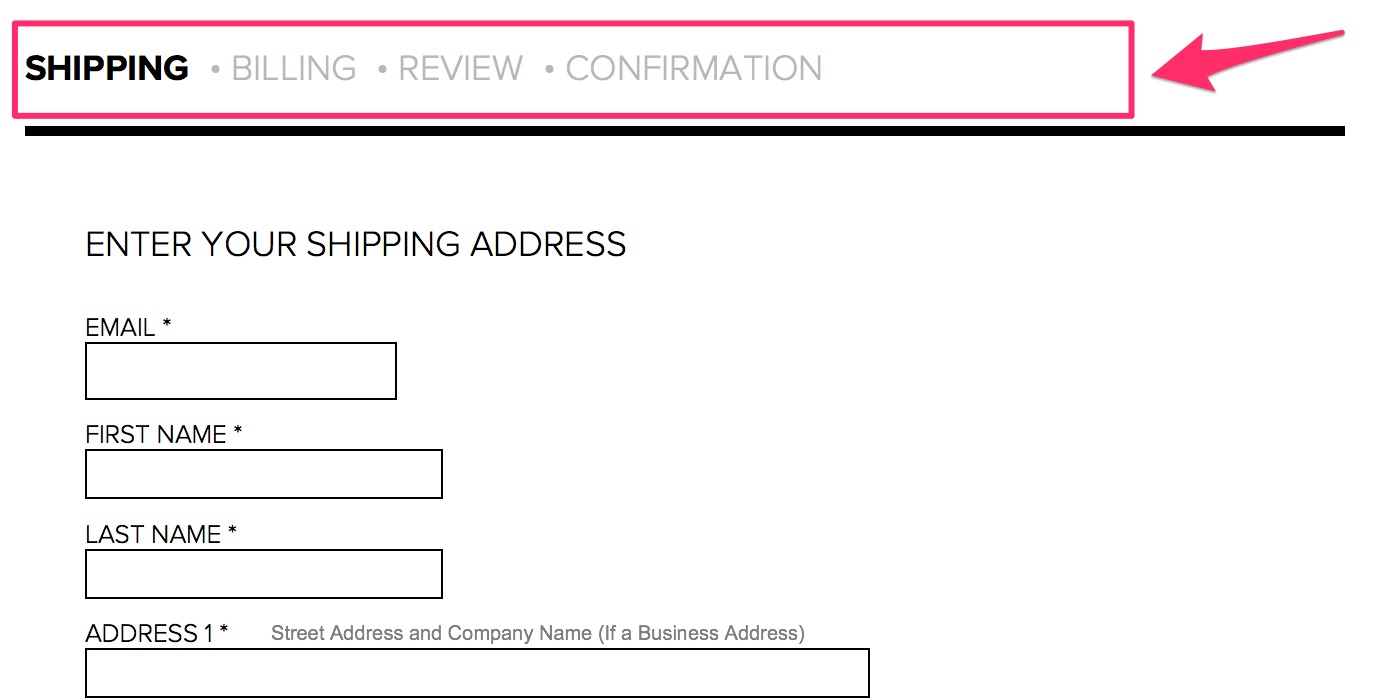
In the image above, it’s easy to see there are four steps to the checkout process.
Customers know what to expect and remain aware of their progress throughout.
4. Have a mobile-friendly version of your desktop storefront
You may be thinking this is obvious, but let me explain.
There are multiple elements to mobile-friendliness.
I’ve seen mobile storefronts that are vastly different from their desktop versions.
If there’s no alignment between the two interfaces, shoppers will think they’re in the wrong place.
The result? They bounce.
As we’ve seen before, most people first go to the desktop site to browse, get reviews, and make their decisions.
Ensure your mobile store is familiar to those who’ve gone through that process.
The other element of a mobile-friendly checkout is speed.
Shoppers of all kinds—mobile or not—want instant gratification.
They’re not as concerned with buying your product as much as they are with owning it.
If you take that away from them, whether by having a slow site or asking for much information, they’ll walk away.
The desire to own the product doesn’t go away. Your customers will simply go to your competitor. That’s bad for business.
Another important consideration is browsing behavior.
Mobile browsing is unique in many ways.
Here’s how you can optimize the mobile checkout process with user behavior in mind:
- To navigate, users use their fingers, not a mouse: This means you should place all key elements on your page within reach of the thumb.
- Typing and clicking are trickier on mobile: You need to have bigger and wider easy-to-click buttons. A larger font size also helps with improving accuracy of text input.
- Fingers are less precise than a mouse, so the process is more error-prone: It’s crucial you make it easy to detect and correct errors.
Ever made an error when filling out a form and had to enter every single bit of information over again?
It happens all the time, and it’s a significant pain.
5. Have several payment options
If you’ve shopped at a store that only offered one payment option, you know how frustrating this can be.
This is another common reason for cart abandonment. It’s clear your customers want choices, especially when payment is concerned.
According to research, 54% of people feel having a variety of payment options is important when checking out online:
![]()
That’s not to say you have to give them every possible payment choice, but two or three is the best practice.
Like this:

The ideal options will depend on your target audience.
For instance, some people loathe PayPal and would never use it.
Others think it’s the most convenient option out there.
I recommend surveying your audience to find out what they prefer.
Note:
There’s a fine line between providing enough payment options and too many.
Having more than three options can get overwhelming, quickly.
It can lead to decision fatigue. And when that happens, users are more comfortable taking no action at all.
You don’t want that.
There is an easy solution to combat decision fatigue when providing several options.
Offer one of the options as the recommended choice and the others as alternatives.
This way, you’ve decided for your customers, but you’re still providing options in case they need them.
6. Set up default billing/shipping address for returning customers
Most people hate filling out this information.
It’s time-consuming and repetitive, especially if you’re a returning customer.
This is necessary info, so people will do it anyway.
But there’s a lot of resistance.
What can you do?
In addition to eliminating unnecessary form fields, you can set up the form so that it auto-fills the information for returning customers.
Email address, name, billing address, and shipping address—all this information can be saved for future purchases.
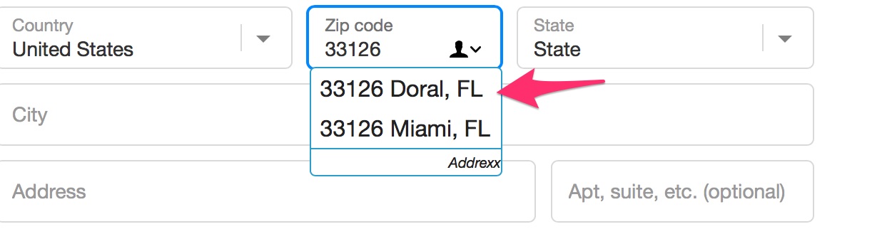
Some stores use a tool that looks up addresses based on a postal code and auto-fills that info.
Here’s how it works.
You type in a zip code:

You’re prompted with a window like this:
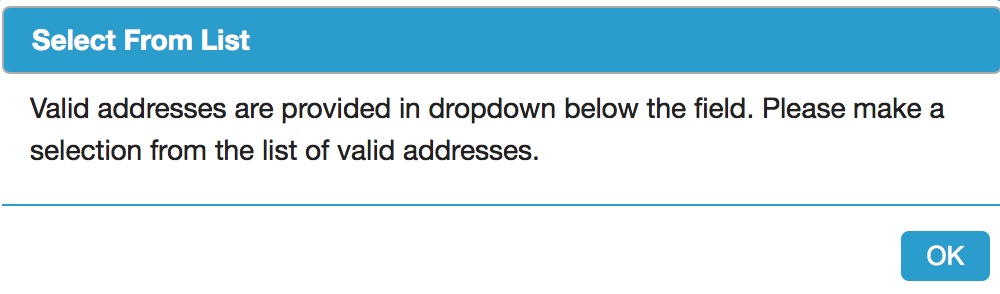
You’re given address options based on your zip code so you don’t have to fill this yourself:
There’s also an address validation tool similar to this one.
When a shopper types in their address, they get asked if it’s the right one and are given other options.
This is useful for a few reasons.
First, it auto-fills with more accurate information.
Secondly, it reassures customers they have the right shipping info. This way, they’re not anxious about missing their shipment due to error.
There’s one thing you need to note.
Address validators aren’t always correct. It means customers should have the option to reject the suggestions and fill in their info themselves.
7. Make navigation easy and distraction-free
Navigation on a mobile device should be as simple as possible.
You know that three-lined navigation button that signifies a menu on a mobile device?
That’s called nested navigation, and it makes things super simple. It makes for a cleaner page and no distractions.
But that alone is not enough.
Here are more tips for simplifying your navigation:
- have only as many options as you need to avoid decision fatigue and distraction;
- have short and descriptive labels in your navigation;
- include a prominently placed search bar;
- use endless scroll instead of pagination for browsing through products;
- make it easy to return to the homepage.
These tips are for your mobile ecommerce store.
On checkout pages, there shouldn’t be any navigational elements.
You can include links to resources that shoppers may need to complete the checkout process. For instance, a call or email button is useful if they need help.
Apart from that, I recommend eliminating navigation.
Don’t include advertisements, links, or buttons that do nothing to move the checkout process along.
8. Allow customers to see what’s in their carts as they shop
The whole shopping cart concept is a bit strange.
Think about it.
You browse through products and funnel different items to a page you don’t actually see.
It’s not until the end of the browsing process that you go to your cart to view your items.
Most ecommerce stores do nothing to improve this aspect.
It’s not uncommon for people to forget what they placed in their carts and be surprised by the total price.
Incidentally, these are also common reasons for shopping cart abandonment:
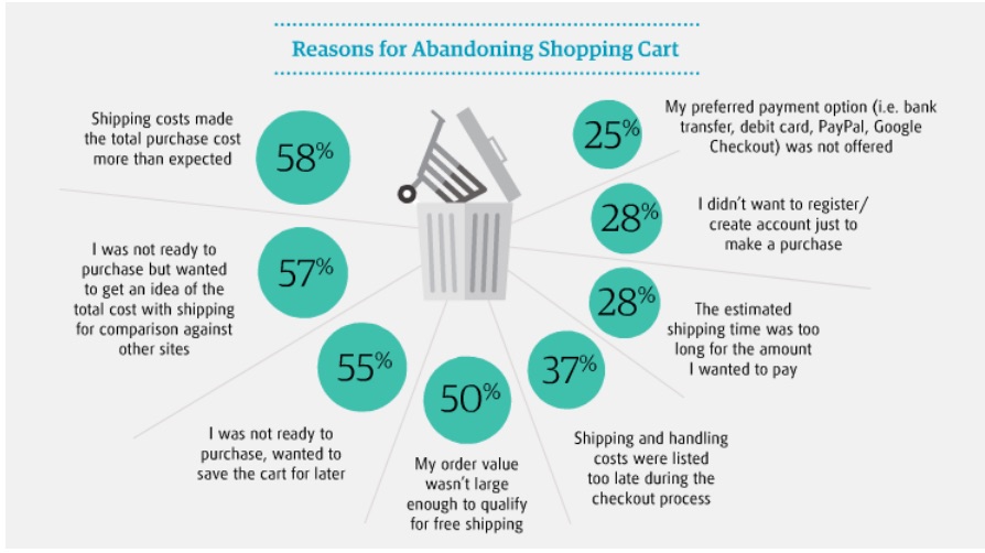
Based on the responses in the graphic above, here are some suggestions for improving the shopping cart experience:
- show customers what’s already in their carts every time they add new items;
- communicate the total price of their items every step of the way;
- have a “save to cart” feature for those who are not ready to check out;
- have your own comparison charts against competitors within product pages;
- list shipping costs as early as possible in the checkout process.
Conclusion
Mobile commerce has improved by many factors over the years.
Despite the progress, you can still do a lot to improve the experience for customers.
The easier and quicker the process is, the higher your conversion rates will be.
That’s a given.
It’s worth noting that every strategy won’t yield the same results for all ecommerce stores.
You need to test the elements of your checkout process to see what works best. That’s the best way to ensure you’re not losing customers where it matters most.
Start with the strategies in this article. Put them to the test, and see what difference they make for your business.
Do you have any other tips for simplifying the mobile checkout experience?