
Sometimes, when it comes to advertising, we feel as talented as Don Draper in Mad Men — one of the best (fictional) advertisers in the game. However, advertising has evolved since the 60s, and that’s partly thanks to how expansive the internet has gotten with commerce.
Banner ads, for example, weren’t around until recently. But for prime ad placement, banner ads are the way to go and have cemented their importance in revenue gain for marketers.

So what exactly are banner ads and how do they work? We’ve got a simplified version you can use to explain them to anyone.
What are banner ads?
Banner advertising is synonymous with display ads. They’re placed in high-traffic locations on webpages, creating brand awareness and generating click-throughs, purchases, and leads. These high-visibility locations include the front, bottom, or the side of a webpage; places where the eyes of browsers usually wander.
Banner ads fall into the category of digital advertising, one of the most lucrative ways to generate revenue. In fact, in 2019’s first quarter, revenue from digital ads reached a landmark high of over $28 billion.
A great banner ad grabs the reader’s attention and invites them to learn more about what’s being advertised. They’re bright, welcoming, and don’t have much text, instead using images or multimedia to convey a message. Check out this banner ad as an example:

Image Source
LinkedIn’s banner ad was found in the sidebar of a webpage I was browsing. It was large enough to catch my eye and inviting enough to make me linger on the ad.
This is a great banner ad because the description is a quote from a C-suite professional, making LinkedIn look reputable to business owners searching for new talent. The high-quality visual proves that the service cares about seeming professional. Lastly, the CTA has text that leads you to act instead of saying “Click here to find out more!”.
Banner ads are lucrative because of programmatic advertising, a term that describes how advertisers place ads. The software of these programs matches ads with the interests of website browsers.
To illustrate, let’s say LinkedIn’s ad team wanted to use Google Ads as their programmatic advertiser. Google Ads would then sell LinkedIn a sidebar space on websites professionals are more likely to visit, such as Investopedia. This ensures more potential for overall revenue earned for LinkedIn.
Let’s look at how much LinkedIn likely paid for their ad, and how much banner ads are going to cost you in cost per impressions (CPM) and cost per action (CPA) for popular advertisers. Recall that impressions are how many browsers saw an ad, and actions are those who clicked.
Banner ads cost
- Facebook: On average, $10 CPM, $18.68 CPA.
- Instagram: On average, $5 CPM.
- Google: On average, $59.18 CPA.
- Google AdWords: On average, $2.32 per click.
As websites gain popularity, their prices for ads are going to rise. While these are the most popular advertisers, this list isn’t exhaustive. Check out our ultimate guide on advertising to find out more options for the cost of banner ads.
Now that you have an idea of average banner ad price tags, let’s get into how to make them stand out, and get into examples of excellent ones.
Standard Banner Ads Sizes
Because banner ads are flexible with their display, there’s corresponding sizes that come with it. Most importantly, there are five sizes to keep in mind when formatting your banner ad; the ones that are top-performing with click rates.
- 336 x 280: This will give you a large rectangle
- 300 x 600: This is half of a webpage
- 300 x 200: This will display a medium-sized rectangle
- 320 x 50: This is a mobile header banner
- 728 x 90: This will give you an optimized header
The ad templates for Google AdWords and Bannersnack will automatically format your banner ads to the correct sizes, so you won’t need to worry about cropping and optimizing.
Having the correct sizes for your banner ads help you format the visual aids of your ad. For instance, a GIF will probably not be the best choice for a 320 x 50 ad on mobile, especially if the file is a little larger than usual.
Best Banner Ads
It’s crucial to know the necessary sizes for your banner ads — but it’s not your only consideration. In order to make sure your banner ad is effective to target audiences, we have some tricks to keep in mind while you’re designing yours.
How to create banner ads
- Incorporate a CTA.
- Add your brand.
- Make sure to use keywords.
- Choose high-quality visuals.
- Keep things simple.
Let’s say you have all the tools for creating your banner ad in place. While the actual execution of the design is up to you, it’s important to incorporate these elements in your ad to make sure it’s effective, and not just something that crowds up a webpage.
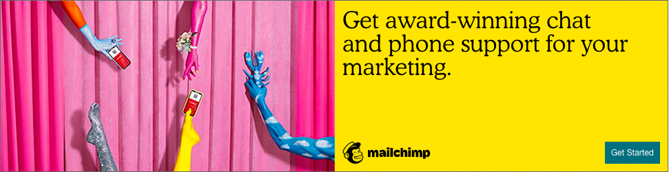
Image Source
To illustrate steps, let’s use this 300 x 200 banner ad from Mailchimp on Entrepreneur’s website.
1. Incorporate a CTA.
A call-to-action (CTA) is what invites prospective buyers into discovering more about your product or service. This is what gets them to click on the ad and interested in learning more. Mailchimp’s CTA is the blue “Get Started” button at the bottom of their ad.
A bright, eye-catching CTA points your target audience in the right direction, and linking to your product page is a good way to get clicks on your website.
2. Add your brand.
If your logo isn’t visible, how will people know what your business is? Mailchimp’s logo is at the bottom of the ad in a clear spot. The logo doesn’t have to take up the entire ad or interrupt the flow of the rest, it just has to be recognizable among the rest of the ad’s imagery.
3. Make sure to use keywords.
Using keywords and action items will not only optimize your ad for search engines but has a better chance of browsers interacting with your ad because your service sounds right for them. Mailchimp uses words like “award-winning,” “support,” and “get started.”
If I were looking for marketing tools to make my life easier, award-winning software that offers support sounds right up my alley. If getting started is as easy as clicking a button, there’s no reason not to at least check it out.
4. Use high-quality visuals
To keep your ad professional, any visual elements, such as images or GIFs, should be high quality. While moving images are a way to keep ads interesting, static images are just as effective.
Mailchimp’s imagery is fun and gets the point across. Their logo is also a way to convey imagery, making sure their brand stays in their audience’s memory.
5. Keep things simple
A crowded ad is nothing but a nuisance to web browsers. An effective ad has minimal text, one or two images, and a CTA. Mailchimp’s ad is one sentence and includes large text.
Some banner ads don’t even have text or images at all, just a logo and a CTA. Though your ad doesn’t need to be that minimalist, it doesn’t need to have as much information as you may think. If your ad has more than one short sentence, it may be too much.
Let’s look at some excellent uses of banner ads and why they’re effective.
Banner Ads Examples
1. Pottery Barn
This desk ad from Pottery Barn is a good example of how a little goes a long way. Using a showroom photo to highlight the practicality of desks, it gives way to how easily their furniture could fit into a space.

Image Source
With the logo, an engaging call to action, and a simple design, all five points of an incredible banner ad are covered, and it’s effective. For students browsing Amazon or professionals building their home office, this ad would be an excellent cater to them.
2. Blue Bloods
CBS’s banner ad for one of their shows has an awesome CTA. “Try 1 Week Free” entices the audience to check out their new streaming service, CBS All Access.

Image Source
Using a show that’s already popular, and having all episodes streaming, pulls in binge watchers. This ad also incorporates the show’s logo and star. It also gives viewers all the information they need without appearing too crowded.
3. SEMrush
Popular SEO extension SEMrush used the small rectangular banner ad choice, which is not only pocket friendly, but useful for ads that don’t require a lot of information to get the point across.

Image Source
In this ad, SEMrush lets you know exactly what their service provides in less than 20 words. Keywords “UX,” “SEO,” “Time,” and “Page Speed” are all golden here. They’re effective in grabbing the attention of companies looking to heighten their analytics.
4. Chevy
Providing all the specs of a car on a banner ad isn’t possible without the ad looking too busy. Chevy chose to play with text in order to keep the information there without being overwhelming. Moreover, they chose essential information and wording to make sure the impact would be as great as it can be.
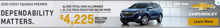
Image Source
Chevy also made it a point to incorporate color into the most important words. The discount on this car and the CTA are both in yellow, bringing the attention straight to those two elements of the ad.
5. The New Yorker
Minimalism goes a very long way, and The New Yorker knows this.

Image Source
The magazine has a promotion going on that includes a free tote bag with a subscription. Imagery of both products a new subscriber will receive is a good way to use imagery, and the price here is bolded, meaning it’s of importance.
You’ve probably interacted with a ton of banner ads with minimal knowledge of them. The truth is that they’re a great asset to boosting visits to your site and expanding your audience. Not that complicated, right?
For more resources on how to advertise for your business, check out our post about how to run Facebook ads.