When was the last time you updated your website?
If you have to stop and think for a minute to answer that question, you may have a problem. Your website needs to be monitored and updated on a regular basis.
However, you don’t want to make changes without any rhyme or reason. That’s why you can use A/B testing as a tool to help guide your website updates.
But before you start A/B testing, you need to understand how it works. It’s not just a one-time thing. Some of you may have tried these tests in the past and seen an improvement. So why did you stop?
For those of you who have never tried A/B testing, it can be difficult to know where to get started. Regardless of your situation and experience with A/B testing, I can help you out.
Continuous A/B testing will make your website more efficient.
I’ll explain how you can use this strategy to improve your business and help you boost your conversion rates.
How A/B testing works
A/B testing isn’t really that difficult of a concept to understand. You start by creating a hypothesis about a certain element and then run a test to see if your theory was right.
To do this, you create two different versions of your website. Then half of your site traffic will get sent to one version, and the other half gets directed to the variation.
Here’s a visual representation to give you a better understanding of what I’m talking about.
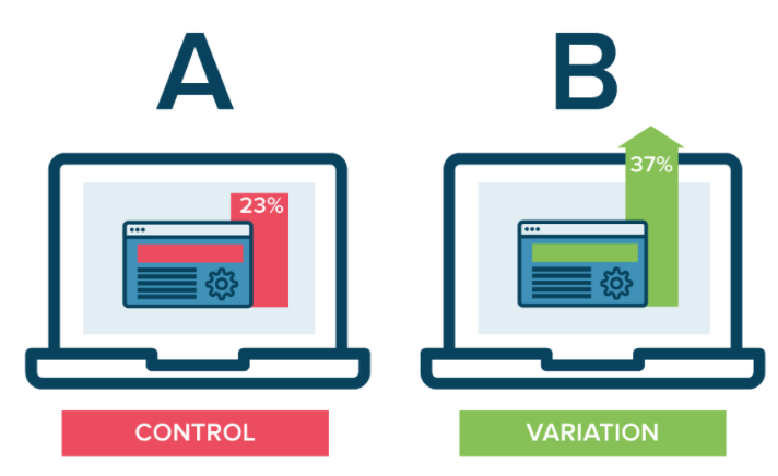
Once you set up the test, you wait and see which variation has higher conversion rates. Then you draw conclusions and update your website with the version that converts the most.
What’s tricky about A/B testing is deciding how long to test things and what elements need to be tested.
Honestly, there’s not one right answer to those questions. But I’ll give you some guidance to help you run these tests efficiently.
Test your CTA buttons
When you’re trying to get higher conversions, it’s best to start with the button that gets people to convert.
Obviously, these buttons are different for each company in every industry. It depends on your goal on a specific landing page as well. Some of you may be trying to drive a sale while others may be trying to get site visitors opt-in to their email subscription list.
The key here is just picking one element to start. You don’t want to test two theories at once. Testing multiple hypotheses doesn’t give you conclusive results because you won’t know which variation impacted the results.
That’s why you should be running tests continuously to maximize the efficiency.
Start with something subtle and easy such as the size, color, or placement of your CTA button. For example, you could hypothesize that a larger CTA button will have higher conversions.
You can also test the actual text written on your CTA button. Try testing power words against action words.
Here are some of the power words that convert the most.
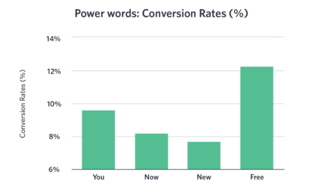
Are any of these words currently used in your call-to-action?
Here are some more statistics about the conversion success of words that entice an action.
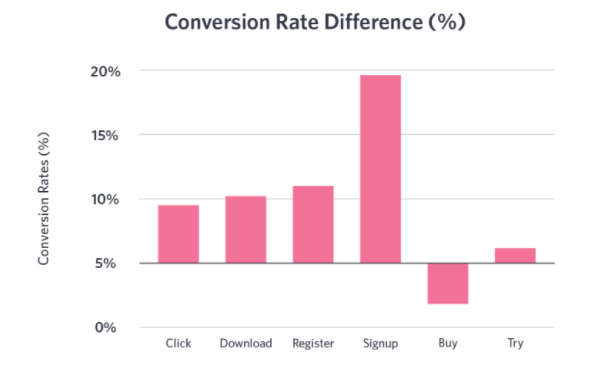
Based on the numbers in these graphics, you could hypothesize that a call to action that says, “Sign up for free” will have higher conversion rates than one that says, “Download now.”
But there’s only one way to find out. Test it.
After you test one of these and you’re satisfied with the results, move on to another. So if you started with the size of your CTA button, then move on to the color. After that, you can test the text or placement.
Test all of the CTAs this way on each page of your website.
Less than half of websites have a CTA button that can be spotted in less than 3 seconds. So putting so much effort into testing your CTA will definitely give you an edge over your competitors.
Evaluate your headings
After you’re satisfied with your CTA button analysis, move on to other components of your website that stand out the most.
Your headlines and subheadings definitely jump off of the page at visitors, so it makes sense to test those next.
If your headlines aren’t worded properly, visitors may not even read all of the content on the page. So while testing the CTA may seem more important, visitors could miss out on your entire value proposition if the headers don’t keep them engaged.
In addition to conversions, you should be looking at analytics that shows how long each visitor stays on the page for.
If one headline causes the average page viewing time to be significantly longer than the variation, it will definitely increase the chances that the visitors will convert.
Here’s an example of an A/B test on a website’s headline.
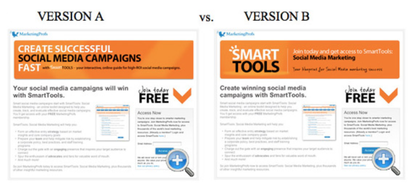
As you can see, the two pages are identical, except for the headlines. The variation has different words for the main heading and subhead.
The test yielded conclusive results. Website visitors who saw version A filled out the form at a 27.76% higher rate than the ones who saw version B.
If your tests are only within 5% or so if each other, you may not be able to say that one is definitely better. To find out for sure, you can run an A/A test before your A/B test to see what your standard deviation is between the same version of a web page.
Improve your checkout process
For those of you with an ecommerce website, you need to find ways to minimize shopping cart abandonment.
Using A/B tests on the layout of your checkout process can really help you maximize conversions. You’ll be able to tell which elements are working and which ones can be tossed away.
I’ll give you some ideas of what you can start testing.
Are you accepting coupon codes? If you have an option for visitors to input a coupon code during the checkout process, it could cause them to go searching for a code.
But if these codes aren’t always readily available and they’re just something you use to offer a disgruntled customer, it shouldn’t be a primary element of your checkout process.
Test it out to see what kind of results you get.
You could also test a guest checkout vs. login to checkout conversion rates. I’m assuming you’re offering a secure checkout, so use A/B tests to see if the size and placement of your security badges have an impact on conversions.
Test every element on the page. You’d be surprised at how something small could make a huge difference.
Here’s a great example of something subtle that iHerb used to when A/B testing their checkout process.
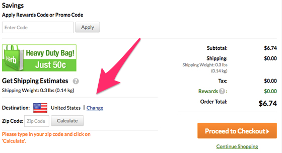
Take a look at the left side of the screen. They have a shipping cost calculator. All the customer has to do is input their zip code and they’ll get an estimate on their shipping costs.
But the heavy-duty bag promotion draws lots of attention away from the calculator.
Here’s another version of that same page.
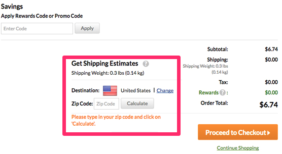
As you can see, the image was removed and the “Calculate” button was placed much closer to the “Proceed to Checkout” CTA.
OK. So technically they changed two elements of this page, which I know I said you shouldn’t do. But this was subtle enough to be effective.
I’m a big advocate for removing clutter from your pages, so I think it was a smart decision to get rid of the image in addition to moving the placement of the calculator.
Find out which images convert
You definitely want to use images to help you improve your website. But it’s just a matter of what images to use and where to place them.
If you’re on the fence about a decision, or you have some images already in place on your website, run A/B tests to see which ones have the highest conversion rates.
For example, you could test an image of a man vs. an image of a woman to see if one yields different results. Or you could test an image of the same model, but with different facial expressions, such as smiling vs. a serious face.
Is it better to have one big image as the background of your website? Or will a white background with the image in the forefront have higher conversions?
The only way to find out for sure is by testing your theory.
You should also consider the size and position of your images in relationship to other elements of your website.
Continuously run these tests to maximize your conversion rates.
For example, let’s say you find out that a photo of a man converts higher than a photo of a woman. Now you’ve got to find the most optimal position of that photo on the page, so your tests will continue.
Test different color schemes
Colors can make a huge impact on how people see your website. That’s because certain colors have a psychological impact on our mind.
We’re programmed to associate certain colors with things. For example, but what color does everyone wear to a funeral? I’m not trying to sound grim, but that’s one of the reasons why we automatically associate the color black with death.
Test colors for every component of your website, such as the color of the text, the menu icons, and CTA buttons.
Here’s an example that tests the colors of the call-to-action on this website.

The pages are identical, including the text. The only thing that’s been changed is the color. Refer back to what I said earlier about our minds automatically associating certain colors with things.
Well, we’re programmed to go on green and stop on red. So a valid hypothesis for this A/B test would be that a green CTA button will have higher conversions than the red one.
Use A/B tests to improve your emails
Everything we’ve discussed so far is based around your website. But that’s not the only platform that you use to get conversions.
A/B testing is not limited to your website. You can also test factors from your email marketing campaigns.
Test things similar to what we’ve already talked about. Focus on your CTA, colors, images, headings, and text.
But with email, you can test other factors as well.
For example, use A/B testing on your email subject lines. The content of your message can be the same, but see if you have a significant difference in open rates and conversions based on the subject.
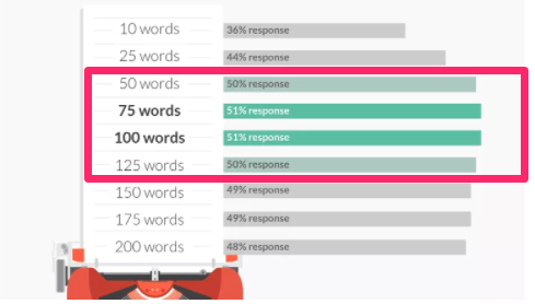
Test the word count of your marketing emails.
Recent studies suggest that emails between 50 and 125 words have the highest conversion rates.
So think outside of the box when you’re running these A/B tests.
Don’t assume that you’re only allowed to test elements of your website. Email campaigns are another viable option.
Revisit your early tests
A/B tests don’t just last for a day or two.
Typically, you’ll want to run each test for at least a few weeks or so to make sure that you’ve got a large enough sample size to yield conclusive results.
So let’s say you run 4 or 5 different tests on your CTA button. That alone could take 3 months. Then you move on to test your headlines, images, colors, and checkout process.
By the time you get through all of these tests, a year or two could have passed since your initial test.
Well, don’t stop now. Go back and see if your CTA is still as efficient as possible.
Conclusion
A/B testing is one of the best ways to increase your conversion rates.
But you don’t just run one test and call it a day. This process needs to be a continuous part of your marketing strategy. Always strive to make improvements to your website.
Test things like your CTA buttons, headlines, and checkout process.
You can also test visual elements such as your images and color schemes on your pages.
A/B testing isn’t just restricted to your website. You can apply this strategy to your email marketing campaigns as well.
Once you finish testing something, move on to the next element. After you’ve tested everything, start back at the beginning.
What elements of your website are you testing first to improve your conversion rates?
Comments are closed.