Your menu is still one of the primary ways that traffic navigates around your site. Deciding what to put in it, however, may be a little more complicated than first thought.
In the old days, a website would have four main links: About, Blog, Contact, and a Home button. But as technology improves and changes, it’s now possible to do a lot more with the humble menu.
Today I’m going to show you a few things I’ve been testing in my own menus as well as some interesting examples from around the web. Hopefully they help you build a menu that’s a little bit more effective.
What is the real purpose of a menu?
It might seem obvious to some, but when I really sat down to think about what I needed in my menu I found that the question was a little bit more difficult than anticipated.
For example, all of the posts that I write are filled with in-post links that send people off to relevant articles that will (hopefully) help them as they’re related to search terms they are reading about.
So, if all of the important links are there in any given post, what do I need the menu for?
This got me thinking that maybe it was less about getting people to move around the site, and more about sending them in a specific direction that helped them achieve certain outcomes based on my blog’s goals.
And that leads us to the next point.
Coming up with some goals for your menu
Before you decide what to add to your menu it’s really important to come up with some goals.
And the goals you have for your menu will closely align with the goals you have for your blog and your blogging strategy as a whole.
If you don’t know what you’re trying to achieve on your site as a whole, there is no way your menu will be effective.
So what outcomes are we looking for in the menu?
- Getting people to make contact
If you’re a physical business like a physiotherapist or a mechanic, then one of your menu’s primary functions will be to make it easy for people to ring and make an appointment. We’ll look at ways to do this below. - Encouraging sign ups
A blog will likely be focusing on mailing list sign ups and, as such, some of your menu real estate should be devoted to making it easy for people to subscribe. - Making people aware of announcements
If you’ve just spent months developing a new tool or creating a conference then you want to make sure that is present in a menu, especially if you’ve been advertising it around the web. - Clarifying their place on site
If you have an ultra-complicated website (think Amazon.com) then the menu should be devoted in parts to helping people understand where they are so that they don’t abandon. This might also work for a checkout process or some sort of timeline. - Making a direct or indirect sale
Making a sale will be a primary purpose of many menus and can be done by either directly promoting a product, or leading people to a landing page or additional content that will make the pitch.
When we decide on a goal for the menu based on our blog’s overall strategy, it will be much easier to create something that makes sense and converts well.
What do other sites put in their menus?
What I’d like to do now is show you a few examples of all of these different goals in action in the hope that it gives you some ideas for how to structure your own menu effectively.
1. Making quick contact
The first example comes from friends of mine over at Reliable PSD who have a stunning menu that has a big emphasis on getting a free quote for your project.
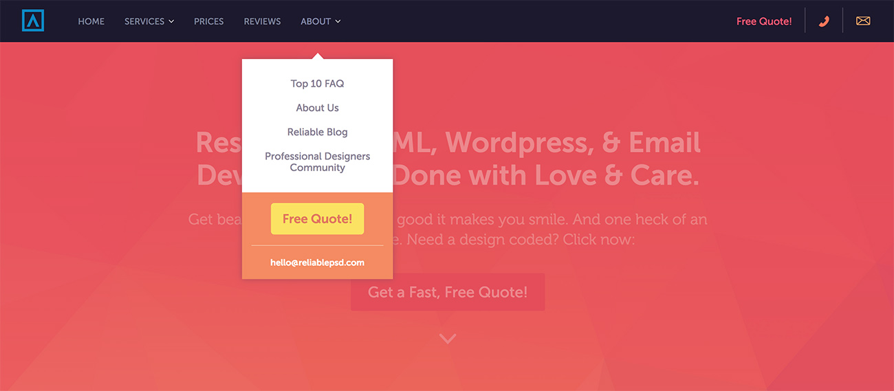
The “free quote” option appears three times in the menu, and is accompanied by an email address in case people want to make contact directly without going through the quote form itself. This is a really clever thing to do in a business where people want quotes and prices quickly.
2. Encouraging quick sign ups
A service like Slack is so simple and elegant that one of their best sales tactics is just to get people to try it out without wasting too much time.
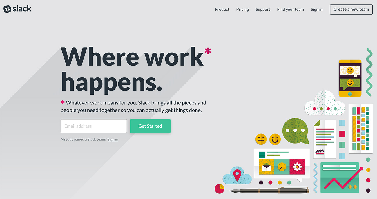
As you can see, their menu is simple and has a big emphasis on one goal – creating a new team. Essentially they’re asking people to try it out and get their friends or colleagues to do it as well.
From that link, you just enter your email and you’re pretty much ready to go. It’s a brilliant way to quickly get people using the service before too many bounces can occur through multiple navigations or explanations.
3. Making announcements
One good example of a complicated website with a good menu is ASOS which, at present, has an announcement for a sale that is happening on the online store.
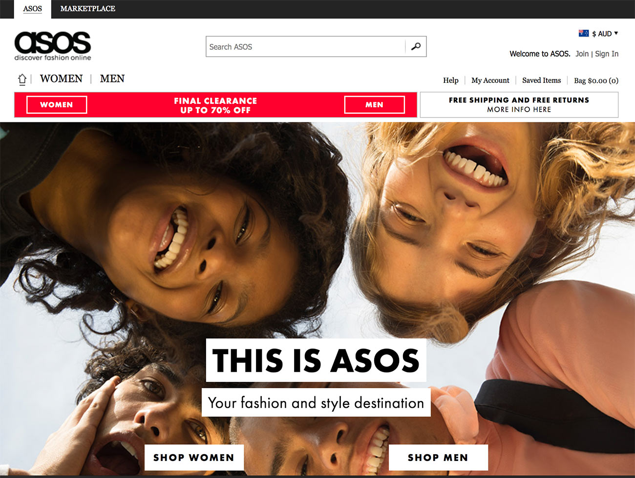
As you can see, the menu divides the store into Women and Men quite clearly, and uses a very distinctive color to show that a sale is on. It’s impossible to miss. This is a good idea to keep in mind for our own menus – sometimes you need a contrast of color to bring attention to something.
I’ve tried to do something similar in the top right corner of Blog Tyrant as the color changes when you scroll from the very top position.
Another really clever example of an announcement is over on Popular Mechanics right now.
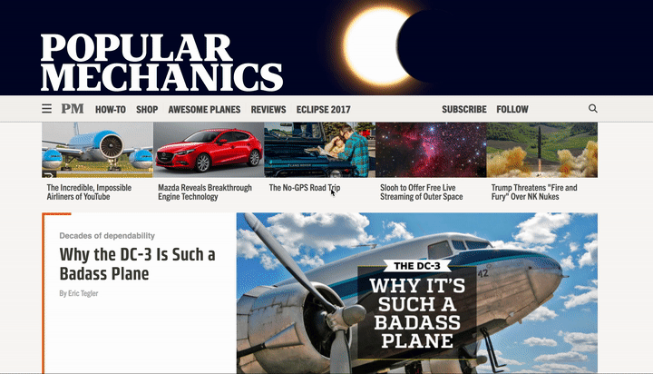
They’ve transformed their whole header into a Solar Eclipse animation and added a big link below it which goes to a massive guide about this year’s eclipse.
Integrating a big piece of content with a current event is a really clever way to get back links and create a lot of buzz around your site.
4. Making quick sales
One of the best menus that I keep coming back to is Smart Passive Income by Pat Flynn who has an incredible moving graph of his earnings, as well as clever links to important products and content areas.
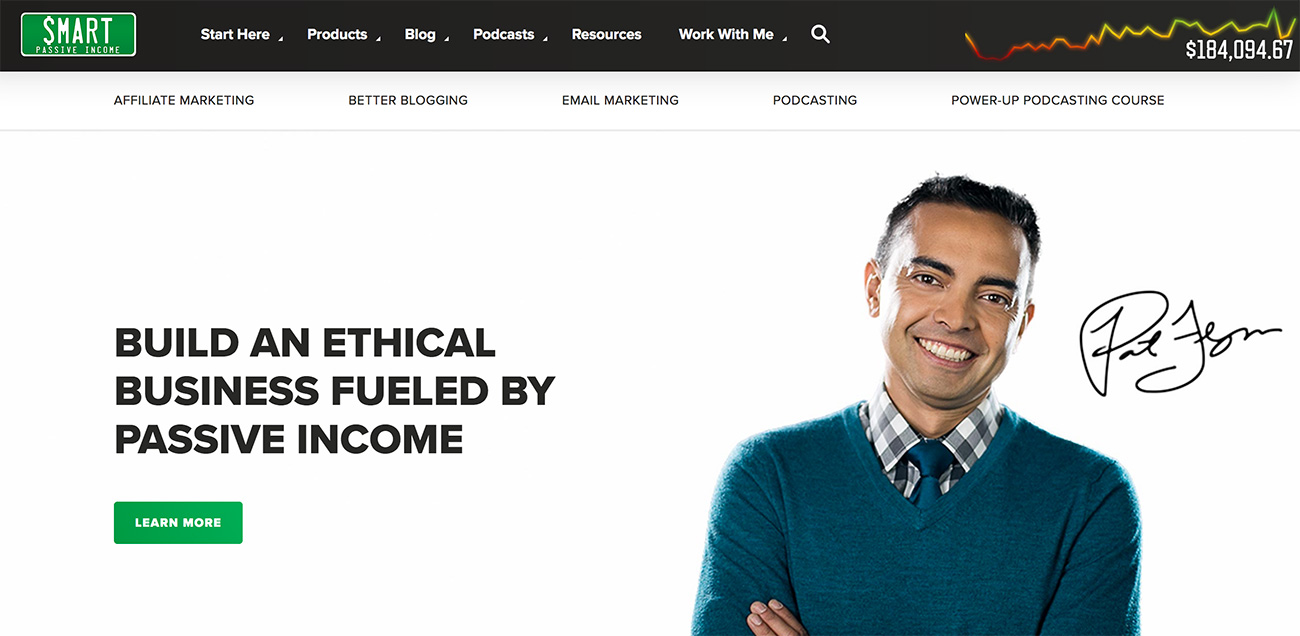
Pat was one of the first to test and pioneer the “New? Start here” link in the menu and it has been working really well for him. He also now has an extended selection of products that you can buy right there without any digging.
One thing that impresses me about this menu is how you can almost decipher Pat’s whole brand by just what appears in the top navigation area. Everything you need to know or do is in that one place.
Remember, there’s more than one menu
It’s good to remember that there are often more than one menu on any given blog or website and, thanks to mobile technology, there is often a separate menu for mobile devices.
This is important to think about because often you will find that the feature you want to add to your desktop main menu could be entirely different for something that people will do on mobiles.
For example, if you have some software or product that only works on a desktop computer then it is probably not ideal to devote a large menu promotion towards it. Instead, it might be better to promote your mailing list, build interest, and take a more long term approach to the sale.
Also, many of the examples that I looked at had sub-menu items, and even some hidden “Easter eggs” that can make the whole thing a little bit more exciting. You might decide that you need more than one menu at different places on a page, or on different pages.
How to make your menu better
Once you’ve figured out what you want to put in your menu, you might need a little bit of help to integrate some new features and really bring it to life.
If you’re on a self-hosted WordPress setup then there’s lots of things you can do with a menu, besides WordPress’s ability to create and edit menus for any theme that you use.
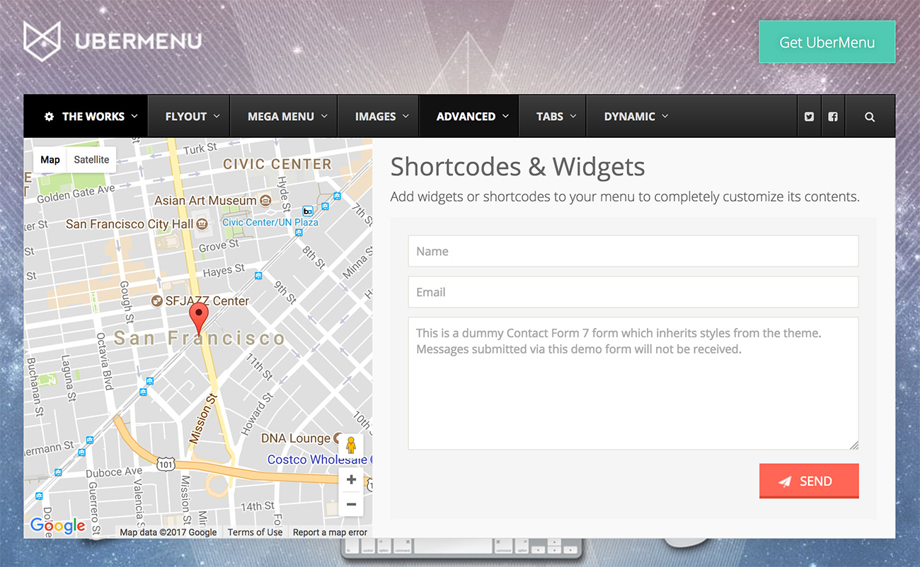
For example, a plugin like UberMenu will allow you to create massive mega menus with slide outs, integrated codes and maps, buttons, etc. which can be really handy if you have a plan for something different.
But if you don’t want to go that complicated route, you could always just simplify your navigation down to one specific goal and remove all the clutter. That is something that I’ve been testing on and off for a while and I really think it’s worked.
Whatever you end up doing, make sure you do test it for yourself to make sure that it is getting actual positive results instead of just a nice design and feeling.
Have you ever done anything different with your menu? I’d love to know about it in the comments below.
Comments are closed.