
Google is rolling out a new design for how it displays hotel results in the core web search results. Instead of a basic looking local pack, Google has revamped the hotel local pack to look more like the new hotel search redesign from a few weeks ago.
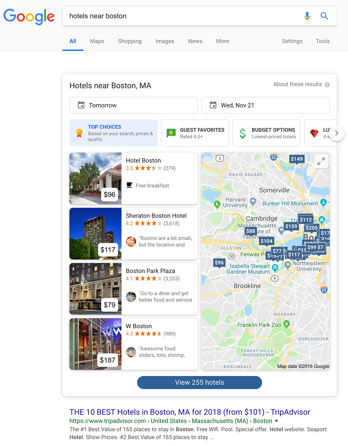
What does the new local pack look like? Here is a screen shot for a search on [hotels near boston]:
What did it look like before? Well, depends on how far you go back, but here is one from 2016:
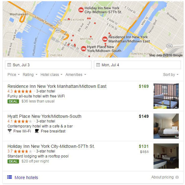
What changed? The biggest difference is Google is now showing four hotel listings instead of three hotel listings. The user interface clearly looks completely redesigned as well. Google also has a new carousel at the top to filter by top choices, guest favorites, budget options, luxurious and more. The date filter is still at the top but the hotel pack has lost the quick filters for price, ratings, hotel class and amenities, instead some of those are in the carousel.
Why should I care? Those marketers or webmasters in the hospitality field will want to take notice of this change. There is now an additional result for another hotel competing in the same local pack as before. In addition, there are new filters and landing in the “top choices” filter might drive more awareness of your hotel listing than being in the “budget” filter.
About The Author

Barry Schwartz is Search Engine Land’s News Editor and owns RustyBrick, a NY based web consulting firm. He also runs Search Engine Roundtable, a popular search blog on SEM topics.