Chart of the Day: Which resolutions of web browsers should you target when testing new website designs?
If you have ten people in a room together, chances are high that most of them will have different device types that use a different browser and have a different screen size.
This is why it is important to be aware of screen resolutions and the devices your prospects and customers are using. The quality of experience you deliver through your website can vary greatly depending on how well your design works at different resolutions. Due to the countless resolutions that exist across the same screen size, designers use viewports to help create mobile-friendly pages. Viewports are scaled down versions of resolutions that allow sites to be viewed more consistently across different devices.
The tables below show the most popular screen resolutions and viewports for both Apple and Android products:


To determine the most popular resolutions to use when testing your website, you should first check the analytics of your own site to see which devices most visitors are using. If you’re targeting a new audience, or focusing on your existing audience, looking at this overall data is a good place to start.
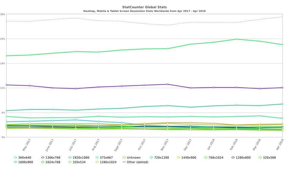
It’s also worth reviewing the ongoing trends in resolutions when deciding which resolution to use. The table below shows the market share of the most popular viewports over the past twelve months. Looking at these trends can help you decide which resolutions and viewports you should test for your website. For example, the most notable trend here is that 360×640 has been generally increased over the past year.
Responsive web design
However, it would be nearly impossible to design a website for every individual device, which is why developers use one of two methods when programming responsive designs:
- Group the styling into the most common device sizes for phones, tablets, and desktops. For example, anything larger than 7 inches is usually displayed at desktop resolution.
- Use breakpoints (defined pixel widths that the display will adjust layout based on screen size) dependent upon the layout and design.
If you’re looking for somewhere to start with programming your website, we recommend you start with grouping the typical device styles together.
The tech world is constantly changing and evolving and so should your website. It’s important to keep this in mind while designing a website, but it’s just as important to keep your website up-to-date and displaying correctly on the most current devices, browsers, and screen sizes.
Sources: Statcounter Global Stats and MediaG