There’s one term that never fails to make the little hairs on the back of my neck stand upright — reporting. Depending on your own approach to creating reports (or lack thereof), we might be paddling the same canoe.
Reporting is a mostly joyless pastime, not unlike paying one’s taxes — a task reserved for those without the luxury of a third-party service. In place of those sleek automated reports is some Frankenstein’s monster, painstakingly cobbled together using an assortment of low-quality screenshots pasted into a Word document.
Surely, there must be a better way — and there is.
Google Data Studio: A Better Solution to Reporting
Part of the Analytics Suite, Google’s Data Studio is looking to provide a better solution to reporting for businesses small and large. Beta access to Data Studio is free and allows users to create up to five custom reports with unlimited editing and sharing capabilities.
In Google’s own words, “Google Data Studio turns your data into informative dashboards and reports that are easy to read, easy to share, and fully customizable. Dashboarding allows you to tell great data stories to support better business decisions.”
The platform works by syncing up with your existing Google data, Analytics, AdWords, and more. The reports you create can be endlessly shared and edited to perfection. You’ll find the learning curve rather negligible provided you’re comfortable navigating your chosen platform.
Data Studio might just be the solution to your reporting needs — here’s how to get started with it.
Choosing a Template
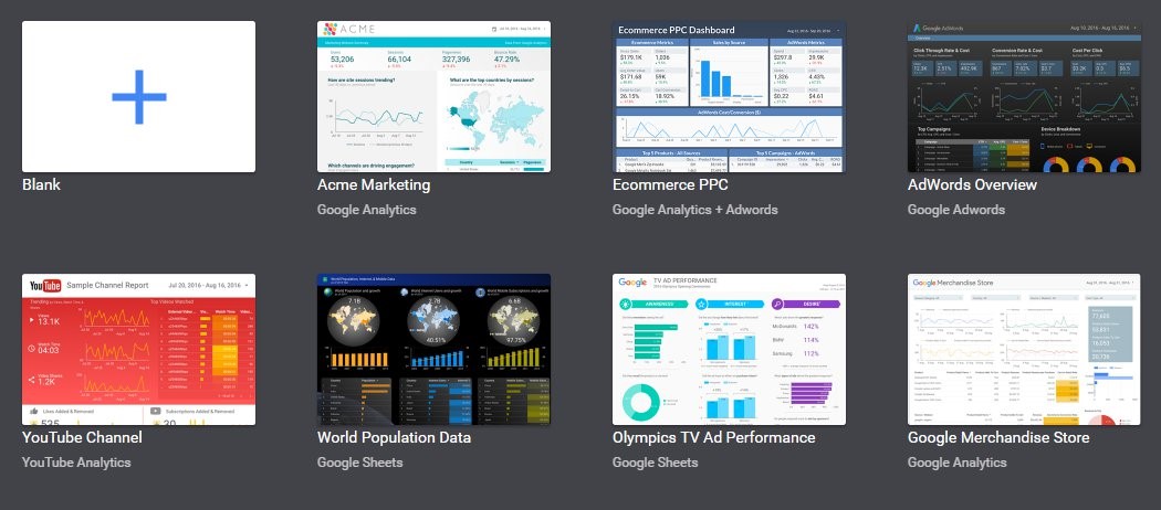
Data Studio gives you plenty of templates to choose from when building your report. The default templates are designed to give you quick options for reporting across various Analytics Suite properties. These default templates are very handy but also rather robust; they’ll likely include metrics you don’t necessarily want to include and require some time spent ‘trimming the fat,’ so to speak.
Personally, I recommend choosing the ‘Blank’ template if you’re just starting out with Data Studio. This is the perfect sandbox to learn the various features within and eventually build a report that fits your own specifications.
Every template can be edited regardless of what you choose. There’s also some sample data to play with if you haven’t already connected your account.
Report Overview
A blank report will look like this:
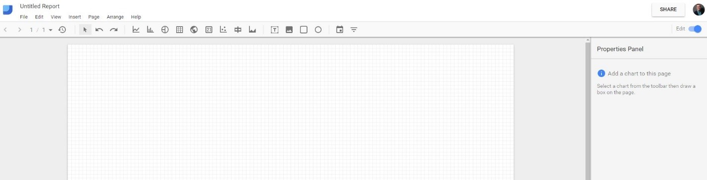
You’ll notice editing mode resembles other Google productivity apps like Docs, Sheets, and Slides — that’s intentional. Several areas to note here: the report title, pull-down menu, toolbar containing various Data Studio features, and right-side Properties Panel used to configure your charts.
Using the Toolbar
The report you create in Data Studio provides a wide range of options for incorporating data. This is possible by using the toolbar.
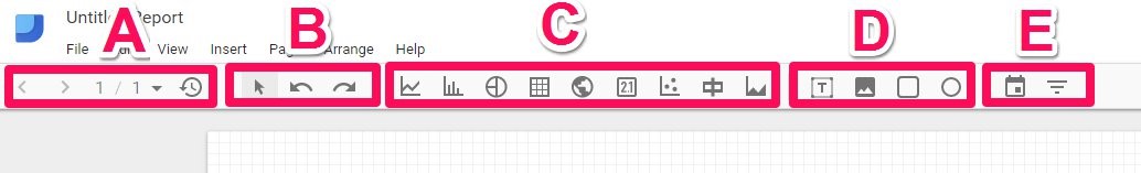
Section A
This section controls your page view and refreshes your data.
From left to right
- Previous page
- Next page
- Show page control
- Refresh data
Section B
This section allows you to select data and make changes.
Section C
This section allows you to insert new data elements.
- Time series
- Bar chart
- Pie chart
- Table
- Geo map
- Scorecard
- Scatter chart
- Bullet chart
- Area chart
Section D
This section allows you to insert text and image elements.
Section E
This section controls the date range and filter.
Building Your Report
It’s easy enough to start building your report if you know what metrics you want to include. Your standard SEO report will typically include things like:
- Date range
- Organic traffic
- Landing pages
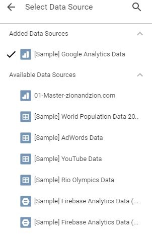
This guide will provide a quick overview of how to add each of these metrics to your report — it should be enough to give you a good feel for Data Studio. We’re using the sample Google Analytics data provided throughout this guide.
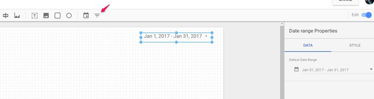
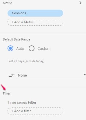
Date Range
Make sure to start by including the date range for the report — essential for staging the subsequent data. You’ll find this in section E of the main toolbar as posted above.
Organic Traffic
Properties Overview
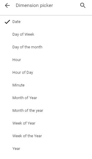
- Dimension — Date
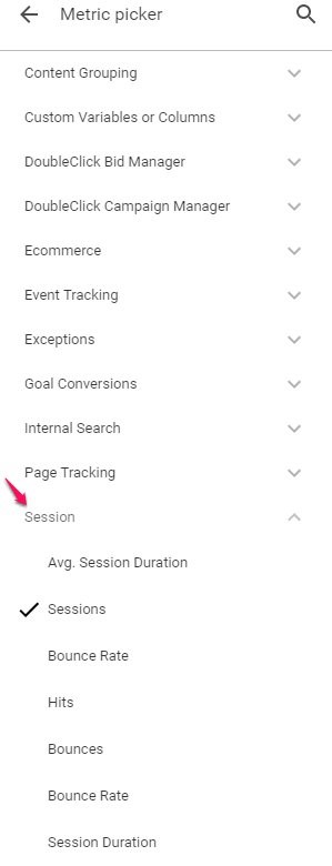
- Metric — Sessions
In-depth Instructions
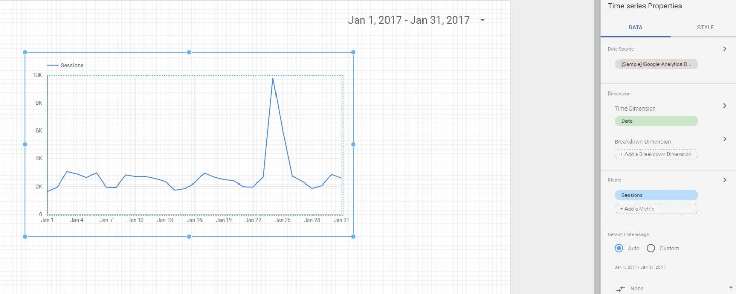
To illustrate organic traffic, I like to use the Time series function. You can find this option on the far right of the main toolbar. You’ll be prompted to scale the time series along a grid; you can resize this later.
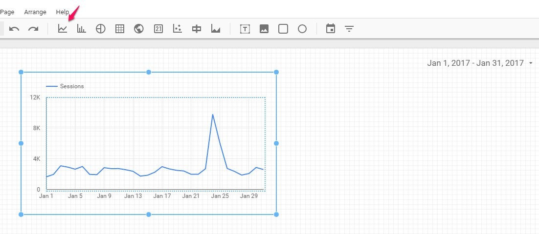
To display the appropriate data in the newly created element, look under Time series Properties.
Beneath the Dimension panel, first select your desired Time Dimension. The example below utilizes the Date option. Keep in mind, as you add properties, you can use the search function to quickly find values — we’re taking the manual approach here.
You’ll have a slew of individual metrics to choose from within this panel. The example below uses Session (Session > Sessions).
Your report should look something like this:
If you want to get a bit more ‘artistic’ with your data than select the style tab (right side, beneath Time series Properties) and start customizing.
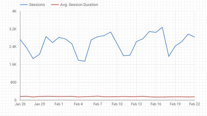
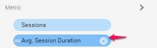
Note that you can add additional metrics to your graph wherever it makes sense; here’s an example of a graph using the added metric of Avg. Session Duration.
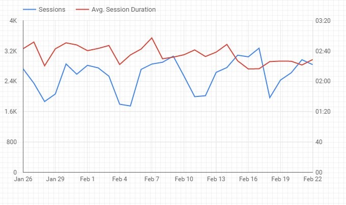
You’ll also notice the axis isn’t quite right here to display the session duration — let’s fix that. With the graph selected, select Style tab of the Properties Panel, scroll down and select ‘Right’ beneath Axis. The graph should be more legible now:
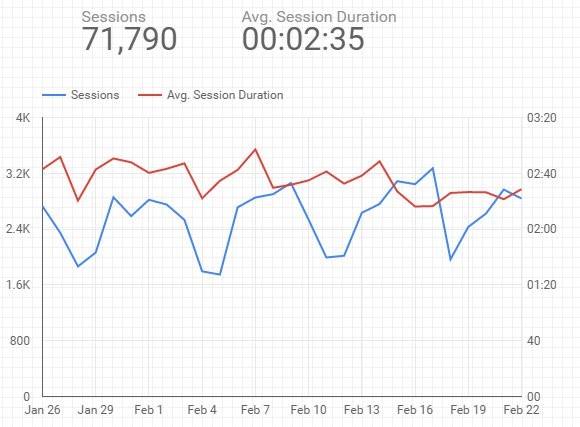
I like to add a scorecard for the sake of clarity — section C of the earlier toolbar graphic. When creating this element in your report, note that the Property Panel data and metrics should align. Here’s how this looks when added:
You can edit your graph as you see fit. The metrics within your graph can easily be reordered (clicking and dragging the metric) or removed (hovering over the metric and clicking the X) as shown below:
Landing Pages
Properties Overview
- Dimension — Landing Page
- Metric — Sessions
- Applied filter
In-depth Instructions
Landing pages might not fluctuate all too much depending on the site. If it’s the first time you’ve put together a report for the site or you’re generating a report less than monthly, it’s probably a good idea to include this information. Here’s how to do it.
I start by selecting Table from the toolbar, located about midway into section C from the earlier graphic. You’ll need to plot this out in similar fashion to the organic traffic.
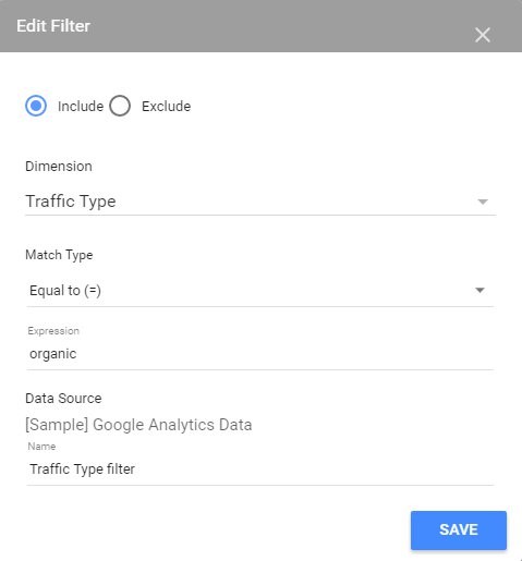
Within the Table Properties, scroll down where you see Filter — we’ll need to apply one to retrieve organic pages only.
Within the Edit Filter panel, ensuring the setting is marked to ‘Include’, apply the following settings:
- Dimension — Traffic Type
- Match Type — Equal to (=)
- Expression — organic
Here that is illustrated below:
With these settings applied you’ll have a table that appears as such:
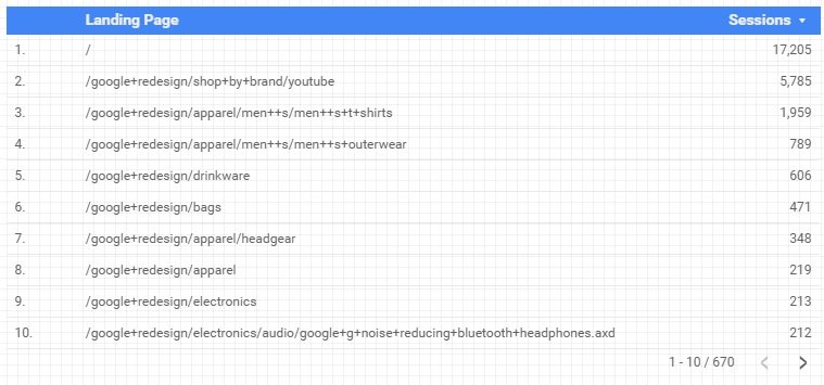
You can adjust this table with additional metrics as you see fit, including other traffic sources — particularly useful if you’re going beyond a traditional SEO report.
Additional Resources
Building your own custom report will take some time to finesse but hopefully, this guide provides a quality introduction to Data Studio.
If you want to take your knowledge further I suggest checking out this detailed video from the Google Analytics team, Report Like a Boss Using Google Data Studio. Carve out about an hour and take notes — this is nearly everything fundamental you need to know.
Once you’re comfortable working in Data Studio, I recommend downloading this nifty template from Luna Metrics. I learned a lot by reverse engineering the report, taking things apart to see where different metrics are located, and how they can be stacked. It’s also a great template to use for Google Analytics in general. I highly suspect you’ll find more of these free templates available in the future as more businesses adopt Google Data Studio.
Good luck in your reporting!
Image Credits
Featured Image: Pexels.com
Screenshots by Tyler Thursby. Taken February 2017.
Subscribe to SEJ
Get our daily newsletter from SEJ’s Founder Loren Baker about the latest news in the industry!
