
It’s important to follow best practices when presenting your user tests findings to your stakeholders and colleagues. Here’s how to do this.
You’ve done all the logistical work — creating user profiles, recruiting representative users, running your test, and collecting reams of data. Now it’s time to share what you’ve learned.
But, unless you want to make peoples’ eyes gloss over, you’ll need to make sure your ‘insights’ report really resonates with your audience. Accomplish this by following these five guidelines and you’ll soon grow your influence in your organization.
1. Provide key background information
Before you present your findings, be sure to ‘set the stage’. Summarize things like:
- What site/app/product was tested.
- Why it was tested (your study goals).
- Who participated in the test (the users).
- How it was tested (the methodology).
Without this context, and especially the ‘why’ explanation, your audience may not pay attention to what you say next.
Only then, after you give this test overview, you should share your:
- Top Findings & Recommendations.
- Suggested Next Steps.
If you forget parts five and six your audience will likely leave wondering, ‘So what?’ and you don’t want that reaction, because that means all of your testing efforts have amounted to nothing. Not only that, your management will grow wary when they don’t see clear outcomes of your work.
When I say include all ‘key’ information, I mean a summary of your study approach and findings. I don’t mean that you should dive into analytical details right away. Save those for the ‘deep dive’ section of your report.
Usability.gov, a long-time source of user experience best-practice guidelines, provides a great summary of these insights report steps.
2. Share your top findings
Of course, you’ll want to share the top things you learned in your test. But before you get into details, lead with your positive findings. Besides affirming what worked well, you’ll create a little goodwill before you share the negatively-charged issues.
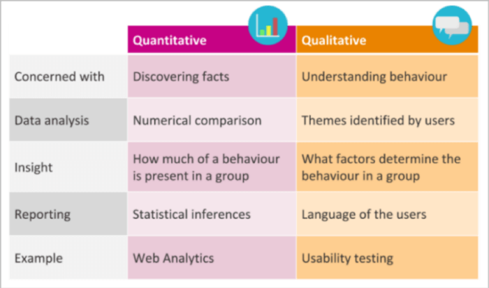
Whenever possible, show both qualitative findings and quantitative summary metrics. Qualitative findings are statements like, ‘four out of six participants couldn’t find the login link.’ Summary metrics are graphs like histograms that show task completion (or non-completion) data. Showing both qual and quant data will satisfy both the ‘Just tell me what’s wrong’ and the ‘I’m not happy until I see detailed data’ people in your audience (and there’s a good chance both types will attend your presentation.)
If you’re not good at analyzing and synthesizing data to draw conclusions, find someone else on your team who is and be sure to acknowledge their efforts when you share your report.
Before preparing your top findings, ask yourself, ‘What are the top three to five things I want my audience to remember after they leave?’ That’s all you should share in your summary section (or slides). Over-sharing is definitely not better in this case.
Along with your top findings, also include recommendations for all ‘root’ user experience (UX) issues. Say, for example, several participants struggled with a few different form interactions. What caused them to struggle? Was it a design model that didn’t match the users’ mental models? Was it some non-standard UX interaction? Whatever the case, search for the underlying issues since fixing them will produce higher design leverage.
Add ‘severity’ indicators for your top (and all other) issues you present. This will help your product and development teams prioritize which issues to fix first. Not sure how to determine UX issue severity? UX measurement expert Jeff Sauro has summarized popular severity scales. 
3. Include a few ‘highlight’ videos
It’s no secret that, due to our increasing exposure to short snippets on social and other media, our attention spans keep shortening. Even getting our attention in the first place can be a challenge (have a teenage son or daughter?). So, unless your user test report grabs your audience’s attention, quickly and visually, you might be its only reader.
The best way to grab your audience’s attention, I’ve found, is with ‘highlight videos’. As the name suggests, these videos highlight the key issues that surfaced during a test. They can also highlight the positive aspects of an interface or experience.
If you’re doing more of a formative user test or an attitudinal study, this video may feature ‘insight’, rather than ‘issue’, clips. Same idea, just different themes.
Userlytics, a user testing platform provider, provides a nice summary of how to create highlight videos.
The process is straight-forward:
- Watch the videos for participants who gave you the best insights.
- Annotate timeframes when participants made comments, asked questions, or had quizzical facial expressions.
- Tag each of these timeframes with an issue label (e.g., ‘couldnt-find-login’).
- Append together all video clips with the same issue/insight theme.
- Produce (output) the video in a common file format (e.g. .mp4).
Unless you’re proficient in video editing and production, these tasks can be tedious. Fortunately, most user testing platforms (like UserTesting, Userlytics and UserZoom) have automated this production process. So, by using these platforms you’ll be working smarter, not harder.
These won’t be ‘highlight’ videos if they’re too long. So make sure each video (by insight or issue theme) is less than five to seven minutes (ideally even shorter).
Lastly, provide a brief ‘setup’ (or at least a theme title) for each video you create so that your viewers — some of whom will be getting a copy of your presentation — will understand the context of what they’re watching.
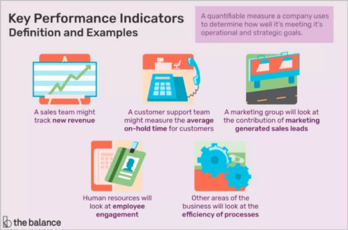
4. Include key metrics – both user experience and business
I mentioned including summary metrics earlier. Now, later in your report, is the place to share the metrics you tracked, along with the associated graphics.
When creating your metrics and associated graphics, ask yourself, ‘How will this tell my story of what needs to be fixed, or created, to take my site/app/product to the next level?’ If the metrics support this, include them. If not, don’t.
Next, include some deep-dive analytics and metrics. But only include them in the body of your presentation if you’re sure you have some ‘analytics geeks’ in the audience. Otherwise, move those details to an appendix so they’re readily available for follow-up discussions.
What are good metrics to include? There’s no one answer there; it depends on your study type (whether quant or qual, formative or summative). To learn more in this area, I highly recommend the book Measuring the User Experience by Tom Tullis. If it’s a UX — or customer experience (CX) — metric that matters, chances are he covers it.
Finally, make sure these metrics map back to business objectives and study goals. If they don’t, you should rethink the metrics you’re showing, at least to executive stakeholders.
5. Present your findings and recommendation with confidence!
When you share your user test findings, you’ll always be including UX solution recommendations (right?!). Unfortunately, though, being the bearer of bad news and potential design/development rework can make you a target of resistance.
So, if you’re not 100% confident in them, review your findings with an analyst-type friend or colleague, then adjust your presentation and supporting data accordingly. Then decide to fully own your recommendations. They’re uniquely yours, and they’re informed by data.
No one else in the room may want to make any of the updates, for whatever reason. Or they may assertively challenge your recommendations (who are you to make them rewrite their software code?).
But hold fast to your findings and viewpoint! Sure, be open to input, but don’t compromise your recommendations before you’ve left the presentation room. Doing so will immediately lessen the power of your findings. And maybe also your organizational influence.
After sharing tactical recommendations, be sure to include a list of ‘next steps’ for your project or product. These are specific actions you’re asking influencers in your audience to take, actions that will eventually transform your ‘poor’ or ‘mediocre’ UX into an ‘excellent’ one.
Include all 5 parts in your perfect test report
If you analyze and present the results of UX research, you’re a change agent in your organization. Your product or service designs will only improve if you drive the UX insights and update process. It will be because you created a report that succinctly shared top issues, featured highlight videos, and included both user and business metrics.
It will be because you presented your findings with complete confidence, backed by data. Who would dare challenge that?