Most ecommerce businesses use responsive design to rearrange elements of their desktop product pages for mobile devices. But mobile visitors benefit from small optimizations that make outsized improvements in add-to-cart and conversion metrics.
I spent years building mobile shopping experiences for Walmart. In this post, I’ll review tactics to improve sales from mobile product pages.
Structure and Design
Titles. Plenty of space exists on desktop pages for a product title. Many sites use titles to insert search-engine keywords resulting in hard-to-read items, such as “Lifefactory 22-Ounce BPA-Free Glass Water Bottle with Classic Cap and Protective Silicone Sleeve, Onyx” instead of, say, “Lifefactory BPA-Free Glass Water Bottle w/ Cap and Sleeve.” On smartphones, product titles with fewer than eight words generate the highest conversions. Optimize accordingly.
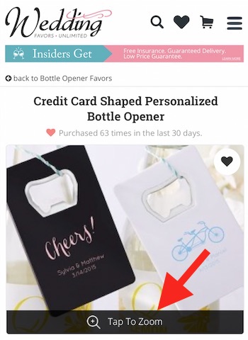
A tap-to-zoom feature enables mobile shoppers to benefit from the high-resolution capability of smartphones.
Photos are the most important conversion element on a product page. But most sites, unfortunately, do not use the higher-resolution of mobile phones for product photos. And most do not display photos on a smartphone edge-to-edge, wasting valuable screen space.
For multiple photos on a mobile page, use a viewer or a swipe interface. The ideal interface has several dots below the primary picture, indicating the user can swipe left to see additional pictures. When she taps the photo, the user is presented with a viewer of the zoomable high-resolution photo.
Pricing. Most products have a single price. But a growing number are sold as bundles or with pricing based on, say, color and size. This results in a pricing layout on mobile devices that is often overly complex. To avoid overwhelming shoppers, make sure a mobile product page has no more than three different prices.
Call to action. The call to action on a product page is typically “Add-To-Cart” or “Buy Now.” On mobile, use a unique color for the CTA and a large clickable button (for a thumb). Never provide a text-only link.
Content
Description. Product descriptions on mobile should not exceed 450 words. Shorter is often better. Make sure the font is easily readable on a small screen — not bold. My rule for mobile product descriptions is 150 words per $50 of value, up to, again, 450 words.
Reviews. Poorly organized reviews on mobile devices often lead to frustration. On a mobile page, first show the overall score at the top of the review section and then exactly six of the most recent reviews. Immediately follow the visible review text with an option to read additional reviews.
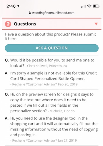
A Q&A section on a product page is a must for retailers dependent on organic search traffic and that sell widely-available items.
Q&A. A Q&A section on a product page is a must for retailers dependent on organic search traffic and that sell widely available items. In my experience, a Q&A section can increase conversions by 5 percent, reduce customer service contacts by 20 percent, and increase organic traffic to a product page by 20 percent. For mobile devices, present a simple form with open text space for shoppers to ask a question, along with fields for their name and email address. Your response will trigger those shoppers to revisit and explore again.
Shipping options. Many sites offer multiple shipping options with multiple delivery windows and costs. For mobile shoppers, present the estimated delivery window up front, near the call-to-action. Avoid showing shipping costs on mobile product pages. Leave those calculations for the cart.
Videos. Videos are increasingly important for high-value products and for items that require close inspection, such as a backpack or a grill. However, on mobile devices videos can ruin a product page. Never start videos automatically unless the sound is muted. It’s best to show a video as a thumbnail with a play button. Doing so will reduce page load and increase dwell time.
360° photography. Use 360° images for products that require a moderate amount of consideration, where three pictures will not suffice. For example, cake toppers and glassware are often viewed from multiple angles in real life. Pens and plates are not. Most 360° imaging software costs at least $5,000 for mobile-optimized photos, plus the time to shoot each item.
Bonus Features
Breadcrumbs. On desktop sites, visitors can easily navigate with pull-down menus or search bars. For single-category sites (e.g., camping or housewares), include breadcrumbs at the top of every mobile product page. This allows visitors to go back and explore other products.
Recommendations. Dozens of recommendation engines exist for ecommerce sites. But none to my knowledge optimize ideally for mobile experiences. Consider separate recommendation sections, such as “Similar Items,” “Others Also Bought,” “Recommended Accessories,” and “New.” Each of these should contain no more than four products in a 2×2 layout. For additional recommendations, display a clear indicator to swipe left or right.
Sharing. Mobile sites should include an easy way for visitors to share the item with others and even themselves. Too often, on-the-go visitors can’t keep track of the sites they’ve visited. An easy “Share” button with an email icon lets them quickly send or save a product-page link. Place this icon near the product description on mobile devices.