
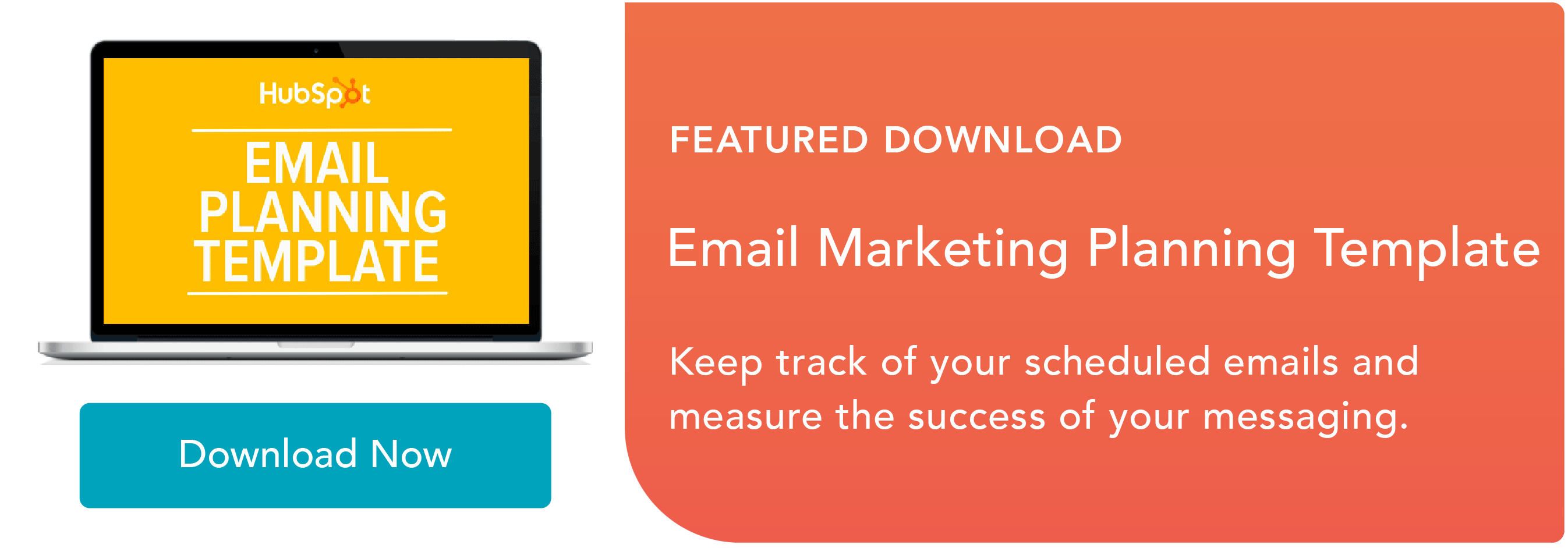
The other day, I received the following email from Adobe and opened it on my desktop at work:
This email from Adobe gave me a top-notch email experience on desktop. However, I didn’t have time at the moment to “Learn more”, so I marked the email as unread and saved it for my commute home.

An hour later, on the T, I re-opened the email on mobile. Now, imagine if I opened this email on my phone and the image was low-quality, the text was too small to be read, and the call-to-action button was broken — as someone who prefers to read email marketing messages on their phone, this would frustrate me and, ultimately, drive me to unsubscribe from the email list altogether.
I’m not the only one who prefers to read marketing emails on their phone. In fact, more than half of U.S. residents prefer to look at email marketing messages on their phone. Optimizing emails for mobile is so important because that’s how many readers are accessing marketing messages.
So the proof is out there, sure, but how do marketers stop sending emails that aren’t optimized for multiple screens? Responsive email is the answer.
Responsive emails are emails that use fluid images and tables to remain flexible across different screen sizes. Ultimately, they deliver content designed for the user’s optimal experience.
Though responsive emails can be designed using CSS media queries, you don’t need any coding experience to make one. Creating a responsive email isn’t just a job for coders. Here, we’ve lined up some best practices, ready-to-use templates, as well as a quick tutorial about the fundamentals concerning responsive emails.
But first, let’s clarify — what is a responsive email, anyway?
What is responsive email?
A responsive email is an email that’s optimized for any device, including a phone, desktop, or tablet. They adapt to multiple screen resolutions, which is particularly useful as demand for mobile-friendly content continues to increase. Responsive emails are also more accessible, since they allow subscribers to read on their preferred device or on-the-go.
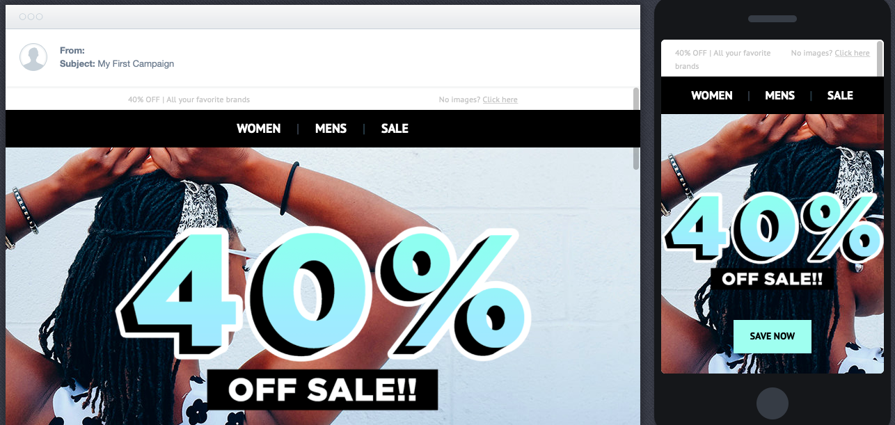
To illustrate, here is how a promotional email I received yesterday looked on desktop:
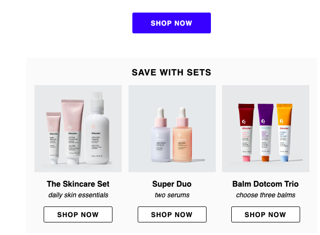
This email has awesome imagery, shoppable icons, and is nicely formatted. When I open the email on mobile, this is what I’m greeted with:
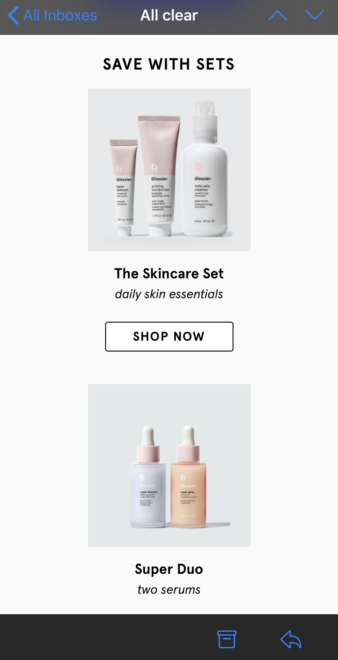 I still have the same information, and the same photos and shoppable icons —the only noticeable difference is the email format. It’s different to better fit the mobile experience.
Now, imagine if that same desktop layout was applied to mobile. I’d have to zoom-in on my phone to see any of the pictures or text. Instead of doing that, I’d unsubscribe.
Low-quality emails could potentially communicate to the subscriber that the quality of that interaction wasn’t taken into consideration. Ultimately, non-responsive emails can result in a loss of subscribers.
With responsive email, user experience can be enhanced, as well as campaign ROI. Think about it: subscribers satisfied with an optimized mobile email design will find themselves opening more marketing messages because they know it’ll look good.
So, with all this talk about responsive emails, you must be itching to create your own. Next, we’re going to look at easy ways to create responsive emails, as well as provide best practices.
Responsive Email Templates
A responsive template will automatically adapt to any screen size, so whether the email is opened on a smartphone, tablet, or computer, it will look great and have complete functionality.
For those with less of a coding background or those looking to spend less time with design, my advice is to use a template. They’re a surefire way to make sure your email will look professional and be responsive.
Responsive email templates save you time on designing an email that could’ve been picked out from a selection. For example, HubSpot’s email marketing tool includes over 60 templates just for responsive emails.
Let’s take a look at some templates options now.
1. HubSpot
HubSpot offers a couple of free responsive email templates. If you’re a HubSpot customer or a free user, you can download and try them out for yourself. For instance, here’s one of the responsive email templates — notice the sidebar, where you can preview the template on multiple devices.
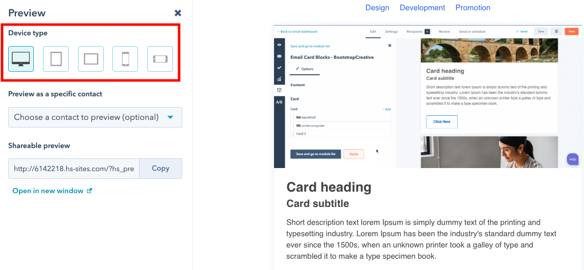
Clicking through device types and making sure your email is formatted accordingly is one of the final steps in the design process, and is the only step in the responsive email process when you’re using software like HubSpot.
By clicking on the smartphone device for preview, for instance, you can see if your content — including font size and image resolution — is formatted in a way that’s pleasing for mobile.
2. CampaignMonitor
The templates offered by CampaignMonitor are similar to many others, in which responsive email results are shown in the preview tool. For example, here is a CampaignMonitor template:
Source
One thing I really like about this set-up is how you can see the different devices side-by-side so you can compare design elements easily. Tiny edits can be made to create the best experience for all subscribers.
CampaignMonitor templates are often free, so it’s a good choice if you have a minimal budget.
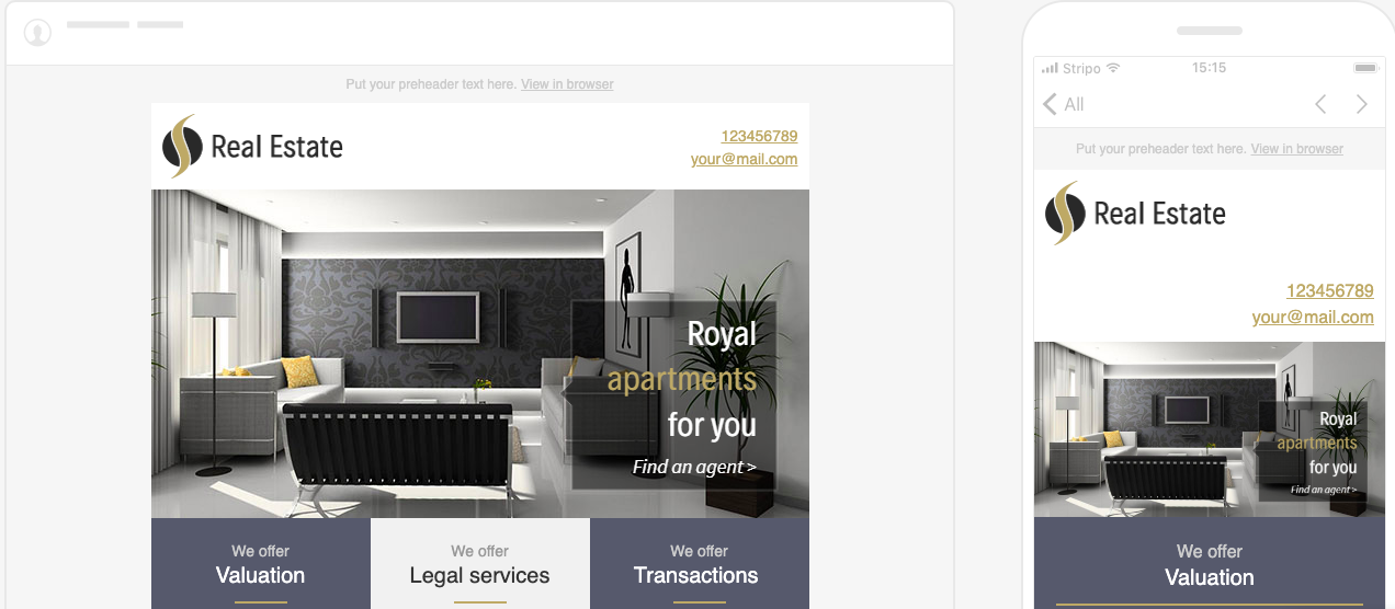
3. Stripo
Stripo offers over 300 free HTML email templates. You can choose templates by industry, season, type, and feature. For instance, here’s a template from their business industry section:
Source
A good sign of a solid responsive email template is the option to see the preview in both desktop and smartphone variations, as shown in Stripo’s preview mode. Notice how a single column layout was adopted in the mobile preview to fit the specifications of phones.
I like Stripo because it’s a website you can visit quickly to find a template that fits your goals. You might consider Stripo if you’re looking to try out responsive emails or want some design inspiration.
4. Constant Contact
Constant Contact offers over 200 professional email templates that are accessible after signing up. From looking at the example below, you can see that the platform offers responsive email templates:
Source
Constant Contact’s templates have drag-and-drop editing, the option to add surveys, Ecommerce functions, and a photo library tool. These features can all help to create the email subscribers want to see.
It’s helpful to use a service like Constant Contact because the specific tools allow you to maintain consistency, like in the example above. You can tell that the responsive nature of the email doesn’t compromise any of the design elements.
Now that we’ve taken a look at some template options, let’s look at another way to make responsive emails work, and best practices.
How to make an email responsive
If you have a coding background, you can make an email responsive by using code.
Some best practices when coding responsive emails include making sure your responsive email is scalable and flexible. Additionally, remember that responsive emails require CSS media queries to change fields that are fixed to fields that are fluid.
Another responsive email design best practice is to use larger fonts that will be easy to read on screens that are smaller. Single column layouts are also easier to be scaled, so if simple layouts are good for your webpages, definitely consider it for a responsive email.
The next time you create an email campaign, it’s a good idea not to finalize any of the designs until you see how they look across multiple screen resolutions. So many people access emails by mobile just for the ease of it. A simple way to check the effectiveness of your email is to send it to yourself or team as a test — does it stack up against the other responsive marketing emails in your inbox?