Everyone knows that mobile is red-hot right now. In fact, there is a pretty good chance you are reading this very article on a mobile device.
And yet, like an old dog who just won’t learn a new trick, most people are still designing websites for desktop computers and then trying to make them work well on mobile devices. Square peg, meet round hole.
Quite simply, it doesn’t make sense. Why would you create a website for a dying medium (cough, cough; desktop) and then try to force it to work for new technology? It doesn’t have to be this way.
Why not, instead, create a website for the devices most people are using that will also work on a desktop?
Google has made it clear that mobile-first is the way to go. It is time to leave the past behind because five billion mobile phone users have made it clear they aren’t going anywhere.
Here is why designing for desktop first is a mistake, why responsive mobile design isn’t enough, and why mobile first is the only way to go in 2019.
It is time to put a stop to responsive mobile design
Let’s say you need a train. You want a fast one, one that can get you from Paris to London in two hours. (Ignore, if you will, that this train already exists.) Would you build a coal train, then convert it to a high-speed diesel-electric train? No, that would be a ridiculous waste of time and resources, particularly since the high-speed train can run on standard tracks.
And yet, that is what most people are doing when it comes to designing sites for mobile. They create a site for desktop first, then try to make it work on mobile instead of building a better, faster site that will work just fine on both.
Before we dig into how to design mobile first websites, we need to talk about responsive design.
What is the difference between responsive mobile design and mobile first design? Aren’t they, essentially, the same thing? Not quite.
Is ‘mobile responsive’ the same as ‘mobile first’?
Mobile responsive and mobile first have some of the same ingredients, but their methods, approaches, and strategies are totally different.
Here is how they differ:
Mobile responsive is a technical web design approach where CSS is used to adjust the site to the device it is viewed on. The coding is more complex, and the design still often places desktop needs at the forefront. In other words, the website’s built for desktop users first and then made to work on mobile later.
Mobile first, on the other hand, is a design strategy. While it may use a mobile responsive framework, it considers mobile users’ needs first and foremost. Instead of creating a desktop website and then forcing it to fit in a mobile box, you create a website that considers the majority of users (on mobile) first.
Mobile websites have been an afterthought for years. Yet, 52.64% of all internet traffic happens on a mobile device.
By implementing the seven strategies below, you’ll start designing websites for the devices users are actually using and not just for desktop.
Seven easy strategies to create mobile-first websites
Designing for mobile first doesn’t have to be complicated. And with the rise of the freelancer and gig economy, finding high-quality designers isn’t complicated either.
So get started and start putting the needs of your mobile users first.
Here’s how you can keep your mobile users at the forefront of your mind and get a few handy tools to make your life easier.
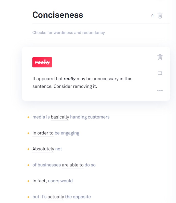
1. Less is more when it comes to content (yes, really)
Wait, what? Isn’t longer content better?
Well, (here comes everyone’s favorite internet answer) it depends.
Longer, more in-depth blog posts are, in fact, proven to generate nine times more leads than short posts.
But, mobile readers are looking at tiny little screens.
To be mobile first, your content needs to be concise and clear, so keep the mobile-first design in mind when starting your blogging strategy.
Solution: Keep your copy succinct and unique using a grammar tool to deliver in-depth information in as few words as possible. Break up text into single-sentence paragraphs when possible.
2. Keep your site simple
Minimization is having a pop-culture moment. The truth is people, love simplicity. It reduces anxiety, improves clarity, and makes us happier.
This applies to web design as well. Less, really is more. Keep the website elements you truly need and ditch the rest.
“But, what about X thing that my site really, really needs??” Ask yourself, “Does it spark joy?” If yes, then keep it.
Ask yourself if each element is really necessary. For example, could you ask fewer questions on your 13 field contact us form?
Can you reduce the number of links on your nav bar?
Here are six more website simplification tips:
- Reduce the number of pages on your site
- Add an improved search feature so users can still find what they need
- Increase white space to reduce the appearance of clutter
- Use clean lines and wide borders
- Use a simple font and make it larger
- Keep a maximum of two columns on mobile

Solution: Keep it simple. Get rid of tiny buttons, ditch scrolling images, trash that 13 field form.
3. Bring your calls to action (CTA) into the 21st
There is nothing worse than clicking on a link from your mobile device that doesn’t load because, while the main site is mobile responsive, the landing page it links to is not.
Or, our favorite, when you get taken to an off-center, impossible to fill out lead-gen form.
Your calls to action are useless if they aren’t designed with mobile in mind. Which means you are missing out on leads and sales.
Solution: Stop throwing money down the drain. Make sure your CTA is designed mobile-first, too. Test links and consider using mobile-friendly calls to action such as SMS text messaging and live chat.
Additionally, your mobile conversion funnel needs to be brought into the 21st century with new features like mobile vibration on button clicks, full-screen mobile e-commerce experiences, and signature collection.

4. Let’s talk about it: Make mobile communication a breeze
There is no question that mobile devices have changed the way we communicate with each other and with brands.
Did you know that 97% of Americans report they send at least one text message a day? Research even shows that the increase in text messaging has contributed to a rise in phone call-related anxiety.
People want answers to their questions now, not at 9 a.m. when your phone support opens back up.
And they don’t want to call you if they don’t have to.
Have you adjusted your contact methods to meet the communication preferences of today’s consumers? If not, you may be leaving customers dissatisfied–without even know it. It is time to change. Luckily, there are plenty of tools to make this shift painless.
Consider using a help desk software like Freshdesk to manage your customer communications across channels and devices. It can track previous conversations, prioritize incoming requests, and even help automate the process.

Or, consider adding a live chat or a chatbot to your website to humanize your website for mobile users. If you are looking for an easy way to transition, this is it. Chatbots are a great way to give a fantastic mobile experience without a massive overhaul of your entire website.
Solution: Use technology like chatbots and mobile-friendly help-desk software to make mobile communication frictionless.
5. Graphic design for mobile first
You might be wondering, “Does graphic design really matter when it comes to mobile first?” The answer is a resounding yes!
A study into the value of graphic design found companies who emphasized on graphic design outperformed non-design-focused companies by 200 percent. Well-designed websites are also considered more trustworthy, more memorable, and easier to use.
So, what does mobile first graphic design look like?
According to Venngage, the most significant graphic design trends of 2019 are:
- Vivid colors
- Strong typographical elements
- Geometric shapes and abstract patterns
- Light and dark contrasting color schemes
- Gradients and duotones
- Bright minimalism
- Original, hand-drawn illustrations and designs
- Real photographs
What does this all mean in practice?
Aim for bold shapes, clean lines, bright colors, and typographical elements. Make use of white space, which is both visually soothing and makes navigating on mobile easier.

Solution: Use graphic design tools to make creating memorable, trustworthy, and easy to use websites simple. We love Canva and Snappa for their library of templates and stock photos.
6. A need for speed
Site speed has always been important to user experience. But now, site speed is a Google ranking factor, too.
If you are too cool to care about what Google thinks, consider that 40% of people will leave a website if it takes longer than 3 seconds to load.
Even more damaging, 79% of shoppers are less likely to buy from a site again if they experience web performance issues.
Clearly, your site needs to load fast if you want to survive on mobile.
How to improve speed on your mobile first website
Luckily, building your site with an eye on mobile first means you aren’t stuck trying to strip features away to make your site load faster on mobile.
Instead, you can implement speed protocols from the beginning.
Here is how to build a fast, mobile-first website.
- Check your page speed using Google’s Test My Site.

- Install a CDN, which loads content from a cache closest to the user.
- Compress images so they look good but load fast
- Consider using lazy load, which loads elements separately so the user can view at least some of your content right away.
- Make the switch to HTTPS, which is faster, more secure, and has SEO benefits.

Solution: Start by testing your mobile page speed, then implementing the changes above.
7. Test, test, test
The more things change, the more things stay the same.
Testing is more important than ever for websites. Even the most carefully designed mobile first website needs to be tested on multiple devices.
Why? Currently, there are at least nine different operating systems in use on mobile devices.
According to StatCounter, Android makes up 75% of the mobile operating system market share. iOS clocks in with just under 22 percent of the marketing share, but KaiOs, Windows, and Samsung all claim at least a small portion of the market.

Dozens of new phones are released every year. In fact, Motorola released 11 new mobile devices in just 2017.
In 2018, Apple released two new iPad models (Mini and Pro), two new iPhones (iPhone XS and XR), and three new computers (new models for the iMac Pro, MacBook Pro, and Mac Mini).
Trying to keep up is just plain exhausting. If you want to stay ahead of the curve, you need to test your site across platforms regularly.
Solution: Use a cross browser and cross platform tool to see how your site performs across the multitude of different operating systems and devices.
Conclusion
The desktop computer is dying. Mobile responsiveness is not enough to keep mobile users on your site.
If you want to create an easy to use website that Google and users will love, mobile first design is simply the only way to go.
But changing the way we’ve always done things can feel overwhelming.
You’ve got enough on your plate, right?
As you can see, the mobile first design doesn’t mean changing your entire process. Instead, it means reimagining how we create content, images, CTAs, and communications while keeping a firm focus on mobile users’ needs.
Stop spending too much time creating sub-par mobile sites that users hate. Instead, use these tips to build websites that search engines and (more importantly) web users will love.
Adam Enfroy is Affiliate Partnerships Manager at BigCommerce, and also does Content Marketing Consulting and Blogging at adamenfroy.com. He can be found on Twitter @AdamEnfroy.
The post Why mobile first design is the only 2019 strategy that will work appeared first on Search Engine Watch.