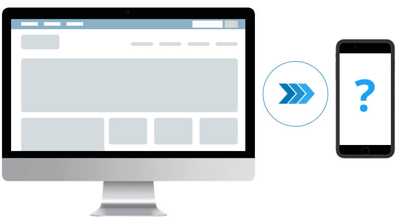
With over 80% of internet users owning a smartphone and 50% of those owners grabbing it immediately upon waking up (according to both Smart Insights and Express Pigeon, respectively), it’s no wonder that more and more businesses are strengthening their marketing strategies by ensuring that their website is mobile-friendly and responsive. Not designing a site that is as easy to experience on mobile as it is on a desktop would mean a loss of visitors and customers. Mobile design is essential, which means that as you plot and plan a new website design or redesign, you need mobile mock-ups (also known as comps). Here are the reasons why.
It Helps You Focus on Your Users
Looking at the aforementioned stats, you can accurately assume that a lot of your user base is most likely on mobile. As of 2018, around 55% of website usage is done via mobile device or tablet. I was once working with a client and asked about mobile vs desktop usage stats on their website. They were convinced that most of their users were accessing the site by a desktop, but the data I had acquired on their users contradicted that. Focusing on only desktop mock-ups, when the number of desktop visitors might be less than 30% of your users, doesn’t make sense.
It Simplifies Your Product
Designing for mobile causes you and your stakeholders to simplify, which is good for everyone. A simple, clean website is easier for everyone to use and generally looks much more visually appealing than a cluttered and complex one. Forcing a lot of fluff and features from a big screen into the constraints of a smaller screen is a lot more work than the other way around.
Developer Handoff Is Seamless and Cost-Effective
Having mobile comps eliminates the need for developers to spend extra time trying to figure out what all of those desktop features are supposed to do on mobile because it’s already been planned and designed. Think about it: a sidebar filter for a section of products works beautifully on desktop, but on mobile, there’s no room for a sidebar. What happens to this vital user control once we view it on smaller screens?
By investing in mobile website mock-ups you may also find things that are possible on a desktop but not on mobile. These will be discovered early so you can plan accordingly or come up with another design that works for all screen sizes.
Users Expect a Great Mobile Experience
Designing strictly for desktop and then scaling down for mobile might get you by, but users are increasingly becoming more accustomed to a stellar design and experience in the mobile apps they use. When they come across a website that feels thrown together on mobile, they will notice. And if the competition has a site that feels closer to the app experiences they enjoy, they’ll probably move on to those websites, meaning that you lose visitors and potential customers to your competitors. This survey reveals that 57% of users say they won’t recommend a business with a poorly-designed mobile site.
Your Competitors Are Already Thinking Mobile First
Your competition is likely already thinking mobile-first and if not, you have a chance to take the advantage with an increasingly mobile audience. Consider this statistic: in 2016, 51% of all digital ad budgets were spent on mobile. By 2019, that statistic is expected to grow to 72%!
Better Mobile Readability
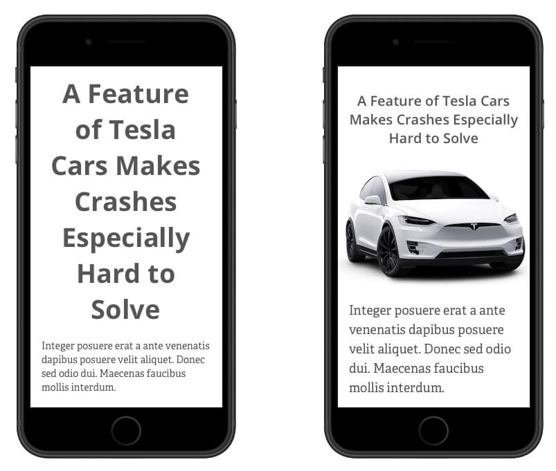
One of the most common problems I see when a project does not set aside time to work on mobile mock-ups is that the typography and call to actions suffer greatly. The reason for this is that the large, 50-pixel heading that looks bold and beautiful on a desktop, looks comically large and hard to read on mobile. On the flip side, often perfectly readable body text and calls to action can be rendered too small on mobile. Take a look at the screenshot below to see the difference taking a bit of time to focus on mobile elements can make.
Hopefully, I have convinced you of the importance of mobile mock-ups. Remember, a website that is designed to adapt to all mobile devices saves you time and money. Don’t think of mobile experience as an afterthought. Keep it at the forefront of your mind during the initial planning stages of your website. Doing so will pay off later.
Also published on Medium.