
![]()
Earlier versions of The 2 Create a Website homepage weren’t too inviting.
Let me be blunt…
Some of my homepage designs were a wreck — especially the first several years when only part of my site used WordPress.
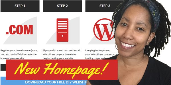
I recently gave my homepage a cleaner look thanks to the Visual Composer plugin, and my analytics tell me it was a good move.
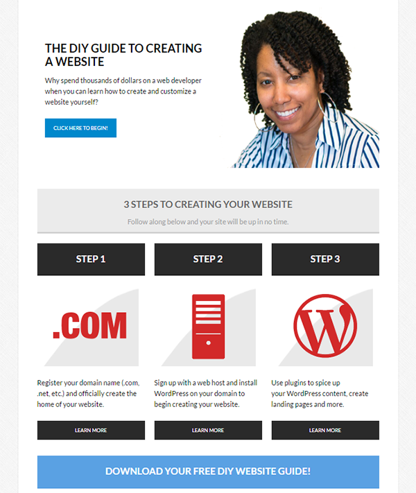
In some previous versions, I was more concerned about sharing what I thought was important instead of putting myself in the shoes of someone who first arrived.
The content YOU value, might not be the same content your visitor’s value.
It’s a common mistake…
When we create our homepages, we tend to assume that people are going to read every word and click every link on the page, but that’s just not the case.
In fact, most people only read about 10% of your site. And the busier the homepage, the less they read.
Your Homepage Is Not About What YOU Like!
We all have content that WE PERSONALLY FEEL is important and want to highlight:
- We want to sell a product or earn an affiliate commission
- We want to tell our story
- We want to highlight our popular posts that we’re proud of
- We want to display our latest posts
But it’s not about us.
Look at your site with a critical eye and ask, “Is this content important to my desired visitor when they first arrive?”
Imagine you have a gardening YouTube channel or podcast, and you tell your subscribers to go to your website to learn how to start their first garden.
Yet when they arrive, there’s nothing but your latest blog posts about personal gardening experiences you’ve had.
How is that helpful to someone who wants to learn how to garden?
Ken Evoy of SiteSell used to say this all the time, and it’s so true…
For years, I had links to AdSense and other random content that I might have been proud of on my homepage.
But it just wasn’t relevant to my visitor at that point.
If someone arrives at my site from googling “how to create a website”, it’s highly unlikely they care much about Google AdSense.
So why clutter my homepage with links and content about it?
Big mistake.
SEO Imprisoned Me For Years
One reason we are tempted to pack our homepages with content and links is SEO (search engine optimization).
And that can be a hard habit to break.
The number of words on a page played a big role for many years, but it’s no longer as much of a factor.
If you have strong links pointing to your site from others, those matter much more. That’s why it’s not hard to find sites ranking first with very little content on the homepage.
While it does bite that Google continues to push small businesses down the rankings, the positive side is we can concern ourselves more with creating websites for PEOPLE instead of SPIDERS.
I remember counting words on my pages before launching to make sure I had at least 750 words. I would add fluff just to beef up the word count.
It’s so freeing to not care about that anymore!
I’ll be talking more about this in my next post, but I’m completely revamping the content layout on this site.
- I deleted about 30% of the outdated and less relevant content
- I’m adding more focused content about using WordPress
- I’m simplifying my menu and organizing the content more logically
- I’m using WordPress categories more efficiently
And it feels so freakin’ good to not give a HOOT about what Google is going to think.
The Post-Only Format Is Not Ideal For Every Site
WordPress is typically synonymous with blogging, but it’s NOT just a blogging tool where you only arrange your content from newest to oldest.
It’s a content management system, and unfortunately most WordPress users don’t take advantage of how dynamic and flexible it truly is.
There’s nothing wrong with a traditional blog because for you, that might be all you need. We all have different needs.
But for me, 2 Create a Website was always created to be a tutorial site for people who want to create websites.
So that’s why I’ve never liked or relied on the TOTAL blog post layout or only highlighting my recent posts on my homepage.
Sure, I have this blog section that is organized in a traditional blog format, but the rest of my menu goes to landing pages that I will be building out logically.
This site has always been like that, but now I’m decluttering and re-focusing the content again, and more importantly, making it easier to reference!
2 Create a Website sort of lost its identify over the years with so much different types of content as I discussed here. Now it’s time to gain it back!
They’ll be more on the new site additions and the strategy/tools behind the layout in another post. This one is long enough! 🙂
Does Your Homepage Pass The Test?
So if your site is about teaching someone how to do something, look at your homepage and answer these questions…
- Would a first time visitor know how to start?
- Am I distracting people from what I want them to do with too much clutter?
- Is all this homepage content really relevant to people when they start?
And if you don’t know WHO your likely visitor is, then that’s a problem in itself. You need to define that first.
Fear Not!
If you’ve always had a busy homepage, it can be scary to trim it down. Trust me. The first time I did it two years ago, I had some serious anxiety! 😛
You might feel like you’re leaving something important out.
But if you answer those three questions above you’ll realize…
Oh and by the way, as a result of streamlining, my homepage’s bounce rate went from 65% to 49% and my email opt-in rate is higher than it’s ever been.
A bounce rate is the percentage of people who exit on the page they entered on. The lower the better. Blogs typically have a bounce rate in the upper 60s to 90s because people often read one post and leave.
Tutorial/informational sites tend to have lower bounce rates because the information is arranged more logically.
You can see your bounce rate by installing Google Analytics.
And if you’re wondering how your bounce rate stacks up, here’s a quote from RocketFuel.
As a rule of thumb, a bounce rate in the range of 26 to 40 percent is excellent. 41 to 55 percent is roughly average. 56 to 70 percent is higher than average, but may not be cause for alarm depending on the website. Anything over 70 percent is disappointing for everything outside of blogs, news, events, etc.
Bottom line…
There’s a reason you’re seeing so many people streamline their homepages and go with a more personal, clean look.
They’re ditching the clutter and highlighting their blog posts elsewhere.
These homepages are much more inviting and they convert!
I’ll be back to discuss more lessons from my re-org in a future post. Now, if you’ll excuse me… I’ve got a LOT of work to do. 🙂
Update: I uploaded a podcast about this subject where I go into more details about creating a silo structure to optimize your content organization.