This is a guest post from Ronita Mohan at Venngage.
Newsletter design has changed in recent years, and marketers and designers are finding new ways to optimize their designs to improve conversions.
The days of text-only newsletters are quickly dying away—people are far too busy to spend their time reading through large blocks of written content.
If you want your customers (or potential customers) to read your newsletters, you need to focus on design—making it appealing, legible, and valuable to the reader.
Design tips for newsletters
Read on to discover seven ways to use design to encourage consumers to open your emails, engage with them, and eventually to click through to further content and purchases.
These seven points are:
- Branding
- Accessibility
- Color schemes
- Bold fonts
- Asymmetrical layouts
- GIF use
- Minimalism
Learn how to design high-performing email campaigns in our guide.
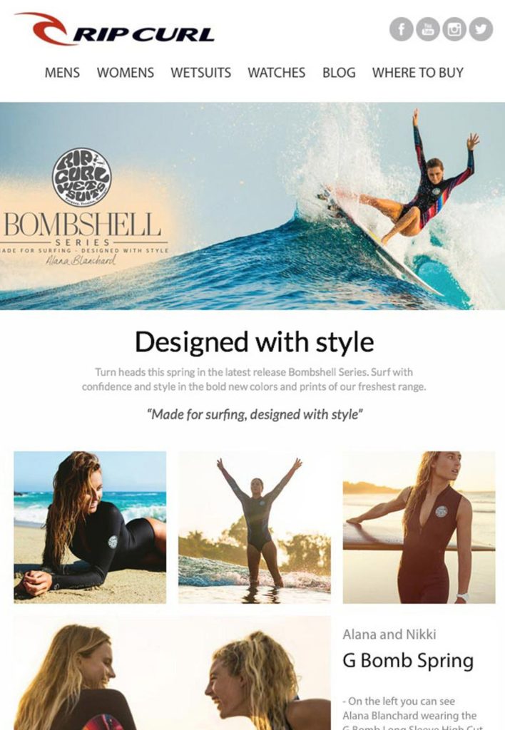
1. Branding isn’t just a logo.
Source: Rip Curl Customer Story
Brand newsletters need to have strong branding elements; that’s what makes the newsletter uniquely yours.
But simply including your logo somewhere in the newsletter doesn’t make your brand memorable—you need to think beyond that essential element of design.
Branding can include a number of other elements such as fonts, colors, personality, and voice. These need to be incorporated in your newsletter design.
Your email newsletters should be consistent with the visual brand that your company has already cultivated, even though newsletters are vastly different from most of your other marketing efforts.
Look at the advertising creatives, social media posts, or even blog posts that you’ve already created. These would’ve cemented your brand identity in the minds of consumers.
Use these elements to inform your newsletter design. Incorporate brand colors into your newsletter so that your marketing materials are immediately recognizable.
Employ fonts from your branding guidelines, or fonts within those font families, to establish a cohesive identity.
Don’t rely entirely on your logo to create brand awareness for you—a logo can be dismissed by consumers
But color schemes and fonts are more likely to stay in people’s minds and will become associated with your brand over time, giving them more reason to open your emails.
Learn about using images in email and how to edit them directly inside your email.
2. Make your newsletter accessible.

Source: Venngage
For far too long, brands have failed to acknowledge the disabled community with their marketing collateral.
But, with strong advocacy over the past few years, the need for accessibility in brand communication has become a priority, and it should be a requirement when designing newsletters.
Are you designing for accessibility? Find out here.
Making your emails and newsletters accessible is something all businesses can prioritize—it’ll help grow your audience and improve click rates.
There are a number of ways that marketers and designers can move towards universal design that can be easily viewed by people who do and don’t have disabilities.
These disabilities could be related to visual impairments, hearing impairments, or mobility. Here are some things you can do to make your newsletter design more accessible.
Avoid relying on color.
People with color-blindness have difficulty distinguishing between reds and greens. If your newsletter design uses these colors, or similar ones, it’ll be lost to the consumer.
Instead of using color to distinguish information, share a particular meaning, or to show data, use text to convey the same information.
Alternately, use starkly contrasting colors to ensure that everyone can see the difference in information you’re presenting.
You can refer to the below chart for choosing the right colors for your universally designed newsletter.

Source: Venngage
Avoid flashing imagery.
GIFs have become a popular tool to include in newsletters, and we’ll be discussing how to incorporate them later in this article.
But, while you can definitely use GIFs and videos to maintain attention, avoid using anything that flickers, flashes, or has a strobe light effect. These can have adverse effects on viewers, even if they seem like a good idea.
Ensure that edits between images and scenes are seamless and gentle, so that everyone watching these visuals can enjoy them.
Correctly sized fonts
The fonts you use should be legible—this should be standard practice, no matter which user your newsletter is catering to.
But, beyond legibility, your fonts should be clear, even if they’re magnified.
Some people with visual impairments use a magnifier to read screens and, if the fonts in your design become illegible when magnified, you’re not catering to a segment of your consumers.
Additionally, you should break up your text with imagery or by using multiple shorter paragraphs. This will make it easier for people to read your text.
Ensure your line spacing and paragraph spacing is at least 1.5—not only is this more visually appealing to readers, but it makes it more legible for people with visual impairments and dyslexia.
We’ve got all you need to know about web fonts. Click to see the guide.
Screen readers
Consumers with visual impairments often use screen readers, which read out everything on a newsletter, including image captions or alt text.
Thus, images included in your newsletter should have relevant alt text that’ll make sense to anyone using a screen reader.
The same goes for headers—use h1, h2, and h3 headers to distinguish the hierarchy of information you’re sharing to ensure that it’s read correctly by a screen reader.
Making your newsletters accessible isn’t a difficult task and will help you reach a target segment that could significantly impact your conversion rates.
3. Color schemes
Color can convey your brand identity but it can also have strong associations with emotion. Red can be attractive, romantic, and angry. While blue is calming, corporate, and earthy.
Decide what message you’re trying to send and choose your colors accordingly.
We’ve spoken about the importance of using color contrast to make your newsletter design more accessible.
But, in general, strong contrasting colors can make your newsletters look more appealing and more memorable.
You can also use color to make your newsletter design more seasonal—orange and light yellow for fall or white and dark blue for winter.
When choosing a color scheme, you have a few options, depending on the kind of message your newsletter wants to share.
Highlight color
Not everyone is comfortable using a cornucopia of colors in their newsletters. But you don’t have to use numerous colors to share your message.
Instead, you can use a single strong accent color that highlights the message of your newsletter.
This could be used for a CTA or to elucidate a single fact in a chart.
A highlight color can make your newsletter pop and help direct your reader’s eye to the most important messaging in your newsletter.
Complementary colors
You don’t always have to use contrasting colors throughout your newsletters.
Complementary colors—colors that are side by side in the color spectrum—can add to the attractiveness of your newsletter, particularly if used in the background.
A gradual gradient encourages the eye forward when scrolling through a newsletter while making the design look cohesive and attractive.
When paired with a strong contrasting color, like we covered in the highlight section above, your newsletter design can be soothing and punchy enough to increase click rates.
Contrasting colors
Contrasting colors weren’t the most popular concept up until recently, but it has become a favored design trend in the digital sphere.
As we’ve mentioned, contrasting colors make materials more accessible to people with color-blindness, which is a great reason to use this style.
But contrasting colors are also a good way to divide sections of your newsletter—particularly if it’s a long one.
Contrasting colors are pleasing to the eye, if chosen well, and can dictate how consumers view your messaging.
4. Use bold fonts.

Source: Campaign Monitor
When it comes to design, you need to look beyond colors, to how your readers interact with your content marketing.
To do this, you need to examine the fonts you’ll use in your newsletter. For one, it’s best to keep your font use to a minimum—two or three, at the most.
Your header font can be over-large—to make an impact and to help with readability.
The remaining fonts—sub-headings and body text—should be smaller, so as to not interfere with the heading.
You need to keep your brand font in mind when choosing fonts—don’t pick something that’s too off-brand or it’ll be jarring to readers.
Avoid changing your font use too often—this will affect brand recognition and leave your consumers wondering which company’s newsletter they’ve received.
5. Asymmetrical layouts
Symmetry is fast becoming a thing of the past—asymmetrical layouts are in fashion across the digital marketing sphere.
Newsletter layouts tend to have a standard flow—usually top-to-bottom or left-to-right—but that doesn’t mean you need to use that format at all times.
Be unconventional in your layout—use asymmetrical frames, remove frames altogether, or use a zigzag layout.
You can be as unusual and creative as your designing system will allow you to be. But remember to ensure that your newsletter is responsive for different-sized screens.
According to email marketing best practices, responsive design is a must in the current digital age because people are more likely to view newsletters on their phones.
So be creative with your layout but conduct extensive tests to ensure that it displays properly to the consumer.
6. Include GIFs.

Source: Beauty Bay
GIFs have become increasingly more popular over the past few years, and including them in newsletters seems like a natural progression.
To keep things light, fun, and interactive, you should be looking at using GIFs in your newsletters, either in the header or as the complete design.
Not only are GIFs attractive, but they can share a great deal of information with your subscribers that a still image can’t.
For instance, you can use a GIF to show the change in data in a chart or as a how-to guide for using your product or services.
The use of GIFs in these email design examples shows how creative and fun they can be.
But it’s important to remember that your GIFs shouldn’t flicker too much, as we mentioned in our section on accessibility.
7. Go minimal.
We’ve discussed colors, fonts, layouts, and the importance of accessibility, and there’s a way to combine all those elements together to make a powerful newsletter: by going minimal.
Brands are often afraid of minimalist newsletter design—too much white space and limited text seems a waste of time and energy. How are you going to convey your message?
But a minimalist design can be cleaner, less cluttered, and make your content far more legible than traditional designs that incorporate imagery, text, illustrations, and CTAs together.
Use a set of frames in your newsletter that keeps elements of your design, such as imagery and text, separate yet connected.
However, don’t overdo the use of frames—that can make it difficult to follow your message or look untidy.
A minimalist design can improve your newsletter’s readability and lead to more conversions.
Wrap up
Newsletter design is a constantly evolving field—the design can be what you make of it and is only limited by your technology and imagination.
Focus on making your branding stand out but don’t rely entirely on your logo—optimize the use of your brand colors and fonts to improve brand recognition.
Don’t forget about accessibility—use colors, fonts, and interactive content that will be legible for everyone.
There are numerous color schemes that you can use, but decide in advance what the purpose of your colors are: to highlight inform, draw the eye, or to make content stand out.
Don’t be afraid to use bold fonts, but prioritize readability. The same goes for unusual layouts—they should still be readable and responsive.
Use GIFs to make your content more attractive and interactive. But, at the end of the day, seriously consider going minimal with your designs.
These seven design tips for newsletters will help you create newsletters that are attractive to readers and will motivate people to click on them more often.
 Ronita Mohan is a content marketer at Venngage, the online infographic template and design platform. She enjoys writing about productivity, design, social media, the digital world, as well as pop culture and diversity.
Twitter: @Venngage