Today, to build upon our working knowledge of data distributions, we’re going to be analyzing CPC data using box and whisker plots. If you missed the first installment, get caught up on histograms and meet us back here.
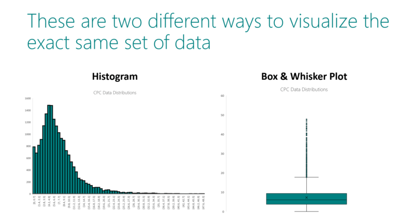
If you’ve finished part one of this series, then the histogram on the left should look familiar. The plot on the right is a box and whisker plot, created from the very same set of CPCs that we used in part one. Hooray for continuity!
First, let’s ground ourselves in some basics. Because we are not segmenting our data in any way, and therefore using only one distribution, the CPC value will be expressed on the y-axis, and the x-axis will be null.

Now, let’s go through the components of the box and whisker plot. First off, the x.
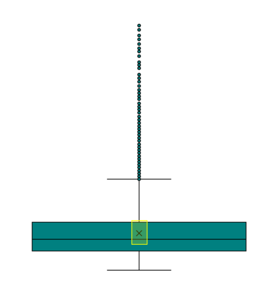
This x represents the mean value of the distribution, which you’ll recognize as the simple average often associated with your search data. For the purposes of this exercise, the X is your average CPC. To that end, the line in the middle of the box represents the median.

While getting both the mean and median of the distribution in the visualization is a wonderful feature of the box and whisker plot, the four quartiles can help divine a lot of information that we can’t get at through a histogram.

The bottom threshold of the box (or left-most threshold for a horizontally justified plot) is the lower quartile, or first quartile, or Q1, and it represents the number such that 25 percent of observations are less than it and 75 percent are larger. In this context, think of an “observation” as a single data point.
The top threshold of the box (or right-most threshold for a horizontally justified plot) is the upper quartile, or third quartile, or Q3, and it represents the number such that 75 percent of observations are less than it, and 25 percent are larger.
Following this same notation, you can also infer that the median serves as the second quartile, given that 50 percent of observations are greater, and 50 percent are lesser.
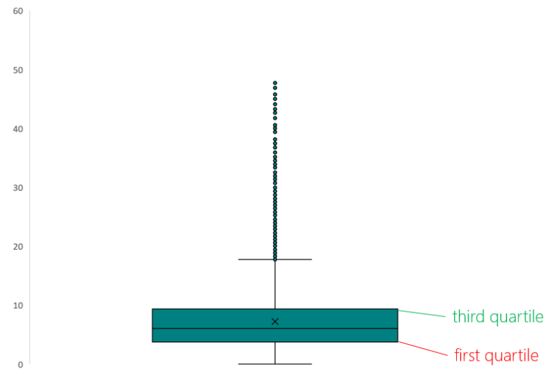
This can admittedly becoming a little confusing to keep track of. We’ve found that something that helps with intuition is to think of the quartiles as possessing ranges, and remembering that each range contains roughly a quarter of the total data points in the data set. Perhaps this pursuit would be frowned upon by the statistician purists of the world, but we take a bright view of whatever helps you learn. Hopefully the visual below helps conceptualize.

Now we’re getting somewhere, right? We can observe that the first three quartile ranges of this distribution have a pretty comparable range of values. But the fourth quartile range is a much broader stroke. For this advertiser to lower their CPCs, a focused and precise tactic would be to isolate keywords that fall within that fourth quartile range, and modify the attendant bids.
Alright, but what about those dots?
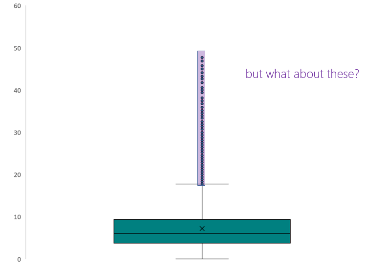
Data points that render as individual dots can be considered statistical outliers in the context of a data distribution. In our hypothetical scenario, the advertiser is looking for tactics to mitigate CPC cost. In addition to the fourth quartile range, this advertiser should investigate the keywords responsible for these outlier values, and act accordingly.
Hearken back to part one of this series for a moment, and recall that our distribution is right tailed, meaning that the skew is towards values that are greater than the median. Knowing what you know now about both histograms and box and whisker plots, you should be able to intuit the relationship between these two visualizations of the same data.

In the final part of this series, we’ll explore using distributions to identify changes in your data over time.
Opinions expressed in this article are those of the guest author and not necessarily Search Engine Land. Staff authors are listed here.
About The Author

Kevin Klein is an Analytical Lead at Microsoft, which means he serves as a life raft when the deep waters of search advertising data become choppy. After slinking into the industry on the strength of his work in hockey analytics, he cut his teeth on both agency and in-house marketing teams.