Welcome to 2022 and another year of feeling inspired by the incredible work of email marketers.
In January, our inboxes were brimming with exciting campaigns that encouraged us to push the envelope as we plan out our own email program. From empathetic and relevant messaging, to personalized experiences and creative trends, we celebrate the brands that are coming out of the gate strong. 🏇
Read on to see the Litmus team’s favorite emails of January 2022.
Jaina Mistry, Senior Email Marketing Manager
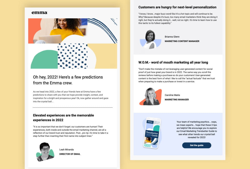
Emma
Subject line: 2022 predictions are in…🔮
Preview text: You can thank us later

Jaina says: There were a couple of things that stood out to me: 1) the gradual tease out of what to expect in the ebook, which then eventually lead to the main call-to-action to download and 2) having the headshots and names of folks involved adds a lovely human touch to the email.
Jess Materna, Director of Product Marketing
Best Buy
Subject line: TVs: you deserve this one!
Preview text: Go ahead. Take another look.
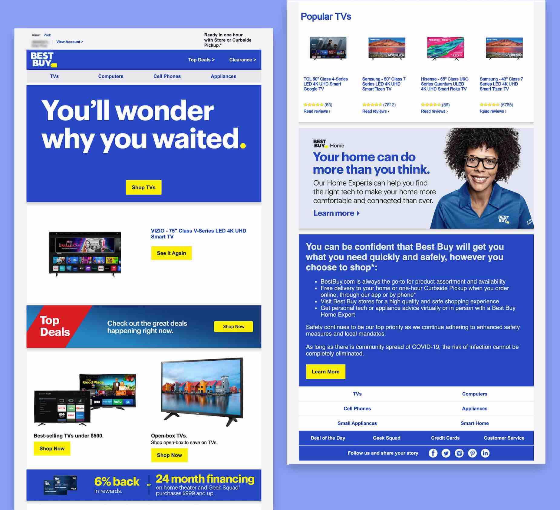

Jess says: From the start, I understood this was going to be an abandoned cart reminder email from the subject line and preview text, but I liked the simple yet empowering “you deserve this” subject line so much that I was intrigued enough to open it. The “You’ll wonder why you waited” headline was a great way to create FOMO in a positive way.
They provided me with an easy and clear way to get back to what I was looking at but also made some suggestions for other devices that might be of interest if price was the thing holding me back. I also loved the commitment to safety at the end of the email. I felt like they really covered a lot of the reasons someone might be hesitant to move forward with a purchase.
Kimberly Huang, Content Marketing Specialist
Grammarly
Subject line: Looks like we have ourselves a productivity wizard.
Preview text: Way to set a personal record last week!
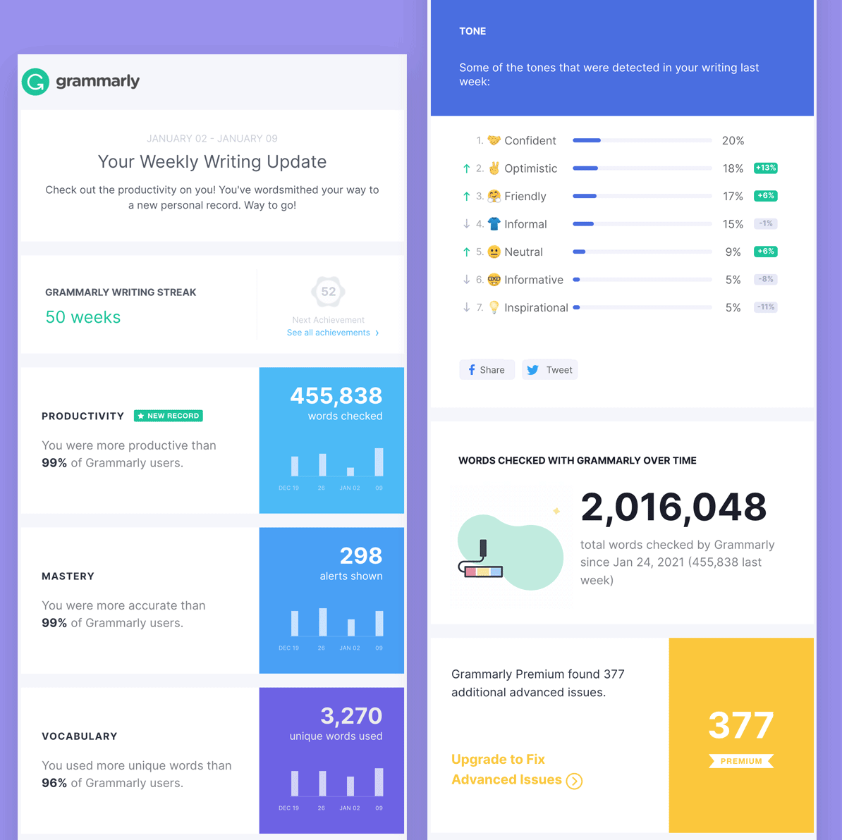
Kim says: What stood out to me was personalization! The subject line was like a nice pat on the back, which prompted me to open. Then, after open, they not only fulfilled the expectation set by the subject line but went above and beyond to help me learn more about my habits as a user of their product.
Ultimately, what won me over was seeing all my metrics displayed in a digestible way (along with a simple yet delightful animated GIF). I also appreciated the thoughtful design—each module was different than the next, which kept things interesting as I kept scrolling.
Daniel Hawkins, Marketing Designer
Ally Bank
Subject line: Make yourself at home in 2022
Preview text: Complete your home financing application in no time with Ally Home.
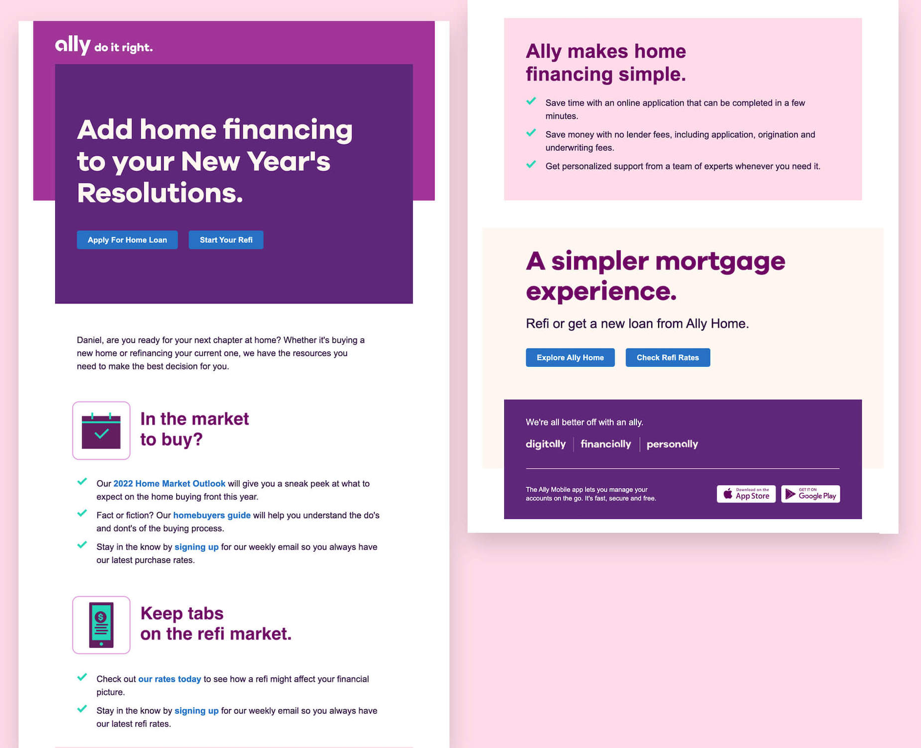

Daniel says: The color scheme is so pleasant in this email and it feels unique to Ally. My favorite part about this email is the stacked color blocks—larger squares with smaller color contrasting squares overlapping them. This is then contrasted by sections without a background that really make those color blocks feel like they jump out.
There is some text in images that could be live text, but otherwise I really like this design.
Carin Slater, Email Marketing Specialist
Magic Spoon
Subject line: Vote on a brand new Magic Spoon product
Preview text: And get 15% off your next order
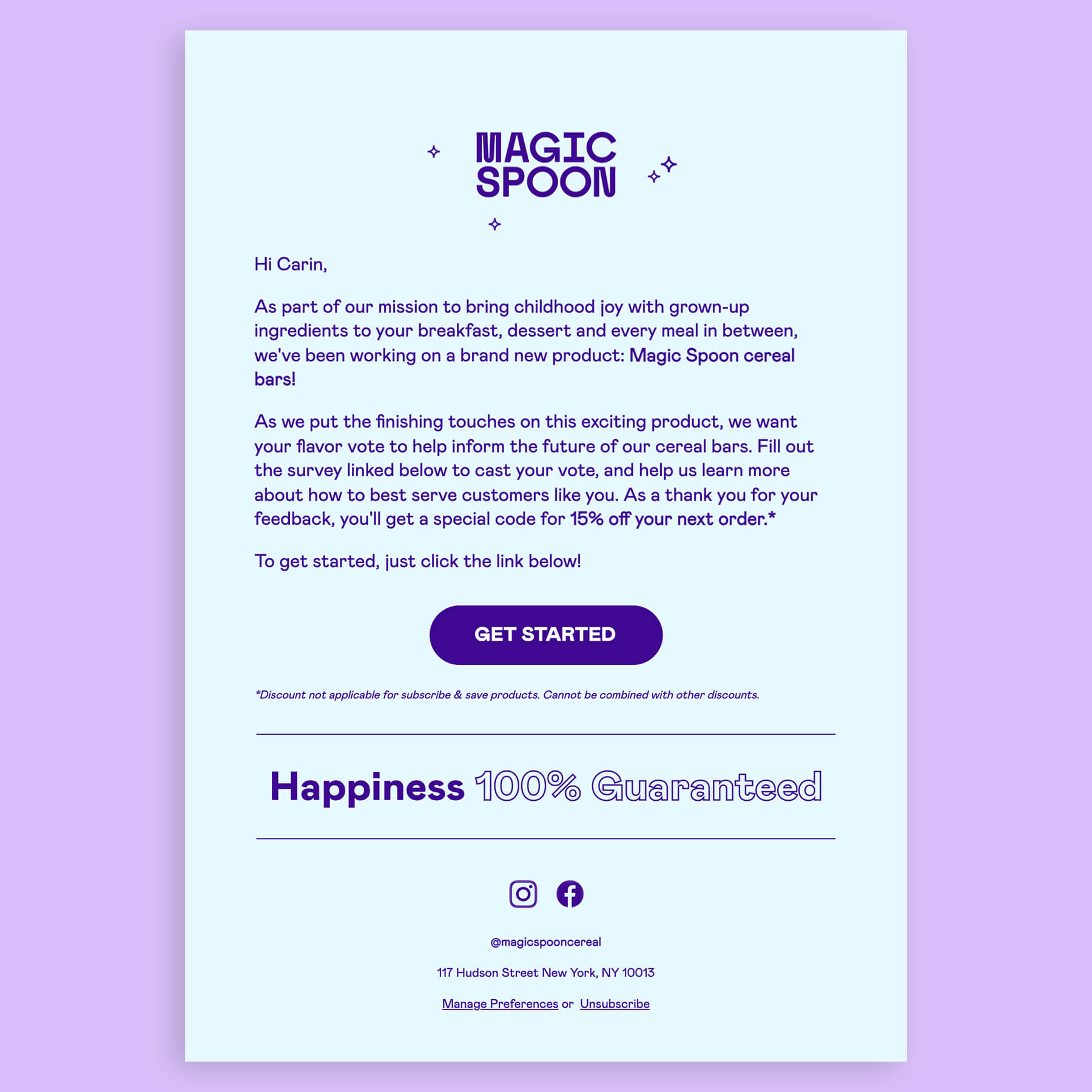

Carin says: Magic Spoon’s emails are usually image heavy. So when I opened, saw the entire email, and understood what was going on without the images, I was surprised and kept reading to find out what was going on.
The ALT text on the button could have been more clear as I originally viewed it with images off and was looking for the link to click, but the email definitely got me clicking through.
 | The Ultimate Guide to Email Accessibility This guide has the insights and step-by-step advice you need to write, design, and code emails that can be enjoyed by anyone—regardless of their ability. Download the ebook |
Lily Worth, Senior Email Designer
UX Pin
Subject line: 📌 Product design trends for 2022, handoff revolutionized, and more.
Preview text: Here’s your design newsletter.
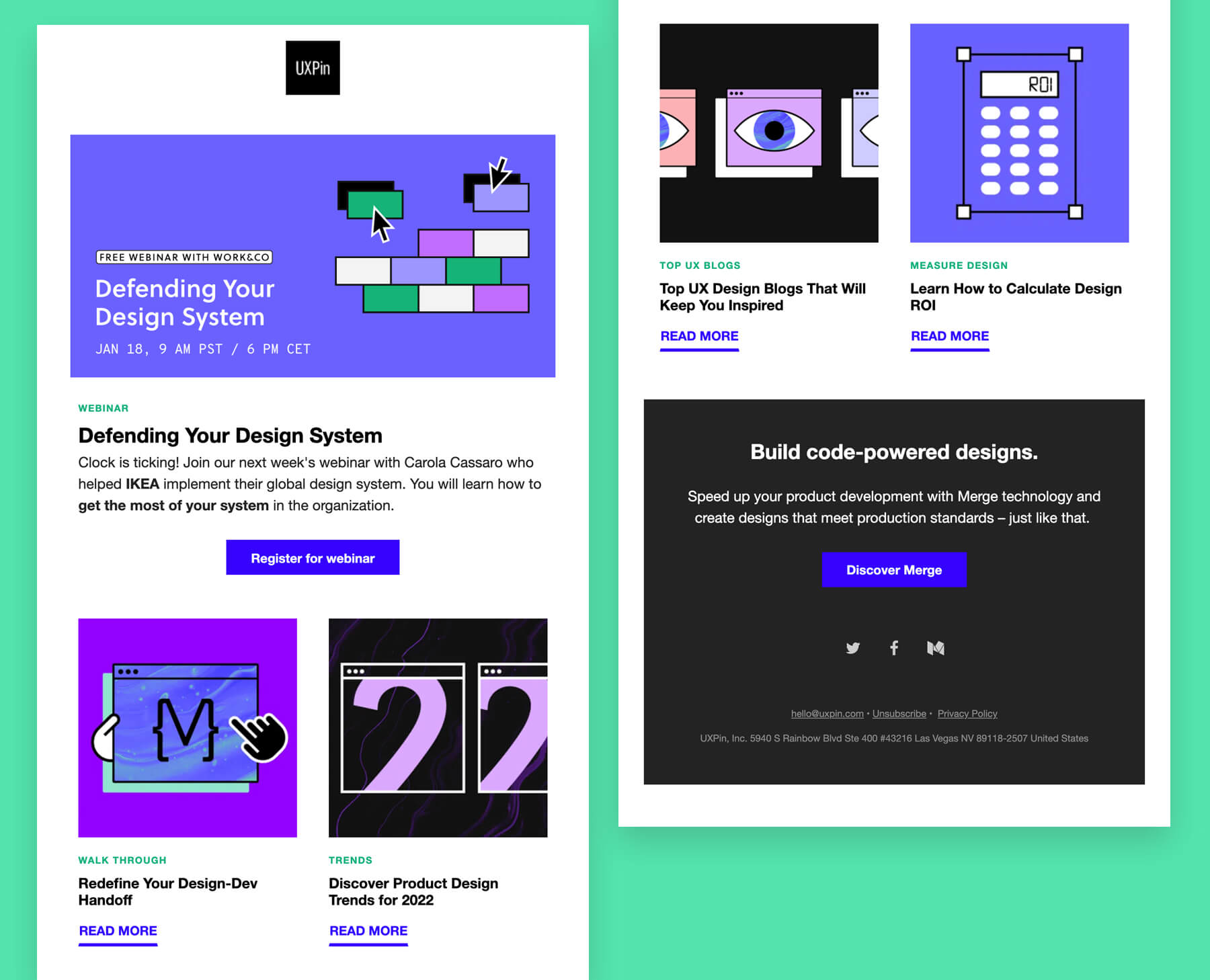

Lily says: The design of this email has some really nice touches. The color palette is bold without being overwhelming or shouting. The outlined illustrations are on trend, leveraging the compartmentalized style many tech and retail brands are leaning into. But it’s the texture brought into the illustrations using a marble effect that I am particularly drawn to, giving them a unique identity that feels more multi-dimensional than flat-vector graphics.
Campaign Monitor
Subject line: 2021 in review: Goodbye 2021
Preview text: Reflecting on some incredible achievements
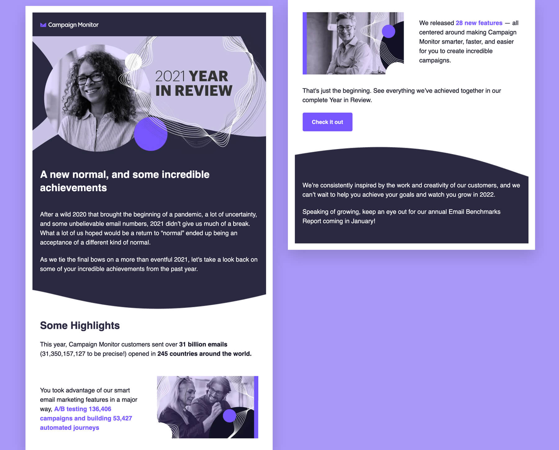

Lily says: This year-in-review email showcases design trends leveraged in recent months, including mixed media, where photography and illustrations or shapes are used together to create interesting visual content compositions. Fluid lines separating content have also been popular, in contrast with the outlined sections and compartmentalized layouts that have been a big hit with brands like Mailchimp and Figma.
Pixel perfect, every time. Integrating Litmus into your email workflow helps your emails be pixel-perfect with every send—ensuring they’re on-brand and error-free, every time. Try Litmus for free |