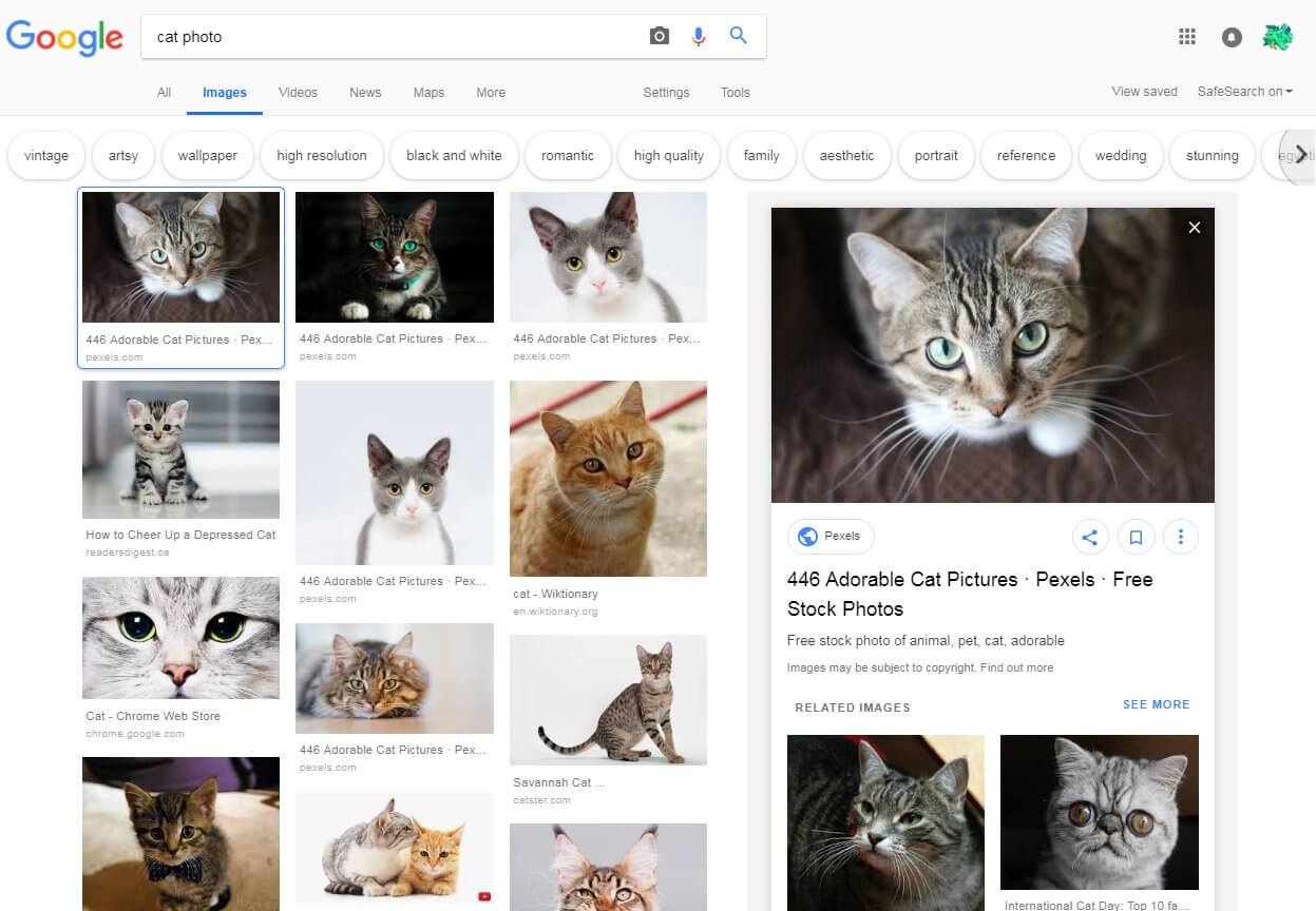
Google seems to be testing a new design and user interface for Google Images , which has been spotted and screen-shotted by users. The new interface has rounded filter bubbles at the top, which suggest ways to filter your image searches. It also offers a new preview for the image you selected.
Instead of showing that image on a black background under the image, Google is showing that image on a white background on the right side of the page.
Here is a screen shot from @thibaultadda on Twitter:
This is different from how it looks now:

Google declined to comment on this design change, so we do not know for sure if this is something Google is planning on rolling out or is just testing in a limited way. Several people shared screen shots of this design on social media and other places, suggesting that it’s a fairly sizeable test if it is one.
About The Author

Barry Schwartz is Search Engine Land’s News Editor and owns RustyBrick, a NY based web consulting firm. He also runs Search Engine Roundtable, a popular search blog on SEM topics.