Data visualization is the act of taking information (data) and placing it into a visual context, such as a map or graph.
Data visualizations make big and small data easier for the human brain to understand, and visualization also makes it easier to detect patterns, trends, and outliers in groups of data.
Good data visualizations should place meaning into complicated datasets so that their message is clear and concise.
Types of Visuals
In the early days, the easiest and most common way to create a data visualization was to take the information from an Excel spreadsheet and transform it into a bar graph, pie chart, or table.
This method is still extremely effective, but the art of data visualization has also come a long way in the past 20+ years.
Nowadays you also have the option to create more intricate visualizations such as:
- Bubble clouds.
- Bullet graphs.
- Heat maps.
- Radial trees.
- Infographics.
- And more.
When deciding what type of visualization to use, you don’t want to just choose randomly.
First, you want to make sure you have a clean and complete set of data to work with. If there are holes in your numbers, they will be reflected in your visualization.
Then you have to consider the specific type of data you’re working with, as well as who your audience is and what message you want to convey. Sometimes a simple graph is the most effective, whereas other times a more complex visualization is needed to get the job done.
You don’t want any elements of the graph to take away or distract from the data. The data and the visual need to work together to tell a story.
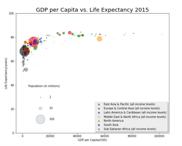 An example of a bubble cloud visualization.
The Importance of Data Visualization
We are an inherently visual world, where images speak louder than words. Data visualization is especially important when it comes to big data and data analyzation projects.
Nowadays more and more companies are using machine learning to collect mass amounts of data. While it’s great that they’re able to do this so quickly and effectively, it also calls for a way to sort through, comprehend, and explain this data in a way that makes sense to both the business owners and stakeholders.
The same concept applies to advanced data analyzation projects.
When data scientists are in the midst of a complex project, they need a way to understand the data that’s being collected so that they can monitor and tweak their process to ensure it’s performing the way it should.
The results from complex algorithms are much easier to understand in a visual format as opposed to lines and lines of text and numbers.
Data visualization is truly important for any career; from teachers trying to make sense of student test results to computer scientists trying to develop the next big thing in artificial intelligence, it’s hard to imagine a field where people don’t need to better understand data.
According to Tableau, “[data visualization is] one of the most useful professional skills to develop. The better you can convey your points visually, the better you can leverage that information.”
Data Visualization & SEO
Anyone who has worked with SEO knows that it can be difficult to explain to those unfamiliar with the field, but it’s challenging even to seasoned experts to explain and understand the results from Google Analytics, Google Ads, Keyword Planner, and more.
This is where visualization comes into play.
Creating SEO visualizations will not only make the data more accessible to you and your stakeholders, but it will also save you time and make it easier to identify trends in the optimization process.
“There are a lot of different elements that affect organic traffic, [and] it is sometimes difficult connecting all the dots during the optimization process. Using SEO visualization, however, allows you to connect the dots and find out whether a new link earned had an effect on traffic and rankings if PPC traffic is performing better than organic traffic, and which keywords created leads that turned into actual sales.”
Data visualization can be most effective in the following areas regarding SEO:
- Competitive analysis.
- Backlink analysis.
When it comes to competitive analysis, chances are you’re collecting data on your competition:
- How they’re performing on social media.
- What content they’re producing that’s successful.
- Their keyword strategy.
- Etc.
But what should you do with that information?
The answer is simple – visualize it!
By putting it into a graph, table, or other types of visualization, you’ll easily be able to look at a large amount of information at once and hopefully see trends among your competition that you can then apply to improve the success of your own business.
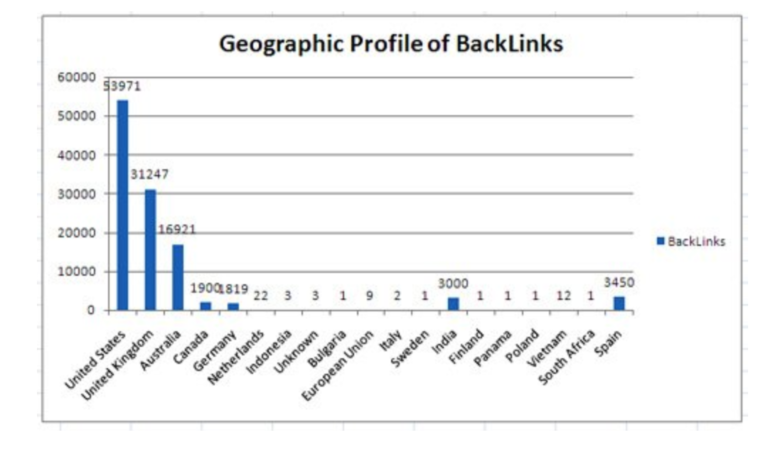
In addition, data visualization can help you develop a link building campaign. You can use it to analyze:
- The geographic locations of your backlinks.
- The anchor text distribution of backlinks.
- The quality of your backlinks.
All this information is extremely pertinent to ensuring your website is optimized, and visualization would make it easy to both understand and convey the data to others.
Check out this article by Anna Crowe to learn more ways to use data for link building.
Recommended data visualization classes:
The Takeaway
Ultimately you won’t regret incorporating data visualization into your business plan.
Whether you use a basic bar graph or an intricate infographic, data visualization makes large amounts of numbers and statistics accessible to both business holders and their audience.
It can (and should) be used to influence your decision making, and it’s especially important when trying to analyze and implement strategies to improve a website’s SEO; visualization makes it easy to ensure your website is as optimized as possible.
Visualization can help you begin to ask the right questions, and it makes the data more memorable for stakeholders.
Use visualization to tell the story of your business in a way that’s both understandable yet engaging.
More Resources:
Image Credits
Featured Image: DepositPhotos.com
Data Visualization Example 1: towardsdatascience.com
Data Visualization Example 2: optimizesmart.com
Subscribe to SEJ
Get our daily newsletter from SEJ’s Founder Loren Baker about the latest news in the industry!