

The concept of an insanely fast site is something Google has been talking about for a long time.
Are you convinced that site speed is your top priority for optimizing user experience in 2017?
In this post, I’ll cover:
- Why site speed matters.
- How your mobile visitors fit into the equation.
- The need for speed in a mobile-first index world.
Why Site Speed Matters
Throughout the years, Google has implemented a host of recommendations and tools to help website owners make their sites faster. These guidelines and tools support the core of our services as a mobile SEO agency.
After all, fast sites are good for the end user. And Google wants to feature in its results those websites that offer a good user experience.
No matter how you slice it, the message from Google is clear: faster is better.
In fact, in late 2016, Google rep John Mueller said to keep page load time under three seconds.
@vivek_seo There’s no limit per page. Make sure they load fast, for your users. I often check https://t.co/s55K8Lrdmo and aim for <2-3 secs
— John ☆.o(≧▽≦)o.☆ (@JohnMu) November 26, 2016
Back in 2010, Google said site speed would be a factor in its ranking algorithm, albeit a lightweight signal.
In its announcement, Google explained why site speed matters:
Speeding up websites is important — not just to site owners, but to all Internet users. Faster sites create happy users and we’ve seen in our internal studies that when a site responds slowly, visitors spend less time there. But faster sites don’t just improve user experience; recent data shows that improving site speed also reduces operating costs. Like us, our users place a lot of value in speed — that’s why we’ve decided to take site speed into account in our search rankings. We use a variety of sources to determine the speed of a site relative to other sites.
Notice that last sentence: “We use a variety of sources to determine the speed of a site relative to other sites.”
If every website that shows up for a particular query has about the same average page load time (even if that happens to be on the slower side), your website will be considered normal.
However, if your website’s page load times are much slower than the average, you’re at a disadvantage.
Former Googler Matt Cutts mentioned back in 2013 that when all other things are equal, page speed can factor into rankings.
For example, if I do a search and all the relevant web pages load are between 1.5 and 2.5 seconds, Google isn’t going to use site speed as a factor for ranking.
But, if there’s a web page that takes 12 seconds to load, it’d probably see a demotion in rankings. You have to be average compared to the performance of every other web page for that query.
So the question is actually: Is faster an advantage or is slower a disadvantage? I think the latter.
Google’s no stranger to giving mixed signals, though. Remember that tweet from John Mueller? Well, here’s another tweet from Google’s Gary Illyes that mentions not to worry “too much” about page load time:
@seefleep I wouldn’t worry about it too much. Make it as fast as you reasonably can.
— Gary Illyes ᕕ( ᐛ )ᕗ (@methode) April 21, 2016
The bottom line is that you should care if you have very slow page load times.
And, you should try to meet Google’s recommendations if you can, making sure pages load within just a few seconds.
How Mobile Browsing Matters to Site Speed
Now let’s talk about how site speed manifests in various scenarios.
Mueller recommended a three-second ceiling for HTTP page load speed. But when it comes to mobile, Google’s official stance here is to have above-the-fold content render in one second or less, so that the user can “begin interacting with the page as soon as possible.”
And, in the coming months, it’s possible this will factor into mobile rankings in Google’s mobile-first index.
This is significant for site speed optimization because with the mobile-first index, Google bases its rankings on the mobile version of your website.
You can test the load times of your pages with Google’s PageSpeed Insights tool. Here, Google explains the need for above-fold-content that is immediately usable:
PageSpeed Insights measures how the page can improve its performance on:
- time to above-the-fold load: Elapsed time from the moment a user requests a new page and to the moment the above-the-fold content is rendered by the browser.
- time to full page load: Elapsed time from the moment a user requests a new page to the moment the page is fully rendered by the browser.
Here’s an example of the types of issues that can improve load times as reported by the PageSpeed Insights test:
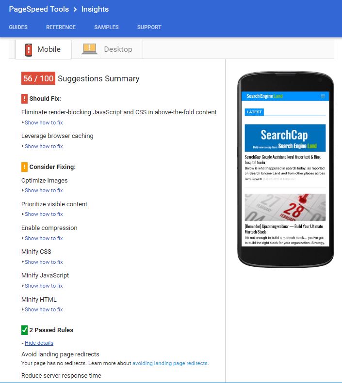
Click to enlarge.
One of the things we’ve discovered is that the results of a PageSpeed Insights test changes over time, and lately it has been very much biased by image load times.
Apparently, a lot of website publishers have gotten their overall page load time to be fast, but their images do not load quickly.
In order to make mobile page load time faster, image compression will be an area of focus. Determining whether an image is even needed may be one of the next things you have to decide in prioritizing efforts of your mobile SEO strategy.
In new research published by Google, the key recommendation is to keep the average request count (the number of individual pieces of content needed to display the entire page) below 50.
The Need for Speed in the Mobile-First Index
It’s worth noting how the practice of reducing content for mobile speed optimization may impact your rankings in this new mobile-first index world.
What is currently being served as your mobile site is what Google would consider for indexing and ranking in its mobile-first index. If the mobile version of your site only displays a portion of all available content, then Google will only consider that part in its ranking calculations (and not any additional resources available in the desktop version of a site).
If a site has a responsive design configuration, as Google recommends, everything on both the desktop version and the mobile version should be accounted for by Google, right?
Not exactly. In responsive design, you tell the site not to display blocks of text or certain images in a mobile device.
Traditionally, Google would index the desktop version of your site. Whatever the desktop image was, that’s what Google would index and use to rank. Whatever the desktop content was, that’s what Google would index and use to rank.
Then, when a person loaded that page on a mobile device, at that point, you could control what was displayed. However, the index was based on the full desktop version of the content. Responsive design just decided what was displayed or not for a mobile or tablet device.
Now Google is moving to a mobile-first index. So if the mobile version of your site is not displaying certain content or images, Google will no longer consider it in ranking and indexing.
For example, on your desktop site in your footer, you might have 50 links. But in the mobile version, you don’t want to clutter it up so you only display 10. When Googlebot crawls your page, it’s not going to count 50 links, it’ll only consider the 10.
As another example, consider the way people have approached mobile performance in the past — by cutting parts off of their page, like images or content. If that’s your approach for the mobile experience, you need to understand you’re cutting out content that may be helping you rank.
So, what do I recommend?
You do want to create a fast experience when mobile users come to the site — that’s still important. But you have to balance the content you need to rank with the mobile experience.
Design your website around the mobile experience to start.
Only display content that is worthy of being displayed on a mobile device, even on your desktop pages. It may require you to have more web pages with less content, because that 2,000-word page may not be mobile friendly.
And when it comes to speed, website publishers may cut out images because loading a particular image on a mobile device takes too long. These common activities geared towards increasing your page load times may actually cause the content to no longer be indexed in a mobile-first world.
Weighing the Option of AMP (Accelerated Mobile Pages)
This brings us to Google’s latest project geared towards speed: AMP.
We cover AMP in detail in our guide here.
AMP is an open-source project that effectively helps website publishers create faster mobile experiences via specific configurations that:
- Pre-render website content while limiting the use of JavaScript that publisher sites can use.
- Caches content so Google doesn’t have to fetch page content from the publisher’s server.
Google has said AMP won’t impact rankings, but with all the signs that faster is better in mobile, I wouldn’t rule out AMP’s ability to load pages faster as a way they might inherently rank better.
Keep in mind that AMP is not an easy thing to implement on a website, and the specifications for AMP are reportedly changing often. As the program expands into more and more potential types of websites (remember, it started out with just news sites and expanded from there), Google is constantly having to make compromises.
And then, of course, there is a cost to develop in AMP. You are going to need to actually change your site to support it. There are also ongoing costs as AMP specs change, because you need to update pages. Then there’s the risk that Google will abandon AMP or come up with a different system such as making your website behave more like a mobile application.
Choose your AMP pages wisely.
Beating Your Competition to the Finish Line
If you want to compete online in 2017, your website has to be fast.
The message from Google is that speed counts. But there are many ways to achieve speed.
This requires you to weigh the costs and benefits of mobile configurations, including responsive, AMP and more.
All the while, keeping in mind that changes you make to your mobile site can and will impact your rankings in a mobile-first world.
Let us help you drive and track traffic to your website with a mobile SEO strategy. BCI’s services are tailor-made to match your business goals and audience. Let’s talk more about growing revenue through mobile-friendly SEO.