If your brand logo or brand message is not connecting with your ideal consumers, the chance of brand recall in the future are slim
Branding is equivalent to telling a story, a story that resonates with your ideal buyers. Visuals form the core of this storytelling.
In other words, visual branding is the first step to building a successful brand image and developing your business. First impressions matter and this rings true even with visual branding. If your brand logo or brand message is not connecting with your ideal consumers, the chance of brand recall in the future are slim.
There are many examples of branding going haywire and the reasons can be anything – a bad logo or poor brand name or inconsistent visuals, and so on. While each brand has a different story, there are a few little design errors that every brand should avoid.
1. Creating a controversial logo
A logo is your brand identity. Creating a logo that impresses people and at the same time conveys your brand message requires a lot of planning. This is the first step in creating a lasting impression and making way for a continuous brand recall.
There are good logos, there are bad logos and then there are those that have sparked unwanted attention for all the wrong reasons. You see, brands like Apple or Coca-Cola have a name that has nothing to do with their core product, but their branding itself has helped them carve a niche for themselves. Had these logos offended anyone’s sentiments, they wouldn’t have been so big.
Whether you’re building your logo for the first time or thinking of re-designing it, avoid the fate similar to the London Olympics in 2012 when they unveiled their new logo only to trigger controversy. London Olympics spent a whopping £4,00,000 on its new logo which happened to tickle the funny bone in some people who claimed it like The Simpsons getting caught in a controversial position.
![]()
A composition of subway-like graffitilike, roughly cut-out edges indicating figures in pink and yellow – London Olympics’ logo was quick to receive over 35,000 signatures in its protest. Some said it resembled the Hindu Swastika while Iran threatened to boycott the Olympics after concluding that it spells out ZION.
Whatever be the poison, the logo was on the headlines for a long, long time.
Although things calmed down later, no brand would want to strike create a nightmare intentionally.
Key Takeaway: Build a logo that is neutral and caters to the global audience. We still remember the London Olympics’ logo fiasco after so many years. Despite the storm passing, this logo continues to feature on the lists of worst designed logos. Don’t do this, unless you think this will be a great way to get featured on Business Insider.
2. Over-using your logo to create a brand identity
The logo is important; we’ve established that. But spending all your resources on the logo alone is a bad call. Doing so will hamper not just your logo but your overall branding.
Often companies are so over-focused on using the logo everywhere, every time, that they forget the core aspect of strengthening the brand identity. On the contrary, it is the reverse way. Avoid using your logo at the forefront of all of your campaigns. Yes, you must include your logo – that is a part of trademarking your campaign assets – but not at the cost of overpowering your entire campaign.
One brand that does this amazingly is Apple. Apple has a half-bitten fruit for its logo, but its brand power is beyond comprehension. You don’t need to write down the brand name in letters. The logo itself evokes a sense of power, class, and exquisiteness. Apple has successfully balanced its logo and external design elements to connect with its viewers instantly. It evokes an emotional response instantly in its viewers. Check this visual below:
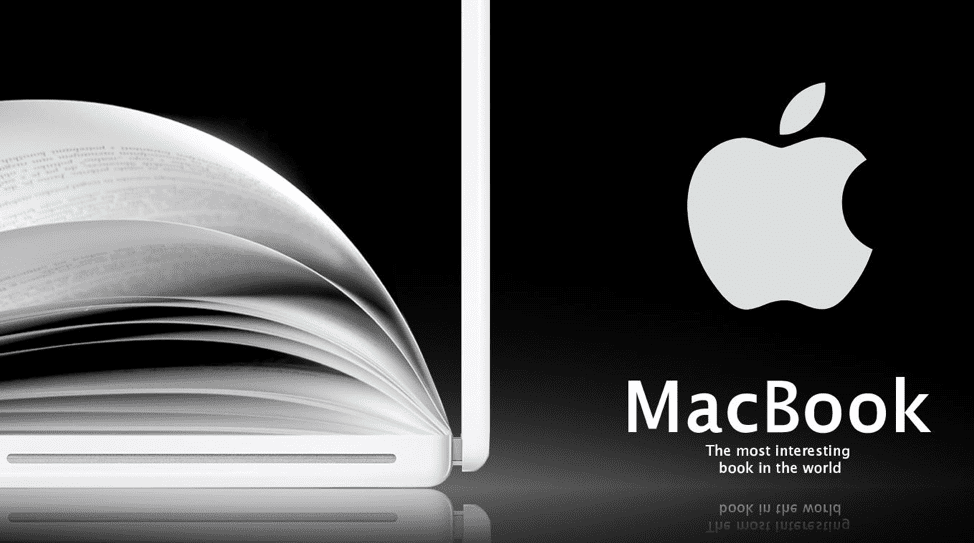
The use of the logo is optimal. It is not overpowering other elements; in fact, it is complementing the context and the background. The dark background does its job of emphasizing other design elements.
Key takeaway: Use high-quality design in the background to maximize your logo’s impact rather than making your logo fill the entire space. The contrast should be eye-catching enough to hold your viewers’ attention.
3. Using overcrowded images for your marketing campaigns
Using visuals in your marketing campaigns gives you the much-needed edge. Your campaign looks visually attractive and you can hook your users for longer compared to using just plain text. Imagine spoiling your users with so many visuals that your users lose track of what is important and what isn’t. To elaborate on why it is as bad as it sounds, take a look at this email from Foodtown.
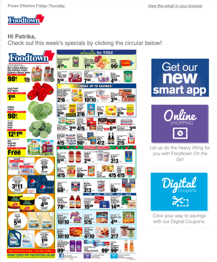
This grocery store had so much stuffed into a single space that users probably had to rub their eyes a few times to clearly see any individual product. We get it, discounts are high and attractive, but this email throws everything at its users hoping that one might catch their eye.
While giving out coupon codes to your users is a great idea, try highlighting your key items. A neat campaign visual is more attractive and can drive higher engagement. It isn’t necessary to stick to just one image all the time. You can always use multiple visuals, GIFs, forms or whatever you want – but in the right and appropriate way.
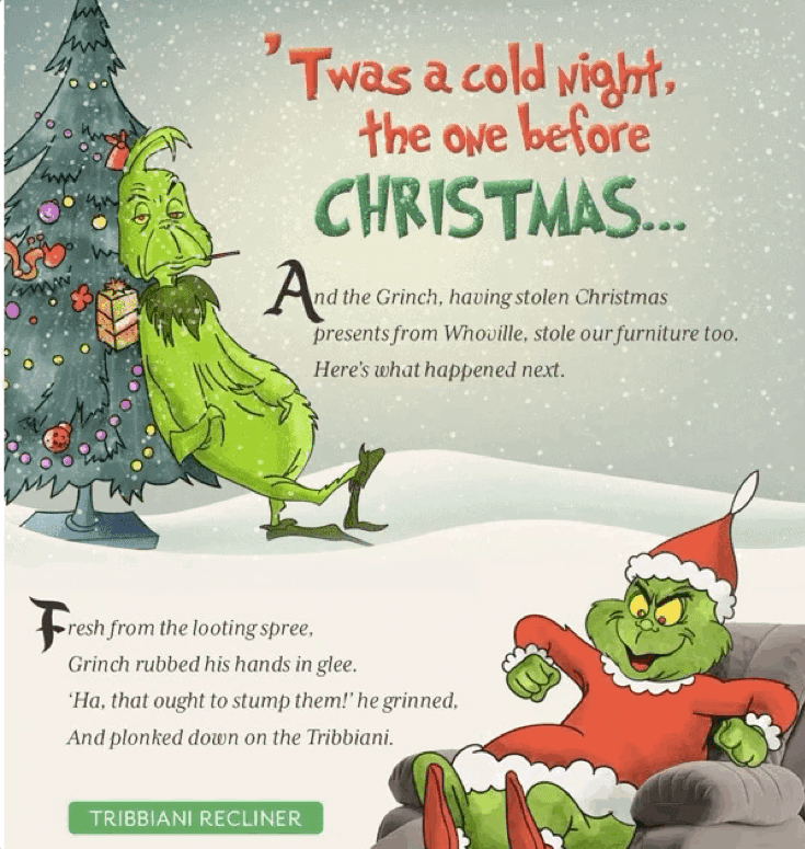
For instance, if you look at this Christmas email from Urban Ladder, a furniture retailer, you’ll see exactly how amazing visuals can hook your users and help you create brand recall. This email is from 2017 telling a story of how the Grinch stole Urban Ladder’s furniture. It is so beautifully done, I still recall this brand through its emails during this time of the year. In fact, I won’t be lying if I say, I look forward to their emails during the holiday season. Now that’s what you call effective branding.
(Below is a Snippet from the entire story of How Grinch Stole Urban Ladder’s Furniture and what happened next).
Key Takeaway: Make visuals that are eye-catching but not overloading and that keep your core message intact. Compromising your main message just because you want to make your campaign look flashy is going to cause harm to your branding. Just don’t do it.
4. Using fonts that are outdated or unattractive
Fonts matter. The size, the colour, the placement, the background- everything adds to your branding. Otherwise, Google wouldn’t have tested 41 gradations of the colour blue for the toolbar on Google Pages.
Some fonts are marked as “bad” fonts, like Comics Sans or Papyrus or Arial. Yet brands and marketing experts sometimes make some unforgettable font-errors in their marketing campaigns.
Another problem with typography is the spacing. Sometimes you may choose the correct font type, but the spacing of your fonts can give a whole new meaning to your ad. And who’d know it better than Walmart. Check this ad from Walmart below:
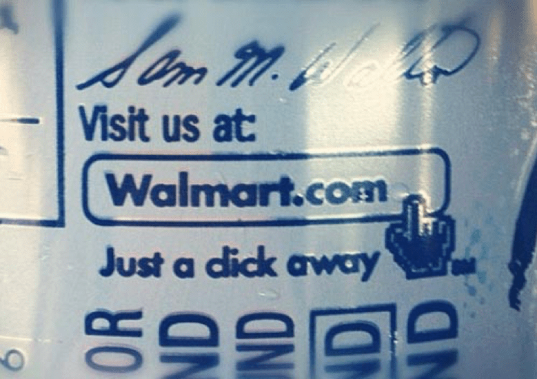
It is amazing that Walmart offered a saving of eight cents on its box of raisins but the ad’s font placement took away the focus from the box of raisins in a snap. I’m sure you’ve already got the clue in the image. What a disaster to the branding it was. You’ll definitely never want to create such a brand recall where your brand’s most embarrassing past catches up with you every single time.
Key takeaway: Read, re-read, get it re-read again. Avoid fonts like Arial, Comic Sans, and more. Stick to proper placement and spacing of your fonts. And, of course, choose a font that gives your brand name an uplift rather than bringing out the worst in it.
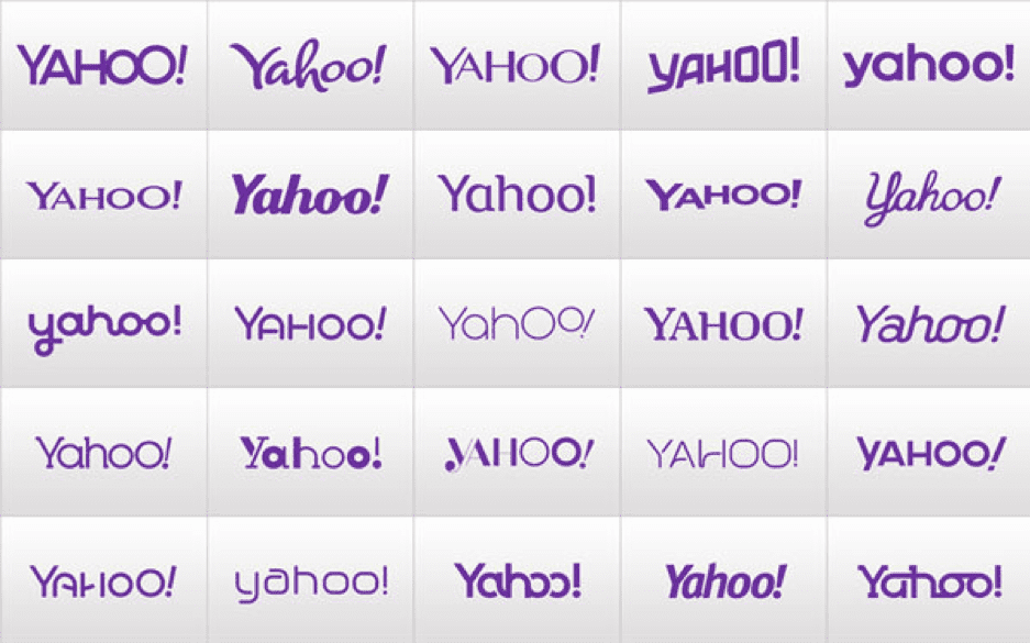
P.S. Avoid making regular font updates to your logo as Yahoo did. Here is a look at the various logo styles Yahoo used over the time.
5. Using an inconsistent colour palette
Colour is a way to build a brand identity. Your products or services can be easily identified from the crowd using your unique colour code. From Amazon’s black-and-orange combination to Starbucks’ green and white mermaid emblem, the colour palette you choose for your brand matters.
What matters more is maintaining a consistency while you do various marketing campaigns to build a brand identity. Not just that, maintaining the colour quality is also important. Imagine you spending a huge portion of your budget only to find out that the colour has rendered poorly and now your end-result looks different to the rest of your branding. Oops.
To give a sneak peek into how bad things can be, here is an email vs. website promotion from Dot Com Gift shop.
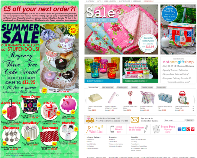
The visual cues used in the email on the left side are completely at odds with that on the website (on the right of the image). The fonts and colour palette used in the email are different and look like they are from a different brand altogether.
This inconsistency can harm your branding and may make your marketing campaign look fake one or like spam. Your users may mark it as spam or ditch your brand because they failed to connect with your email and your website. A negative impact of such measures can hamper your sales and your brand identity.
Inconsistency in branding is an unforgivable sin. Your customers will never forget these mistakes. It’s not just about using a random colour or images. Inconsistency also comes when your users fail to connect your ad with your core product or services.
One instance of this comes from Colgate’s Kitchen Entree ad that showcased a food bowl on its ad. Colgate is a toothpaste brand, and we all know it. Then Colgate comes up with this brilliant idea of showcasing frozen food to mark its expansion. However, things turned out to be bleak for this brand as the new ad failed to connect with the brand image Colgate had already created.

Despite the creative edge behind the idea, consumer behaviour relies a lot on consistent branding awareness. If you keep changing that time and again, your branding falters and your customers slowly forget what your brand is all about. It looks as if your brand has an identity crisis, which is a good reason for your customers to avoid you.
Key Takeaway: Maintain branding consistency, be it colours, fonts or product placements. Let your customers connect with you the same way as they did the first time you launched. Every brand innovates and puts a creative touch to their ads and branding, but messing up with the primary brand colour is a huge risk. Most often such risks can bring you down from the highest pinnacle of success in a snap.
6. Copying other brands’ visuals
It can be very tempting to just copy from someone who has already tasted success but don’t. Doing so means you are committing a huge marketing crime.
Taking inspiration is one thing, but copying visuals from other brands is a strict no-no. The simplest reason is that what worked for them may not work for you. Your audience, your objectives and your goals are definitely different from any other brands. This means your visuals and brand identity should be too.
This doesn’t just go for your competitors, you shouldn’t copy anyone’s designs. That’s just bad. Here’s why.
Popular fashion brand Zara was recently under scrutiny after an illustrator, Tuesday Bassen, claimed that Zara literally copied her illustrations without giving her credit. This Spanish fashion brand misused someone’s creatives without having the courtesy of giving the artist her due credits.
Artist Tuesday Bassen called out on Zara on social media while showing how exactly Zara copied her illustrations. In the end, it wasn’t just Bassen affected, more than a dozen indie artists spoke out against the fashion brand’s habit of using creatives without permission.
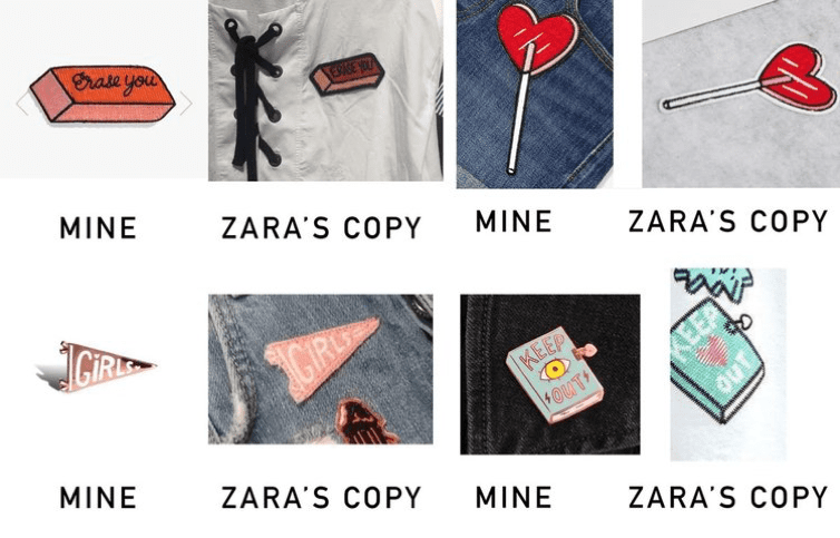
A brand as big as Zara falling to this level is unacceptable and was a big blow to its social image.
Similarly, Snapchat was in deep water when an array of indie artists called out on the brand for allegedly stealing their work and turning them into filters without giving credit or asking permission.
Things like this have a negative impact on consumer perception. This can impact your branding and your sales.
Key Takeaway: Take inspirations, but always be original. If you find someone’s work so good and you cannot think of anything else, give that artist their due credit, ask permission and then go ahead. CONSENT-based marketing, remember?!
7. Failing to stand out
Your target users are bombarded with thousands of marketing messages and ads daily. You need to cut through a lot of clutter before your target users see your marketing message or ads. The key: Be unique.
Good design can make your brand stand out rather than just merely fitting in. Your designing calibre is put to the test when your users fail to recognize your brand in the long run. By being unique and bold, you can create a brand identity that is hard to beat. After all, if your users don’t see a difference, why would they choose you?
Key takeaway: Stop pretending to be something that you’re not. Stay focused on your core branding message and utilize it across your marketing campaigns. This brings us down to merging all the six mistakes together – build a logo that triggers a brand recall, use consistent colour, create neat marketing assets, use proper fonts and be original.
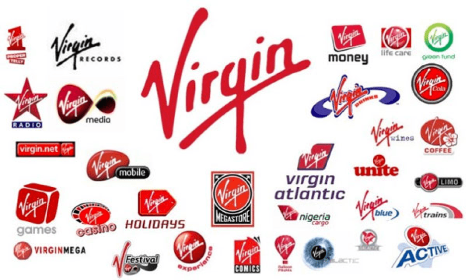
Sometimes in a bid to be unique, brands often create extensions that go too far to do any good. A living example is that of Virgin’s brand extension that results in absolute chaos.
Avoid heading into unknown territories if you are not confident enough to beat the existing competitors. Remember McDonald’s vague attempt at convincing people to get a slice of pizza but failing miserably? Brand extensions, if stretched too far, can reverse the branding game altogether.
Conclusion
Branding is similar to living up to the promises you’ve made, time and again. It triggers customer loyalty and helps build a proud customer base that rises up, goes ahead to bring in its friends and carry forward the brand legacy. If a brand breaks its promises, it hits customers’ trust hard.
Inspire your customers with your amazing designs and build a brand identity that your customers love and feel connected to, irrespective of the date or time.